 kage
usefastlane.ai
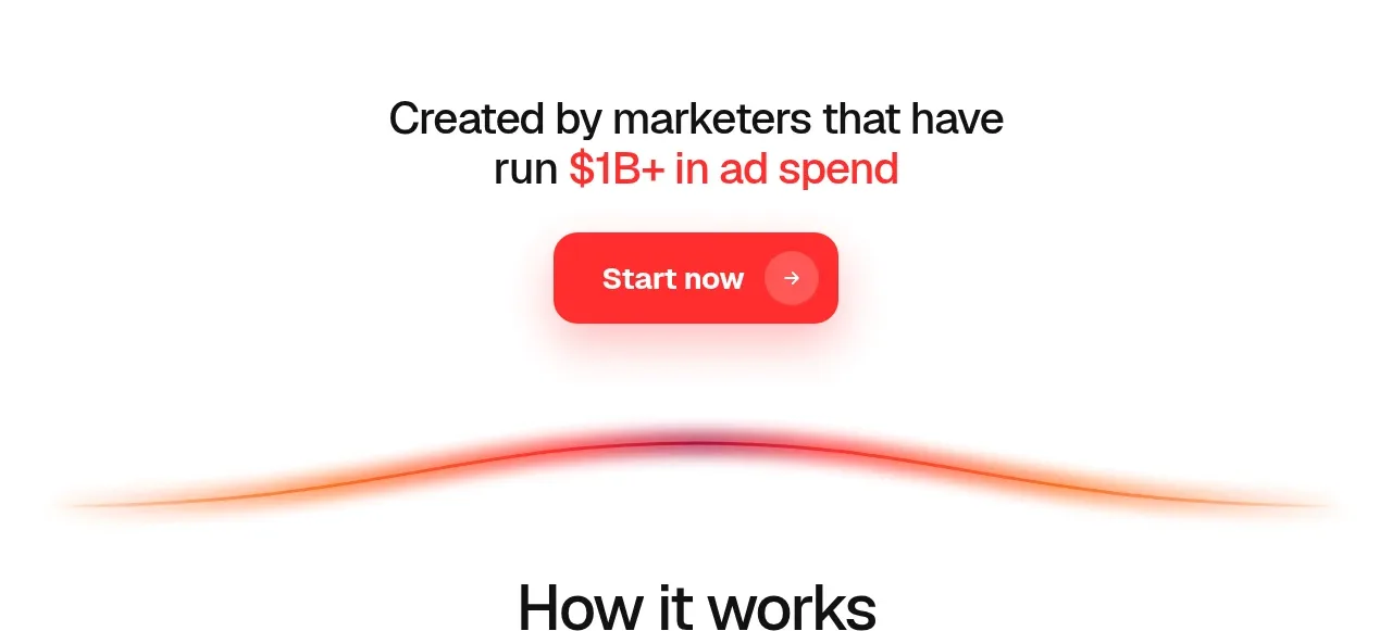
Design analysis
Short credibility-led copy, a single CTA, and a soft red light streak create a compact conversion break before the workflow explanation.
Prompt preview
## Reference images

Study these alongside the description below: hierarchy, rhythm, spacing, colour. Build for the product you are asked about, using this design language.

- Component: https://kage-design-assets.t3.tigrisfiles.io/components/fastlane-2-0/959a4273-adb0-42a9-9dfc-df0ea320e78d-1792735309-3.webp
- Full page it was cut from: https://kage-design-assets.t3.tigrisfiles.io/screenshots/fastlane-2-0/959a4273-adb0-42a9-9dfc-df0ea320e78d-1792735248580-full.webp
- Component on Kage: https://kage.design/component/fastlane-2-0-cta

## Before you start
Ask what evidence, customer outcome, or founder credibility the user's product can honestly claim. Build the CTA around that real proof.

Create a compact centered conversion band with a two-line statement about expertise or measurable outcomes, followed by one coral-red button. Use a clean white background and a very subtle decorative glow or horizontal light streak in #ff3b3b fading into #ffd4d4; keep it abstract and non-essential. Headline size should be 24–32px with 700 weight, body text 14–16px, and the CTA should be 140–180px wide with 12–14px radius, white text, and a gentle red shadow. Use 56–80px vertical padding and ensure the section feels like a pause rather than a second hero. Add hover lift and keyboard focus treatment.

Never: copy logos, product names, copy, illustrations, or imagery from the reference.
More components

 Conversion banner
Papermark Data Rooms · Call to action
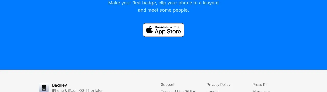
 Final download call to action
Badgey · Call to action

 Final signup call to action
AgentGrid.io · Call to action

 Final conversion call to action
Context Engine · Call to action
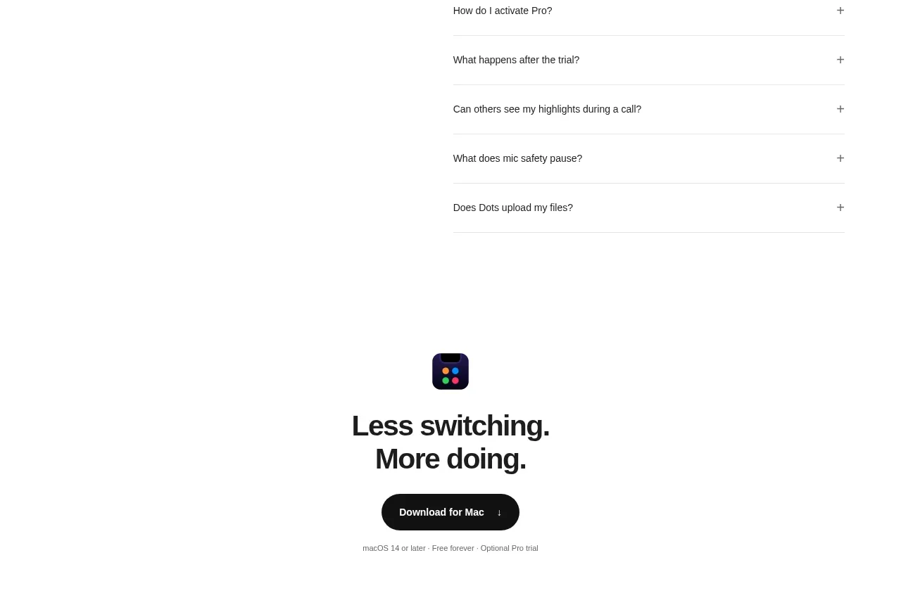
 Final download CTA
Dots · Call to action
 Developer workflow callout
Dots · Call to action