kage
kage
callfifi.app
Design analysis
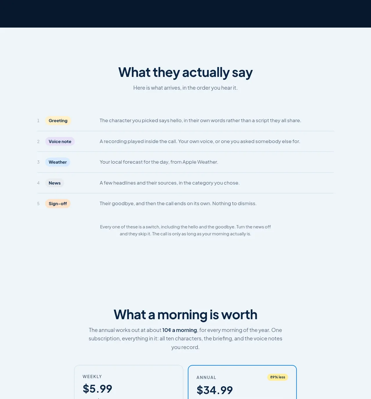
An airy centered section presents the product experience as five numbered rows with colored category chips and explanatory text.
Prompt preview
## Reference images

Study these alongside the description below: hierarchy, rhythm, spacing, colour. Build for the product you are asked about, using this design language.

- Component: https://kage-design-assets.t3.tigrisfiles.io/components/fifi/65f510a7-1d11-431a-a427-6e570df25f2f-1789538468-5.webp
- Full page it was cut from: https://kage-design-assets.t3.tigrisfiles.io/screenshots/fifi/65f510a7-1d11-431a-a427-6e570df25f2f-1789538432367-full.webp
- Component on Kage: https://kage.design/component/fifi-table

## Before you start
Ask what the user's product is, who it serves, and what their brand personality and palette are. Apply the following principles to that product rather than reproducing the reference.

Design a lightweight ordered-content table on a pale blue-white background. Center a heading and short intro above a max-width table around 720px. Each row should have a small sequence number, a compact colored pill label, and an explanatory sentence. Use 1px horizontal dividers in #d8e1e7, generous 18–24px row padding, and a clear three-part grid that collapses to number plus stacked content on mobile. Use dark navy text for headings, slate for descriptions, and a restrained set of pastel chip backgrounds such as #fff0ad, #dfeafa, and #fde5c6. Add a short concluding note below the rows without turning it into a separate card.

Never: use logos, product names, copy, illustrations, or imagery from the reference.