 kage
flyweel.co
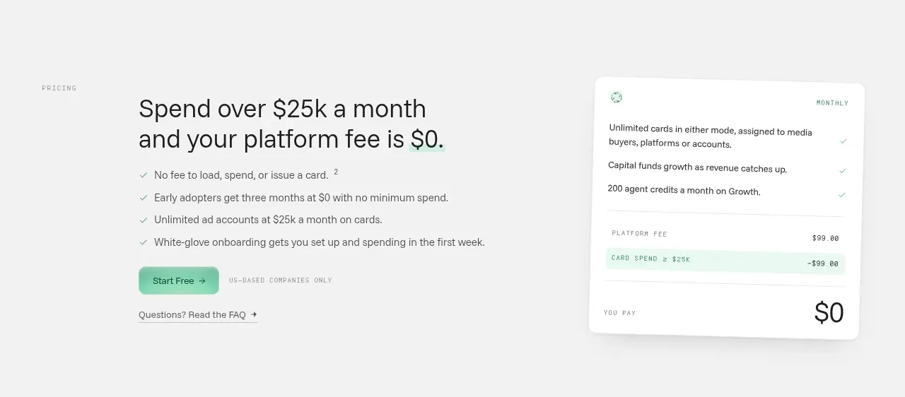
Design analysis
A pricing-focused conversion band presents a simple monthly spend promise, benefit bullets, a primary action, and a tilted fee-summary card.
Prompt preview
## Reference images

Study these alongside the description below: hierarchy, rhythm, spacing, colour. Build for the product you are asked about, using this design language.

- Component: https://kage-design-assets.t3.tigrisfiles.io/components/flyweel/865e3c33-9e14-4c9c-942f-392b2bfd1af5-1792649014-6.webp
- Full page it was cut from: https://kage-design-assets.t3.tigrisfiles.io/screenshots/flyweel/865e3c33-9e14-4c9c-942f-392b2bfd1af5-1792648958364-full.webp
- Component on Kage: https://kage.design/component/flyweel-cta

## Before you start
Ask what the user's product and brand are, then apply the principles below to that context rather than reproducing this reference.

Build a two-column pricing conversion section on a soft gray background. The left side should include a small pricing eyebrow, a large 34–42px headline, three or four check-mark benefits, a mint primary CTA, and a small FAQ/help link. The right side should be a slightly rotated white summary card with a few included features, a fee calculation, a highlighted savings row, and a prominent final amount. Use 18–22px radius, subtle shadow, mint (#8fe3c0) highlights, and clear financial hierarchy. Keep calculations readable and accessible; remove rotation on mobile.

Never: use logos, product names, copy, illustrations, or imagery from the reference.
More components

 Conversion banner
Papermark Data Rooms · Call to action
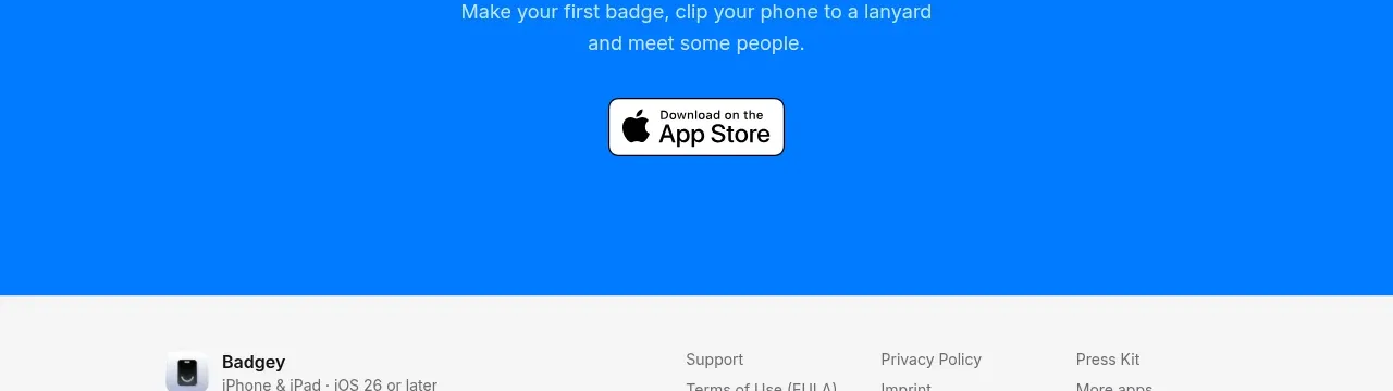
 Final download call to action
Badgey · Call to action

 Final signup call to action
AgentGrid.io · Call to action

 Final conversion call to action
Context Engine · Call to action
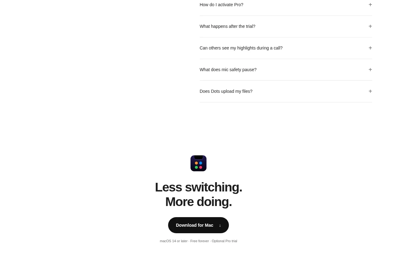
 Final download CTA
Dots · Call to action
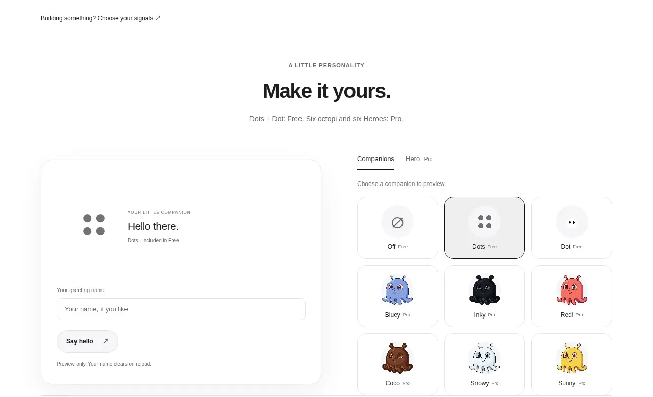 Developer workflow callout
Dots · Call to action