kage
flyweel.co

Design analysis
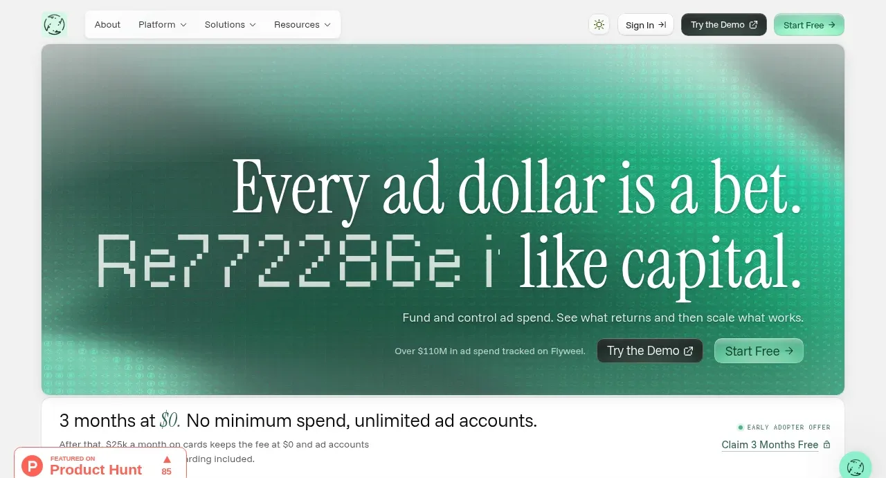
The design uses a high contrast, alternating structure of dark and light sections, anchored by a vibrant teal accent color. Typography is clean and hierarchical, using large, impactful headers contrasted with dense body text blocks. Feature sections employ modular cards and asymmetric layouts to break visual monotony and guide the eye through specific value propositions.
Prompt preview
## Reference images

Study these alongside the description below: hierarchy, rhythm, spacing, colour. Build for the product you are asked about, using this design language.

- Full page: https://kage-design-assets.t3.tigrisfiles.io/screenshots/flyweel/865e3c33-9e14-4c9c-942f-392b2bfd1af5-1792648958364-full.webp
- Above the fold: https://kage-design-assets.t3.tigrisfiles.io/screenshots/flyweel/865e3c33-9e14-4c9c-942f-392b2bfd1af5-1792648953283.webp
- Design on Kage: https://kage.design/designs/flyweel-landing-page

## Before you start
Please ask the user what they are building, who it is for, and what brand assets (name, colors, type) they already have. Wait for the answers. All the following design guidelines are to be applied to their new product, not to the reference.

## Page structure
**1. Hero Section:** A large, commanding header block featuring the core value proposition. It uses a strong, dark background contrasted by large, white or light-colored typography, complemented by an illustrative graphic element on the side.
**2. Feature Blocks (Initial):** A set of introductory blocks that define the product pillars (e.g., 'Ad Spend Cards', 'Cash-Gap Funding'). These are often presented in a grid layout (e.g., 3-column or alternating 2-column), using clean text descriptions and specific, labeled service cards.
**3. Deeper Explainer Sections:** The page continues with more detailed, longer-form sections. These sections frequently alternate background colors (light/dark) and might use asymmetric grid layouts or split content (text on left, image/data visualization on right) to explain complex processes.
**4. Process/Implementation Section:** A section dedicated to how the product works or the steps involved. This is typically presented as a linear flow or numbered steps, maintaining a high sense of clarity and rhythm.
**5. Final Call-to-Action (CTA):** The page concludes with a powerful, self-contained CTA block. This block usually repeats the high contrast and bold color treatment of the hero section to drive final conversion.

## Design language
**Hierarchy and Rhythm:** Hierarchy is established through drastic shifts in background color (dark vs. light) and the strategic use of scale. The page rhythm alternates between dense, informational sections and focused, high-impact visual breaks.
**Color Palette:** The primary colors are a deep charcoal or black (#111111), pure white (#FFFFFF), and a vibrant teal/emerald accent color (approx. #00C897). The accent color is used exclusively for CTAs, icons, and key highlights.
**Typography:** Use a modern, highly readable sans-serif typeface. Headers are bold, expansive, and high-contrast. Body text is well-spaced and legible. Keep the type scale strong, with clear differentiation between H1, H2, and paragraph text.
**Spacing and Density:** Maintain high vertical rhythm. While some sections are informationally dense (explaining features), these densities are broken up by generous padding and visual negative space, ensuring the page feels controlled and professional, not cluttered.
**Components:** Use modular cards with clean, subtle borders or background differentiation to group related information. When showing mockups (e.g., dashboards or cards), these should be depicted with crisp shadows and slight rounding to suggest depth without looking skeuomorphic.
**Borders and Rounding:** Edges should be sharp where data fidelity is key, but subtle rounding (e.g., 4px to 8px radius) should be used on cards and interactive elements to add a modern, friendly touch.

## Never
Never use the specific logos, complex illustrations, or unique phrases from the reference. Do not present the resulting design as the original product. Maintain the professional, high-contrast fintech aesthetic.
Components from this page
All components
 Top navigation bar
Flyweel · Navigation
 Ad-spend growth hero
Flyweel · Hero
 Early-adopter offer banner
Flyweel · Banner
 Platform positioning statement
Flyweel · Hero
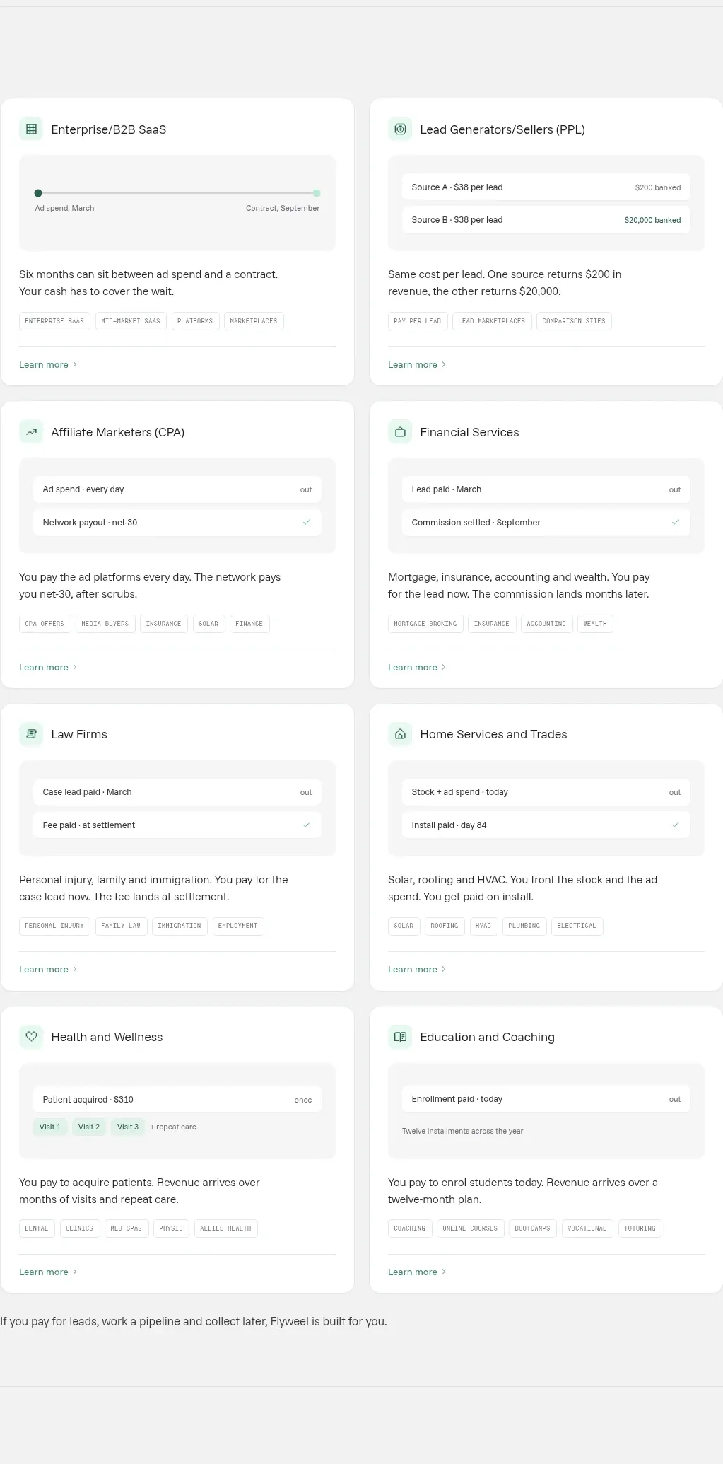 Audience use-case cards
Flyweel · Feature grid
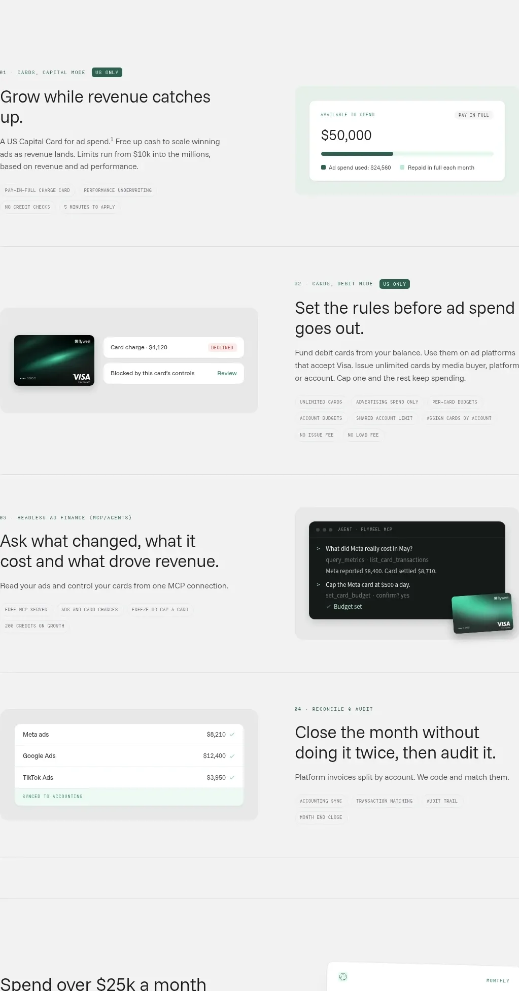 Product capability modules
Flyweel · Feature grid
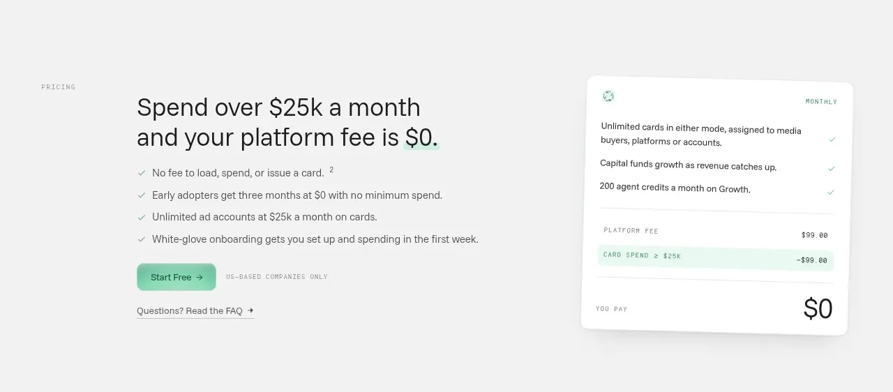 Pricing conversion section
Flyweel · Call to action
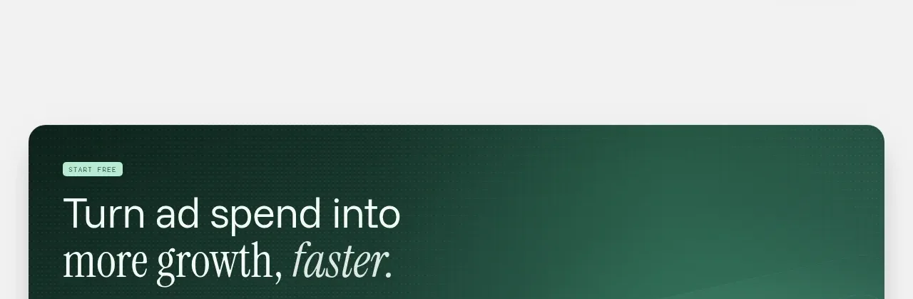 Dark closing conversion panel
Flyweel · Call to action
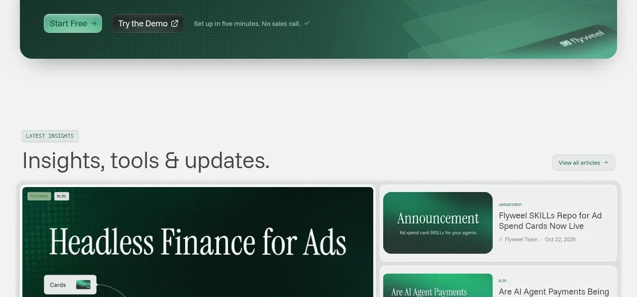 Insights and updates gallery
Flyweel · Gallery
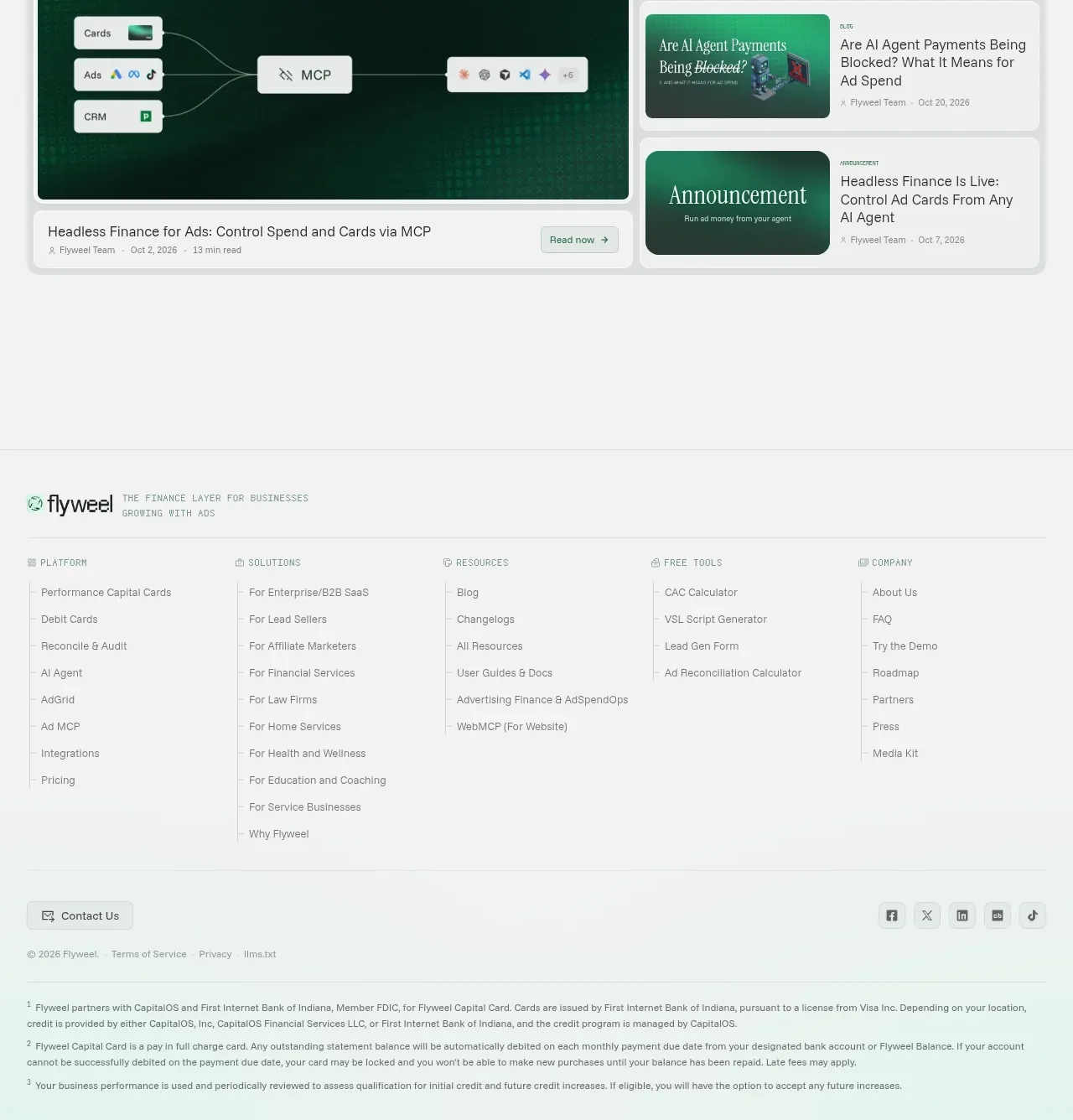 Multi-column site footer
Flyweel · Footer