kage
flyweel.co

Design analysis
A quiet editorial section explains the economic gap the product closes, using a small label, oversized two-line statement, and highlighted terms.
Prompt preview
## Reference images

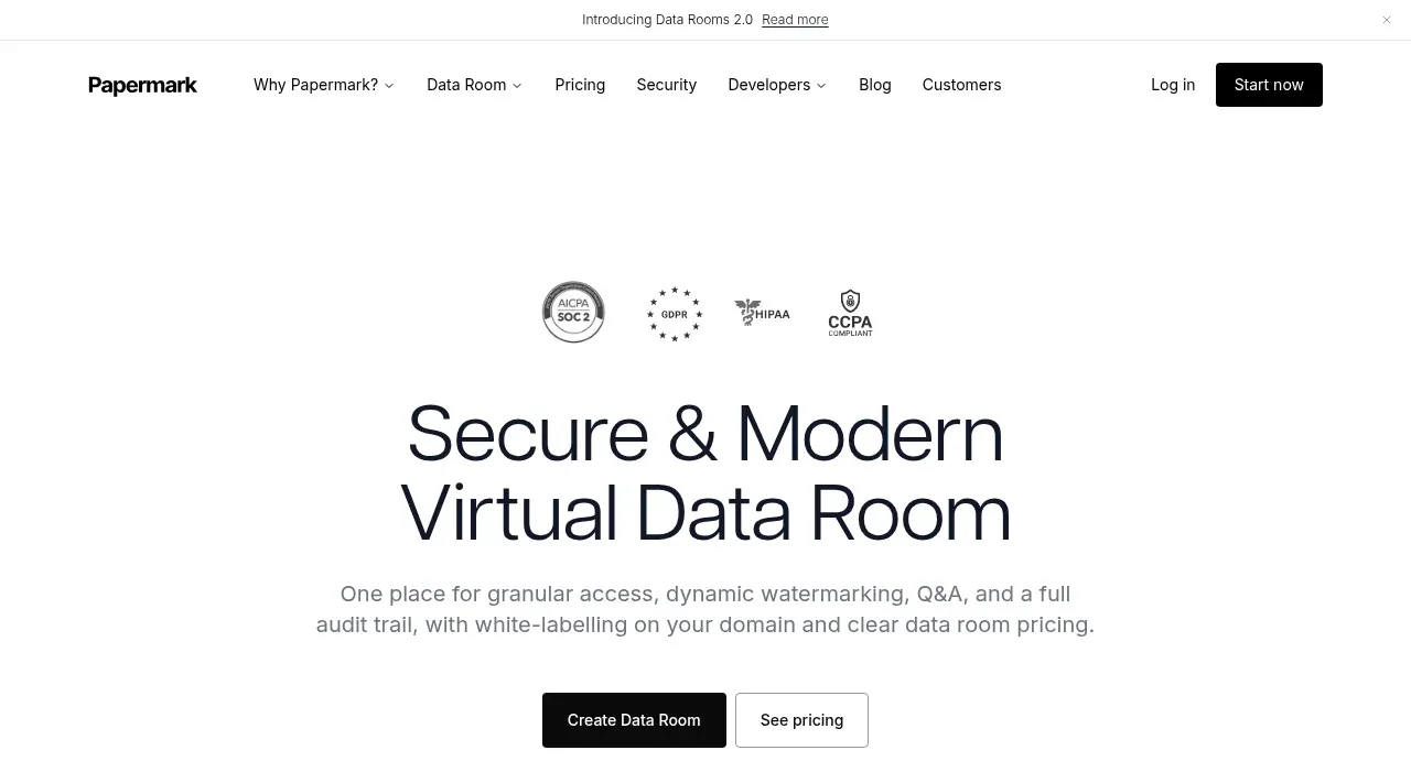
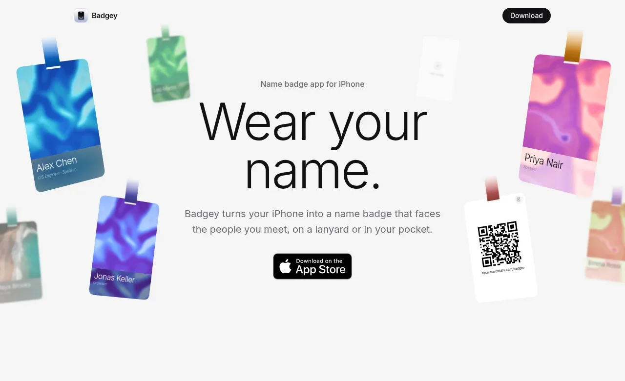
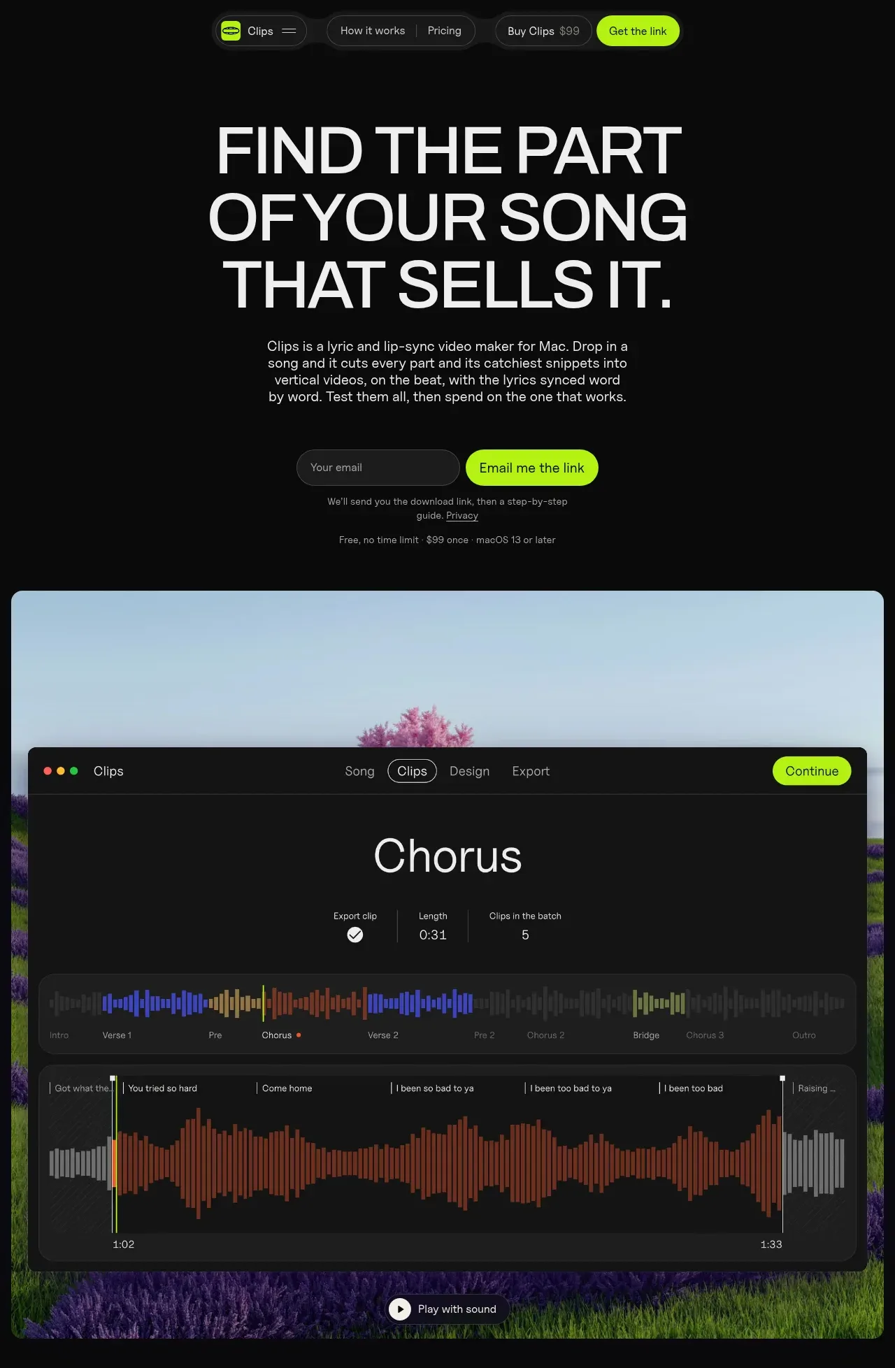
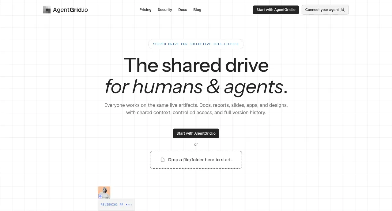
Study these alongside the description below: hierarchy, rhythm, spacing, colour. Build for the product you are asked about, using this design language.

- Component: https://kage-design-assets.t3.tigrisfiles.io/components/flyweel/865e3c33-9e14-4c9c-942f-392b2bfd1af5-1792649013-3.webp
- Full page it was cut from: https://kage-design-assets.t3.tigrisfiles.io/screenshots/flyweel/865e3c33-9e14-4c9c-942f-392b2bfd1af5-1792648958364-full.webp
- Component on Kage: https://kage.design/component/flyweel-hero-2

## Before you start
Ask what the user's product and brand are, then apply the principles below to that context rather than reproducing this reference.

Create a spacious positioning statement section with a constrained text column offset from the left edge. Start with a tiny uppercase eyebrow in a monospaced or tracked font, followed by a two-line 28–34px sans-serif statement. Add a second supporting line with a small brand-neutral icon and selectively underline or color important concepts in muted green (#317f69). Use a very light gray background (#f4f5f3), no card container, and large vertical whitespace. Keep the reading width around 620px and use responsive left alignment rather than centering.

Never: use logos, product names, copy, illustrations, or imagery from the reference.