kage
kage
frctl.art
Design analysis
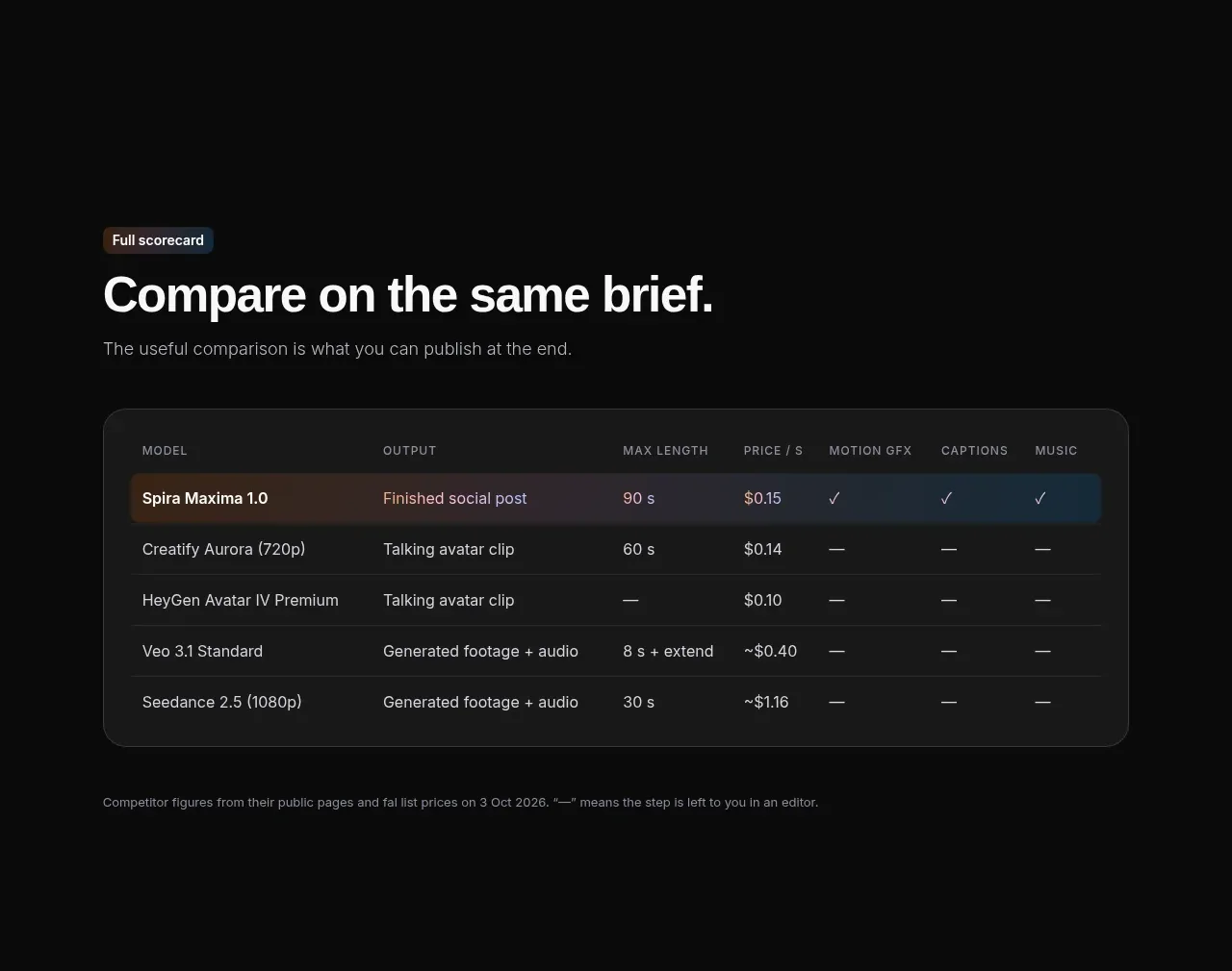
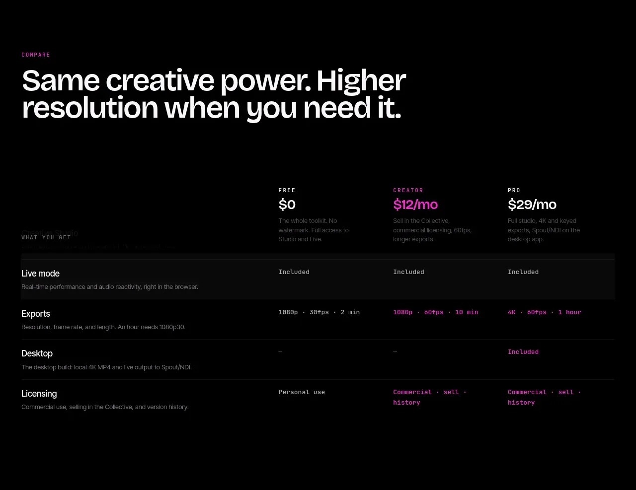
A strong comparison heading precedes a dense but readable feature matrix, with plan headings across the top and alternating row treatments that preserve scanability on a black canvas.
Prompt preview
## Reference images

Study these alongside the description below: hierarchy, rhythm, spacing, colour. Build for the product you are asked about, using this design language.

- Component: https://kage-design-assets.t3.tigrisfiles.io/components/frctl/44ee5e18-5619-4ecf-b1a3-c989d58893aa-1790488994-3.webp
- Full page it was cut from: https://kage-design-assets.t3.tigrisfiles.io/screenshots/frctl/44ee5e18-5619-4ecf-b1a3-c989d58893aa-1790488956222-full.webp
- Component on Kage: https://kage.design/component/frctl-table

## Before you start
Ask what the user's product capabilities are, which plans should be compared, and what the most important upgrade differences are. Then turn those answers into a useful original comparison table.

Build a dark comparison section with a small uppercase eyebrow and a large two-line heading explaining the value of upgrading. Place a responsive feature matrix below: a left feature-name column and three or four plan columns. Use a subtle charcoal header row (#0a0a0b), thin horizontal separators (#171517), and generous 18–24px row padding. Give plan names and prices a clear typographic hierarchy, with the highlighted plan in magenta (#c32679). Use concise feature descriptions in muted gray, and show inclusion, limits, or values in brighter text. On mobile, convert the matrix into stacked feature cards or allow intentional horizontal scrolling; never let labels become unreadable. Maintain 30–32px outer gutters and align every column precisely.

Never: use logos, product names, copy, illustrations, or imagery from the reference.