kage
kage
harmony.io
Design analysis
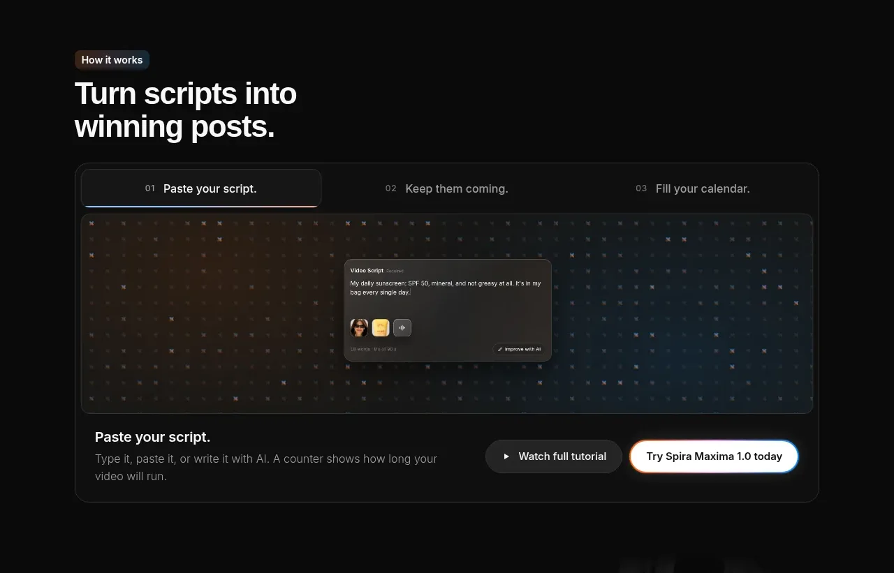
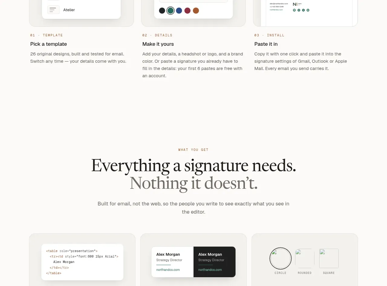
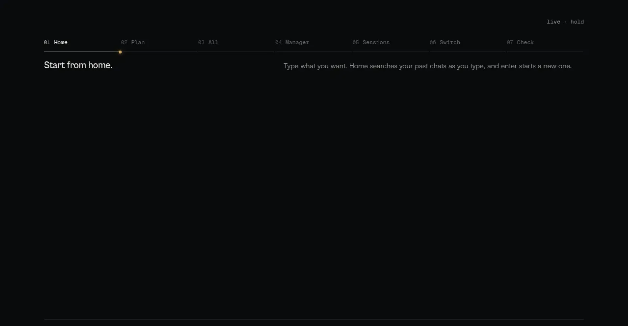
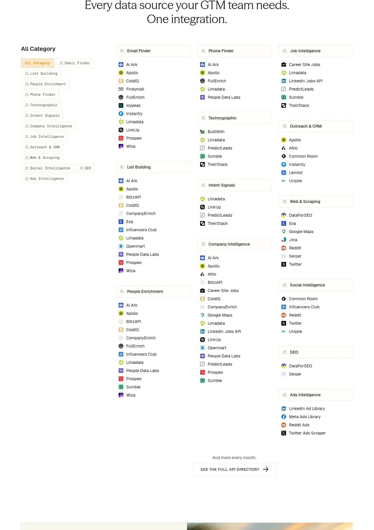
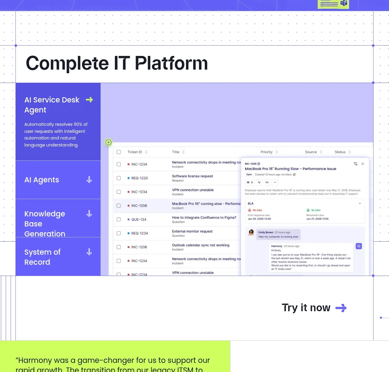
A platform overview uses a large heading, a vertical category rail, and a detailed dashboard preview to make several capabilities scannable.
Prompt preview
## Reference images

Study these alongside the description below: hierarchy, rhythm, spacing, colour. Build for the product you are asked about, using this design language.

- Component: https://kage-design-assets.t3.tigrisfiles.io/components/harmony/a96ec10f-a650-47bb-acaa-8bed3696d9f4-1790575329-3.webp
- Full page it was cut from: https://kage-design-assets.t3.tigrisfiles.io/screenshots/harmony/a96ec10f-a650-47bb-acaa-8bed3696d9f4-1790575269319-full.webp
- Component on Kage: https://kage.design/component/harmony-tabs

## Before you start
Ask which product modules the user's customers need to compare and what interface evidence best proves each one. Build the component around those answers.

Create a product-tour section on a lightly dotted white canvas. Use a large dark heading at the top, then a two-column showcase: a narrow vertical tab rail on the left and a wide dashboard preview on the right. Tabs should have bold labels, short supporting descriptions for the active item, and a violet active background (#6257ef) with lime or white accents. The preview should look like a credible software table with rows, status dots, filters, and an open detail drawer, but use invented data. Use #f7f7fb and #cfcfea for the panel surfaces, 1px borders, 0–12px radii, and 72–100px section spacing. Add keyboard-accessible tabs, clear active states, and a responsive mobile accordion or horizontal tab scroller.

Never: use logos, product names, copy, illustrations, or imagery from the reference.