kage
kage
holavoicemail.com
Design analysis
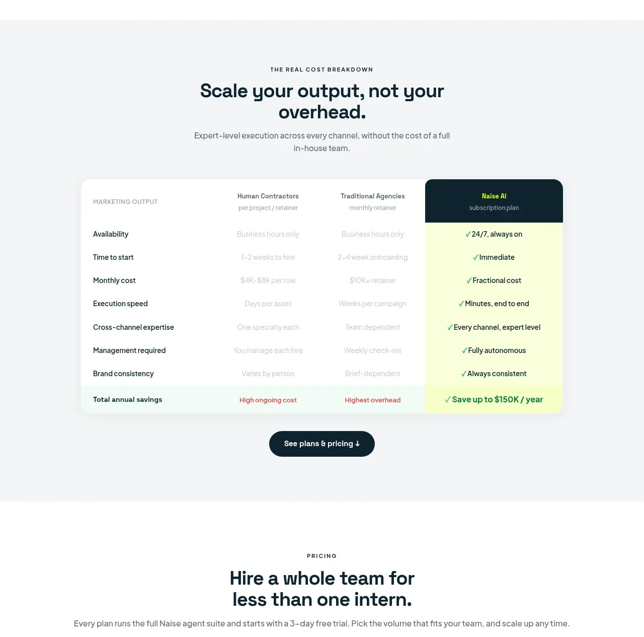
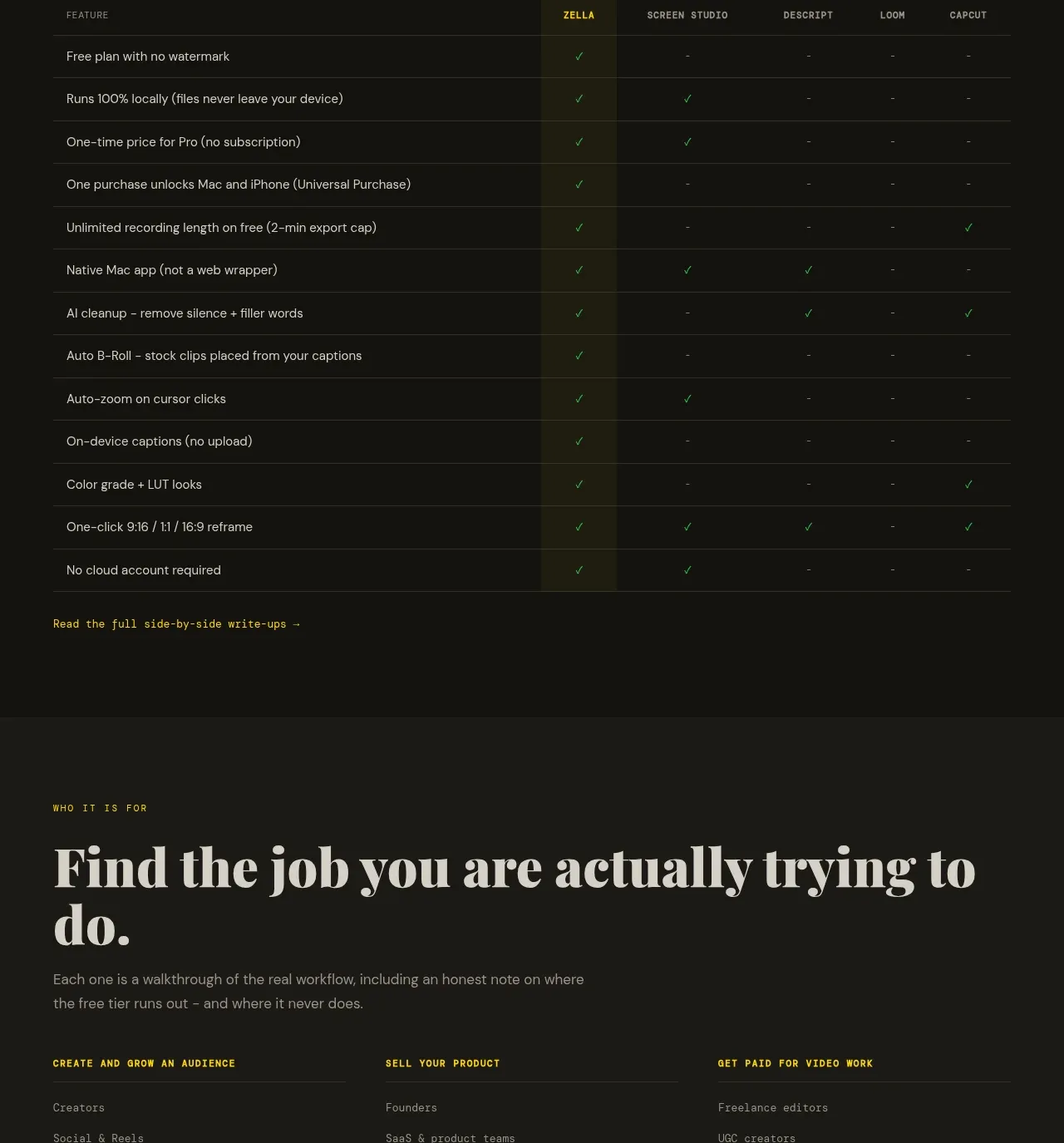
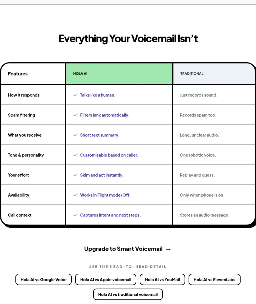
A centered head-to-head table makes product differentiation scannable through a highlighted middle column, strong grid rules, and concise row-level contrasts.
Prompt preview
## Reference images

Study these alongside the description below: hierarchy, rhythm, spacing, colour. Build for the product you are asked about, using this design language.

- Component: https://kage-design-assets.t3.tigrisfiles.io/components/hola-ai/6afc16ea-d4a5-4b10-89cd-47c92dad80e5-1790143388-6.webp
- Full page it was cut from: https://kage-design-assets.t3.tigrisfiles.io/screenshots/hola-ai/6afc16ea-d4a5-4b10-89cd-47c92dad80e5-1790143310582-full.webp
- Component on Kage: https://kage.design/component/hola-table

## Before you start
Ask what alternatives customers compare against, what evaluation criteria matter, and which column should be emphasized for the user's product.

Build a centered comparison section on white with a compact centered heading. Use a responsive table with three columns: criteria, the user's product, and an alternative. Give the table a thick black outer border, 20–24px rounded corners, and a hard black bottom/right shadow. Use 1–2px black internal rules and generous 18–24px cell padding. Highlight the product column with a soft mint #A9E8B4 header/background treatment, while the alternative column uses a cool pale gray #E8EDF0. Keep row labels bold and body values short; use a restrained coloured checkmark or status indicator in the highlighted column. Under the table, include a centered text CTA and a row of pill-shaped comparison filters/tabs that wrap on mobile. On narrow screens, allow horizontal scrolling while preserving a readable minimum width.

Never: use logos, product names, copy, illustrations, or imagery from the reference.