 kage
kage
imagetoascii.art
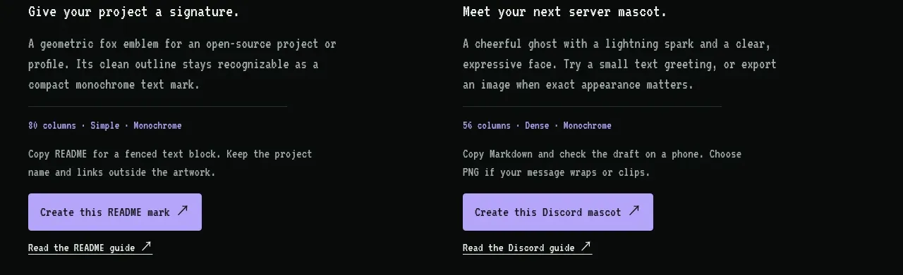
Design analysis
A concise instructional band explains the three-step workflow using numbered items aligned beside a short heading and description.
Prompt preview
## Reference images

Study these alongside the description below: hierarchy, rhythm, spacing, colour. Build for the product you are asked about, using this design language.

- Component: https://kage-design-assets.t3.tigrisfiles.io/components/image-to-ascii/536947f7-3504-43cd-9692-a327ad82583f-1789452199-5.webp
- Full page it was cut from: https://kage-design-assets.t3.tigrisfiles.io/screenshots/image-to-ascii/536947f7-3504-43cd-9692-a327ad82583f-1789452107158-full.webp
- Component on Kage: https://kage.design/component/image-to-ascii-tabs

## Before you start
Ask what the user's product workflow is and reduce it to the smallest useful sequence of steps. Then apply this structure to the user's brand.

Create a horizontal process section with a left column containing a two-line monospace heading and supporting copy, and a right column containing three numbered steps. Each step should have a small colored index, a short bold label, and one sentence of explanation. Use a 1px top border, #070a09 background, off-white text, and muted gray copy. Keep the layout airy with 40–56px column spacing, and stack the steps vertically on mobile. Add subtle hover or focus emphasis to each step if they are clickable, but do not overdecorate the instructional content.

Never: use logos, product names, copy, illustrations, or imagery from the reference.
More components
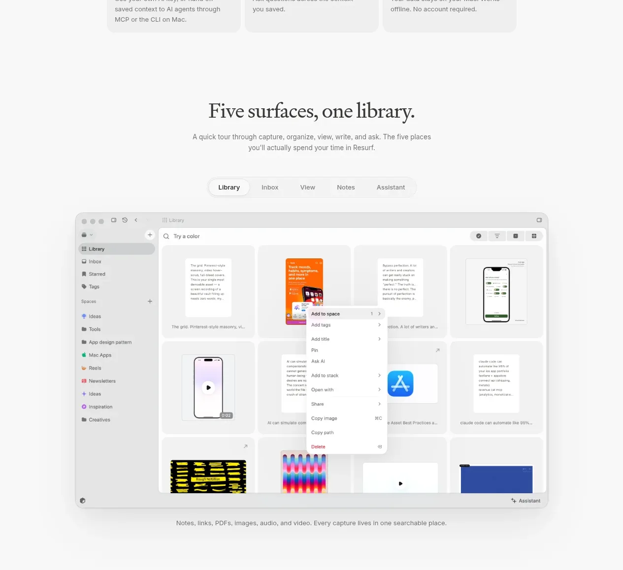
 Product surfaces walkthrough
Resurf · Tabs & steps
Product surfaces walkthrough
Resurf · Tabs & steps

 Multi-path workflow explorer
Jackalope · Tabs & steps
Multi-path workflow explorer
Jackalope · Tabs & steps

 Interactive capability explorer
Cadenya · Tabs & steps
Interactive capability explorer
Cadenya · Tabs & steps

 Use-case selector
descript.com · Tabs & steps
Use-case selector
descript.com · Tabs & steps

 Audience selector tabs
bunq.com · Tabs & steps
Audience selector tabs
bunq.com · Tabs & steps

 Discovery FAQ tabs and accordions
opentable.com · Tabs & steps
Discovery FAQ tabs and accordions
opentable.com · Tabs & steps