kage
kage
intercom.com
Design analysis
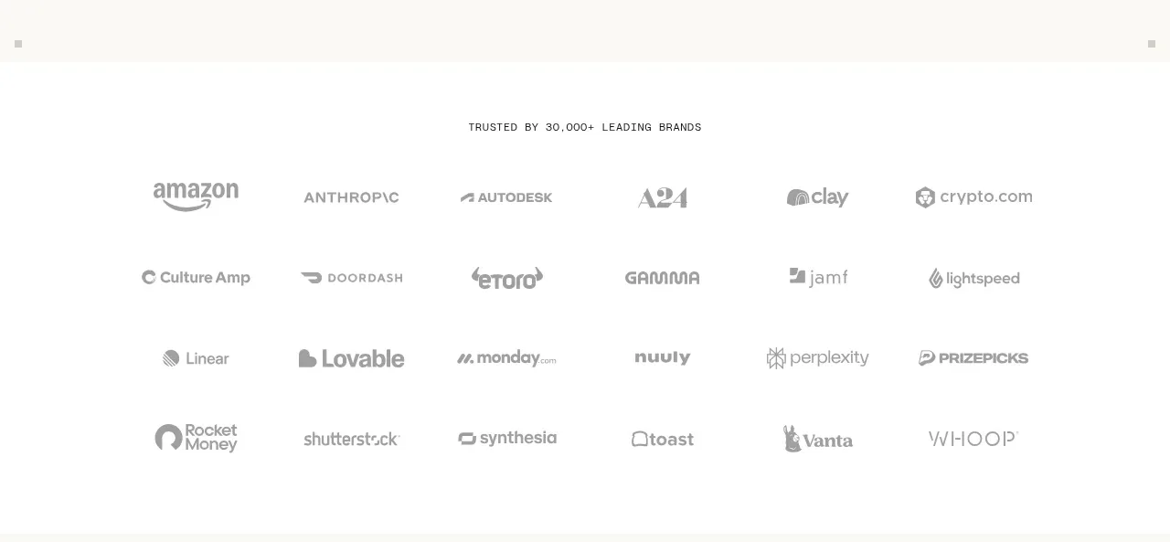
A centered all-caps trust statement is followed by several airy rows of monochrome customer marks. The low-contrast treatment supports credibility without becoming a promotional focal point.
Prompt preview
## Reference images

Study these alongside the description below: hierarchy, rhythm, spacing, colour. Build for the product you are asked about, using this design language.

- Component: https://kage-design-assets.t3.tigrisfiles.io/components/intercom-com/1643b347-46d4-4b8f-b100-4d586237bab2-1789906750-3.webp
- Full page it was cut from: https://kage-design-assets.t3.tigrisfiles.io/screenshots/intercom-com/1643b347-46d4-4b8f-b100-4d586237bab2-1789906717325-full.webp
- Component on Kage: https://kage.design/component/intercom-logo-cloud

## Before you start
Ask what the user's product, brand, and credible customer proof are, then apply these principles without copying the reference.

Build a trust logo cloud with a centered eyebrow statement above a responsive grid of customer or partner marks. Use 5–6 columns on desktop and 2–3 on mobile, with generous row spacing and consistent logo bounding boxes. Normalize each mark visually so differently shaped logos have similar perceived weight. Keep the entire module quiet and monochrome.

Use #ffffff or #fbfbf8 as the background, #999b98 for marks, and #555753 for the eyebrow. The eyebrow is 10–11px uppercase with 0.14em letter spacing. Give the cloud 56–72px top and bottom padding, 28–40px column gaps, and 28–36px row gaps. Logos should be rendered as accessible images or text alternatives and shift to a slightly darker #666666 on hover only if interactive.

Never: use logos, product names, copy, illustrations, or imagery from the reference.