kage
kage
intercom.com
Design analysis
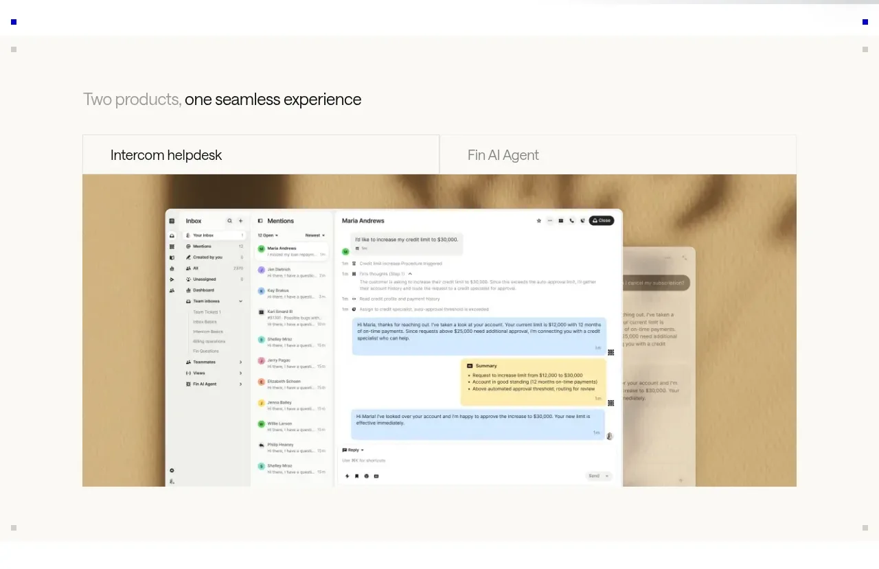
A short section heading introduces a two-tab product switcher, followed by a large framed product visual. The tab treatment is quiet and lets the visual carry the section.
Prompt preview
## Reference images

Study these alongside the description below: hierarchy, rhythm, spacing, colour. Build for the product you are asked about, using this design language.

- Component: https://kage-design-assets.t3.tigrisfiles.io/components/intercom-com/1643b347-46d4-4b8f-b100-4d586237bab2-1789906750-2.webp
- Full page it was cut from: https://kage-design-assets.t3.tigrisfiles.io/screenshots/intercom-com/1643b347-46d4-4b8f-b100-4d586237bab2-1789906717325-full.webp
- Component on Kage: https://kage.design/component/intercom-tabs

## Before you start
Ask what the user's product and brand are, then apply these principles to that product.

Create a product showcase section with a small left-aligned heading and a two-option tab control above a large media frame. Use tabs as simple labels separated by a fine border rather than loud pills. The active tab should be indicated by darker text and a subtle bottom or top rule. Below, show one large product screenshot or mock interface in a wide frame with an understated background image or color field behind it.

Use a warm off-white #fafaf7 section background, #111111 active text, and #8f8f8a inactive text. Set the section max-width to about 732px, use 16px horizontal padding on small screens, and allow the visual to reach the full container width. Heading is 16–18px; tab labels are 14px; the media frame has a 1px #deded8 border and 0–4px radius. Maintain 36–48px spacing from heading to tabs and 0px or 8px radius depending on the product aesthetic. Make tabs keyboard accessible and animate the media transition with a restrained fade.

Never: use logos, product names, copy, illustrations, or imagery from the reference.