kage
koiscribe.com
Design analysis
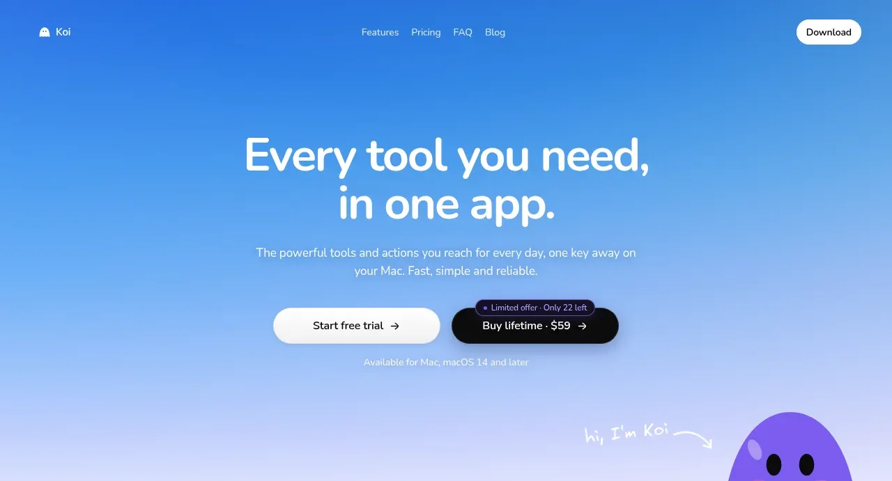
The hero uses a calm blue-to-lilac field, a short centered value proposition, dual purchase paths, and a small character detail near the lower edge to create immediate product recognition.
Prompt preview
## Reference images

Study these alongside the description below: hierarchy, rhythm, spacing, colour. Build for the product you are asked about, using this design language.

- Component: https://kage-design-assets.t3.tigrisfiles.io/components/koi/1f2fb87d-9243-4e92-a42a-66c20077da12-1792649017-1.webp
- Full page it was cut from: https://kage-design-assets.t3.tigrisfiles.io/screenshots/koi/1f2fb87d-9243-4e92-a42a-66c20077da12-1792648920300-full.webp
- Component on Kage: https://kage.design/component/koi-hero

## Before you start
Ask what the user's product is, what outcome it promises, and what brand colours and voice it should use. Then create an original hero based on these principles.

Build a full-width hero directly below the navigation. Use a soft luminous gradient from saturated blue at the top toward pale lavender at the bottom, with generous vertical breathing room. Center a two-line headline with a strong 34–46px desktop scale, tight line-height, and high contrast. Follow it with one or two short lines of supporting copy in a smaller muted colour. Place two adjacent CTAs beneath: a light filled primary action and a dark translucent or dark filled secondary action, both with rounded pill geometry and clear price/trial hierarchy. Add a small supporting availability note below. If a decorative mascot or product visual is useful, let it peek from the lower-right edge without obscuring the CTA; use an original visual. On mobile, stack CTAs and reduce headline size while retaining the gradient.

Never: copy logos, product names, copy, illustrations, or imagery from the reference.