kage
kage
uselateron.com
Design analysis
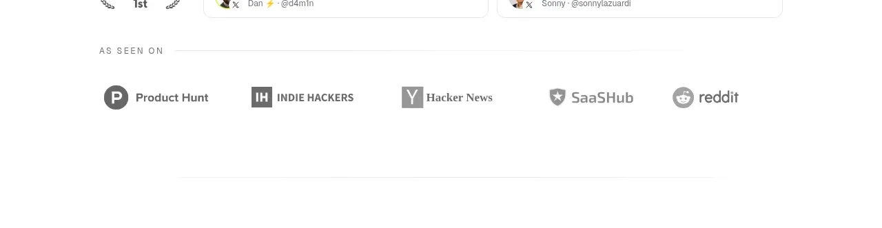
A quiet “as seen on” strip adds credibility without competing with the product narrative, using monochrome marks and ample whitespace.
Prompt preview
## Reference images

Study these alongside the description below: hierarchy, rhythm, spacing, colour. Build for the product you are asked about, using this design language.

- Component: https://kage-design-assets.t3.tigrisfiles.io/components/lateron-v2-the-agentic-email-plaftform/0ff3184e-0d5c-46ea-8012-61473093bd6c-1790402771-2.webp
- Full page it was cut from: https://kage-design-assets.t3.tigrisfiles.io/screenshots/lateron-v2-the-agentic-email-plaftform/0ff3184e-0d5c-46ea-8012-61473093bd6c-1790402643023-full.webp
- Component on Kage: https://kage.design/component/lateron-v2-the-agentic-email-plaftform-logo-cloud

## Before you start
Ask what credibility signals matter for the user's product and which publications or communities are legitimate for it. Apply this treatment with original content.

Create a short full-width trust strip with a small uppercase eyebrow, a thin divider, and a single horizontal row of five monochrome publication/community labels. Use muted gray #737373, simple icon placeholders or text-based marks, even spacing, and lots of white space. Keep the strip visually secondary, with no loud colors or oversized logos; make it wrap gracefully on mobile.

Never: use logos, product names, copy, illustrations, or imagery from the reference.