kage
kage
layernote.io
Design analysis
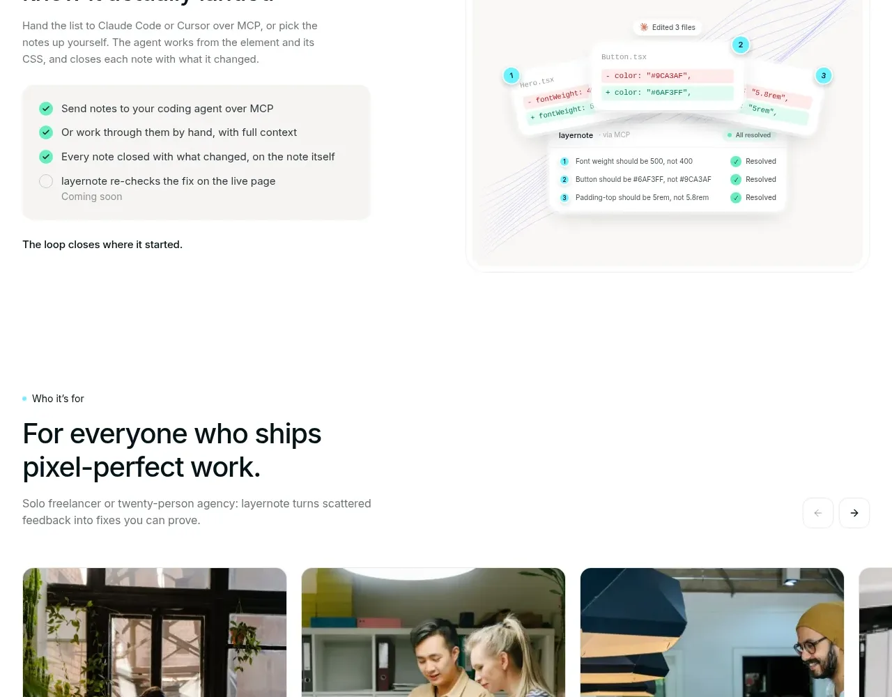
A bright cyan rounded panel explains that the product fits an existing toolchain, then presents integrations as compact white chips. The panel turns compatibility into a visual reassurance rather than a dry list.
Prompt preview
## Reference images

Study these alongside the description below: hierarchy, rhythm, spacing, colour. Build for the product you are asked about, using this design language.

- Component: https://kage-design-assets.t3.tigrisfiles.io/components/layernote/c87f4990-99cd-473d-ba2e-c718b2a2f8cb-1790402579-6.webp
- Full page it was cut from: https://kage-design-assets.t3.tigrisfiles.io/screenshots/layernote/c87f4990-99cd-473d-ba2e-c718b2a2f8cb-1790402512875-full.webp
- Component on Kage: https://kage.design/component/layernote-logo-cloud

## Before you start
Ask which tools the user's customers already rely on and which integrations are strategically important. Build a branded ecosystem panel around those answers.

Use a large rounded rectangle with a vivid cyan #5ae4ed background, very subtle decorative linework, and centered heading/copy. Add a small “coming soon” or availability badge only if relevant. Below the message, arrange integration items as white rounded chips in two responsive rows; each chip should have an icon, readable tool name, and enough contrast. Use 12px chip radii, 1px translucent cyan-gray borders, dark #0b1719 text, and generous 24–40px panel padding. Make the list wrap on desktop and become a horizontal scroll or two-column grid on mobile. Avoid implying an integration exists unless the product actually supports it.

Never use the reference's logo, product name, copy, illustrations, imagery, or exact visual assets.