kage
kage
mailyte.com
Design analysis
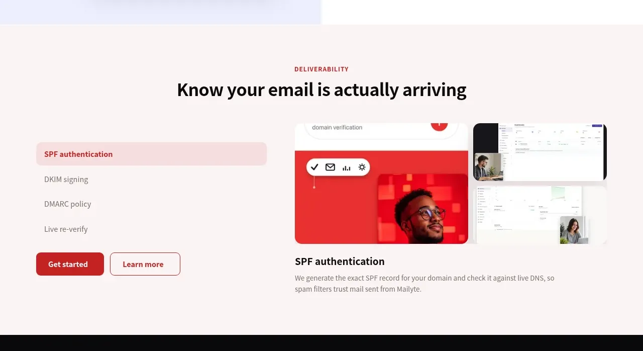
A warm tinted section uses a vertical feature selector beside a changing visual and explanatory detail, making a complex capability scannable.
Prompt preview
## Reference images

Study these alongside the description below: hierarchy, rhythm, spacing, colour. Build for the product you are asked about, using this design language.

- Component: https://kage-design-assets.t3.tigrisfiles.io/components/mailyte/142780af-add7-4be9-ae30-6edb3206e4e0-1789538514-5.webp
- Full page it was cut from: https://kage-design-assets.t3.tigrisfiles.io/screenshots/mailyte/142780af-add7-4be9-ae30-6edb3206e4e0-1789538442487-full.webp
- Component on Kage: https://kage.design/component/mailyte-tabs

## Before you start
Ask what the user's product, audience, and brand are, then apply the principles below to that product rather than reproducing the reference.

Design an interactive deliverability/security feature section. Use a warm off-white blush background (#fcf5f5), a centered eyebrow and heading, then a two-column layout: a vertical tab list on the left and a large visual/detail panel on the right. The active tab should have a tinted background or accent rule; inactive tabs remain quiet. The right side should show a dashboard or diagram placeholder, a feature title, a short explanation, and optional action. Use red/coral (#d9272e) for the active state, deep charcoal text, muted gray copy, 16–20px radii, and generous 72–96px padding. Implement accessible tabs with arrow-key navigation, aria-selected, and a fade/slide transition; collapse tabs into a horizontal scroll or accordion on mobile.

Never: use logos, product names, copy, illustrations, or imagery from the reference.