kage
kage
maybloc.com
Design analysis
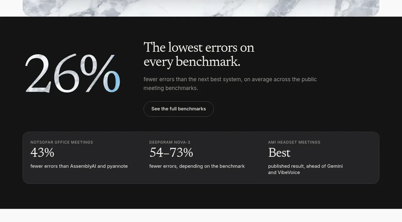
A dark full-width band leads with an oversized percentage, explanatory benchmark copy, and a compact three-column evidence card.
Prompt preview
## Reference images

Study these alongside the description below: hierarchy, rhythm, spacing, colour. Build for the product you are asked about, using this design language.

- Component: https://kage-design-assets.t3.tigrisfiles.io/components/maybloc/1877ee03-3cf3-49f7-b006-226ca2ea42de-1792217040-2.webp
- Full page it was cut from: https://kage-design-assets.t3.tigrisfiles.io/screenshots/maybloc/1877ee03-3cf3-49f7-b006-226ca2ea42de-1792216974687-full.webp
- Component on Kage: https://kage.design/component/maybloc-stats

## Before you start
Ask what the user's product is, who it serves, and what brand voice and visual identity it should use. Apply the principles below to that product rather than reproducing the reference.

Build a dark proof section that interrupts the light page with a near-black #151515 background and warm white #f3f3f0 type. Pair an oversized serif metric on the left with a concise serif claim, supporting sans-serif explanation, and a secondary outline button on the right. Below, include a rounded, slightly lighter charcoal #252525 evidence panel with three equal columns; each column should have a small uppercase label, a prominent metric, and one line of context. Use thin rgba(255,255,255,.12) separators, 16px radius, and generous padding. Make the metric responsive and ensure the contrast meets accessibility requirements.

Never: use the reference's logo, product name, copy, illustrations, imagery, or exact benchmark figures.