kage
kage
navige.ai
Design analysis
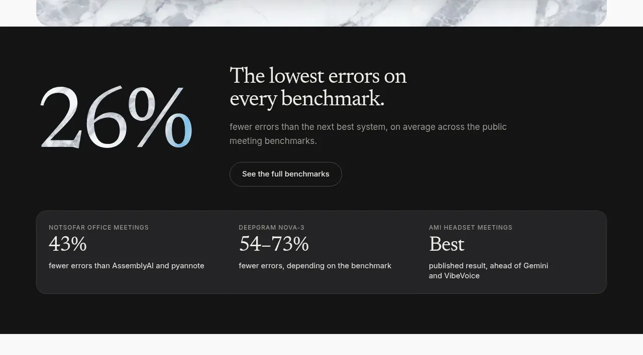
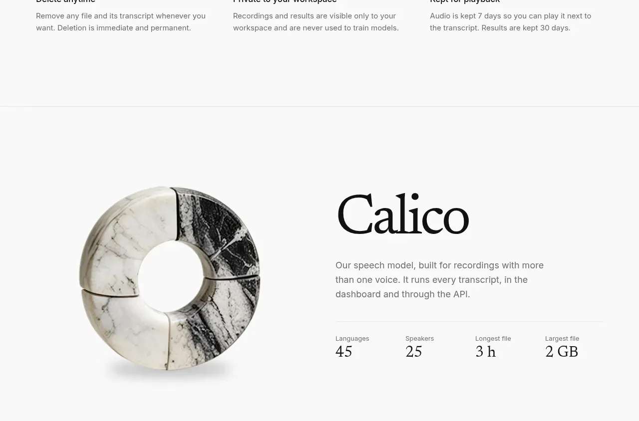
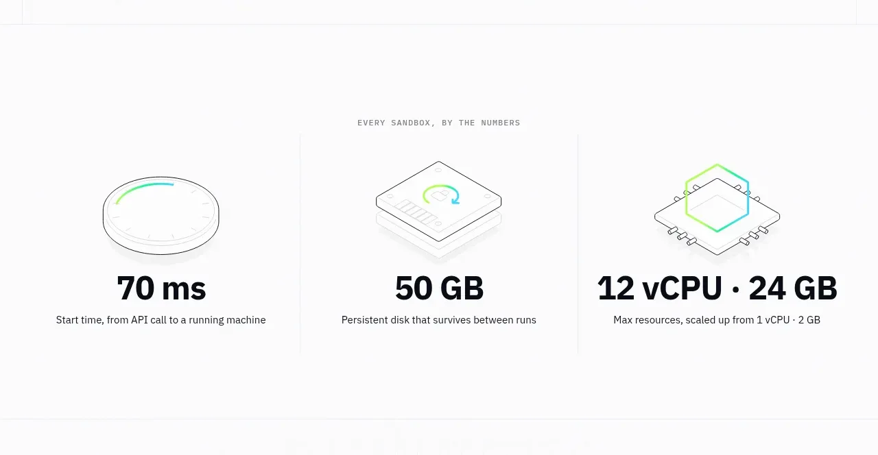
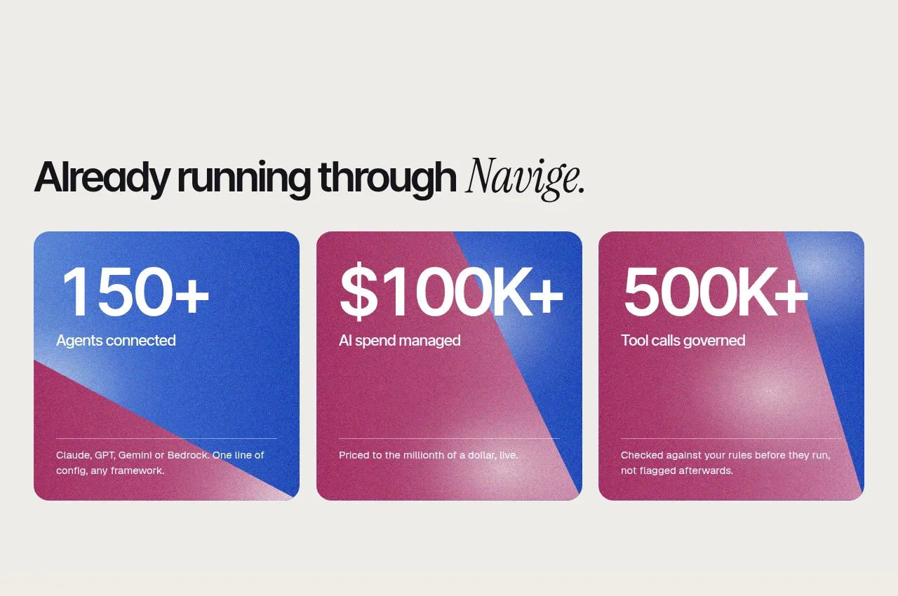
A short section heading leads into three large, colourful metric cards, each combining a prominent number, label, and explanatory qualification.
Prompt preview
## Reference images

Study these alongside the description below: hierarchy, rhythm, spacing, colour. Build for the product you are asked about, using this design language.

- Component: https://kage-design-assets.t3.tigrisfiles.io/components/navige/e3ee1ee4-7855-4062-a956-cf327122240e-1792130699-3.webp
- Full page it was cut from: https://kage-design-assets.t3.tigrisfiles.io/screenshots/navige/e3ee1ee4-7855-4062-a956-cf327122240e-1792130598253-full.webp
- Component on Kage: https://kage.design/component/navige-stats

## Before you start
Ask what measurable outcomes the user's product can credibly prove and what brand palette should express them. Apply the principles below to that product rather than reproducing this reference.

Create a proof section with a left-aligned or centered editorial heading followed by three equal-width statistic cards in a responsive row. Each card needs a very large metric, a concise label, and a small explanatory sentence anchored toward the bottom. Use vivid but controlled gradient surfaces mixing cobalt #2d5fd5, magenta #b73574, and soft lavender #aab9ed; use white text. Give cards 18–22px rounded corners, subtle grain only if generated accessibly, and consistent internal padding of 24–28px. Keep metric typography bold and compact, with labels clearly subordinate.

Cards should stack on small screens. Avoid implying fabricated results; support an optional source or disclosure affordance.

Never: use logos, product names, copy, illustrations, or imagery from the reference.