 kage
kage
squadroom.app
Design analysis
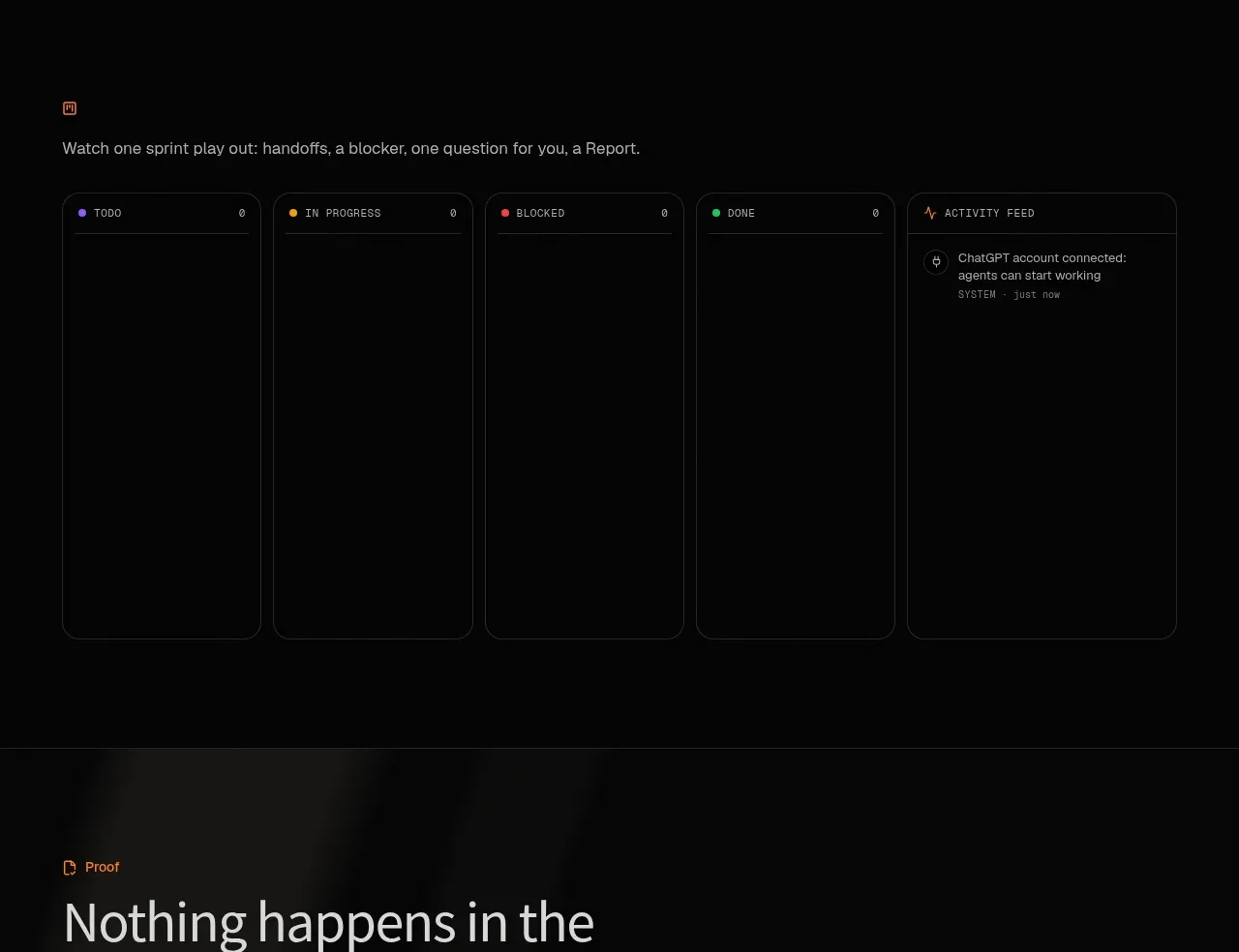
A broad product preview turns the abstract workflow into a tangible board with status columns and a live activity feed.
Prompt preview
## Reference images

Study these alongside the description below: hierarchy, rhythm, spacing, colour. Build for the product you are asked about, using this design language.

- Component: https://kage-design-assets.t3.tigrisfiles.io/components/squadroom/d449f1a3-a1d7-46c0-a9d5-0020447fa3ed-1791871292-4.webp
- Full page it was cut from: https://kage-design-assets.t3.tigrisfiles.io/screenshots/squadroom/d449f1a3-a1d7-46c0-a9d5-0020447fa3ed-1791871247696-full.webp
- Component on Kage: https://kage.design/component/squadroom-gallery

## Before you start
Ask what operational process the user's product visualizes and which states matter to customers. Build an original preview around that model.

Design a dark product-preview section with a short eyebrow and one sentence above a wide five-column board. Use a near-black canvas (#070707), panel backgrounds #0b0b0b, borders #252525, and 10–12px rounded corners. Each column gets a compact uppercase status label with a distinct dot color, a count, and a large open area for cards or activity. Include one narrower activity-feed column to suggest live updates. Keep most cells intentionally sparse so the board feels calm and premium rather than crowded.

Use small 11–13px UI type, monospace labels for statuses, off-white text, and low-contrast dividers. Add subtle hover elevation on columns and cards, and make the board horizontally scrollable on mobile. The preview should be built with HTML/CSS components and realistic placeholder records, not a screenshot.

Never: use logos, product names, copy, illustrations, or imagery from the reference.
More components
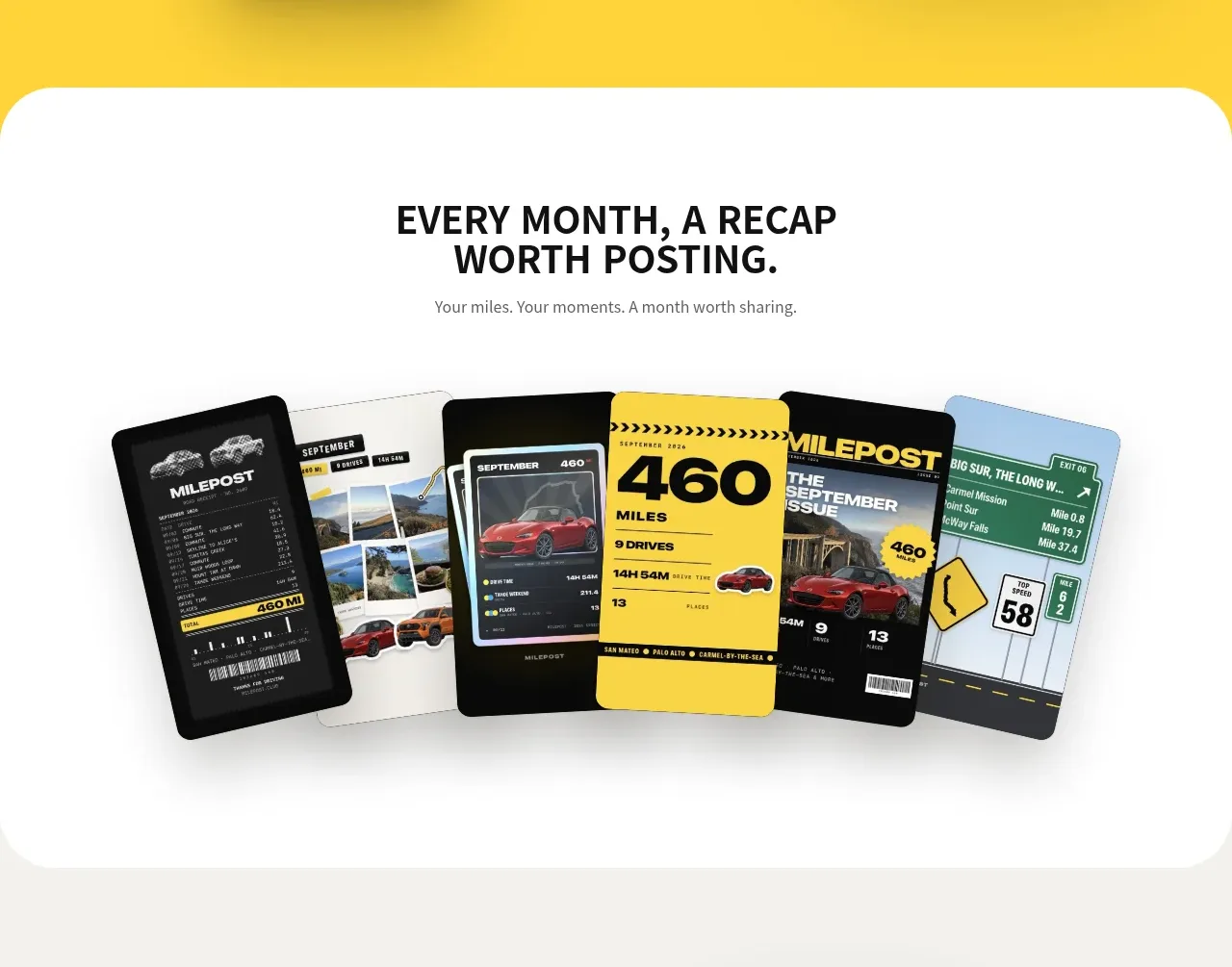
 Monthly recap gallery
Milepost · Gallery
Monthly recap gallery
Milepost · Gallery
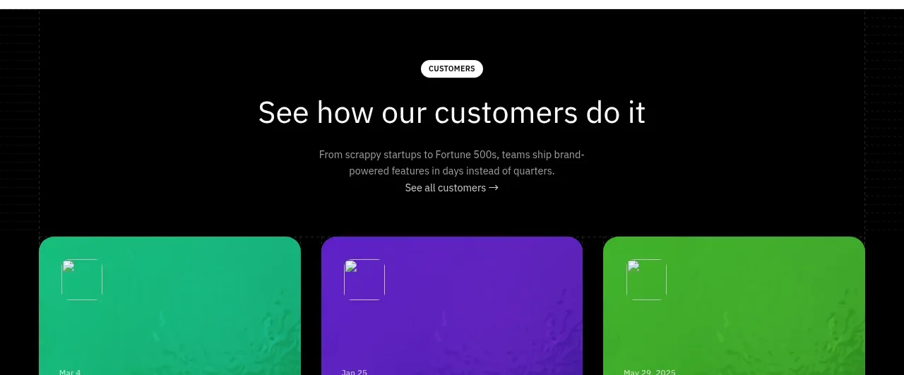
 Blog article cards
Scrape Anything by Context.dev · Gallery
Blog article cards
Scrape Anything by Context.dev · Gallery
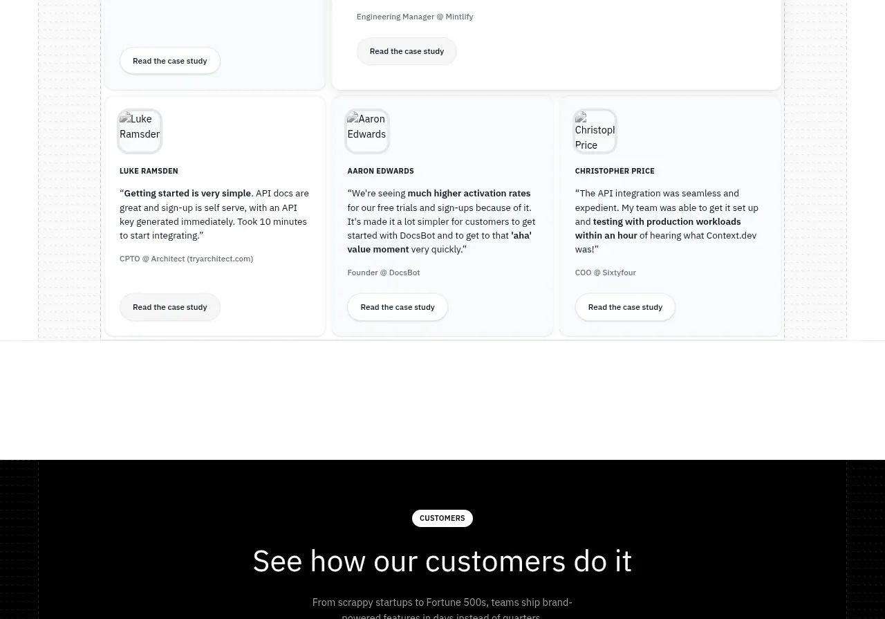 Customer stories carousel
Scrape Anything by Context.dev · Gallery
Customer stories carousel
Scrape Anything by Context.dev · Gallery
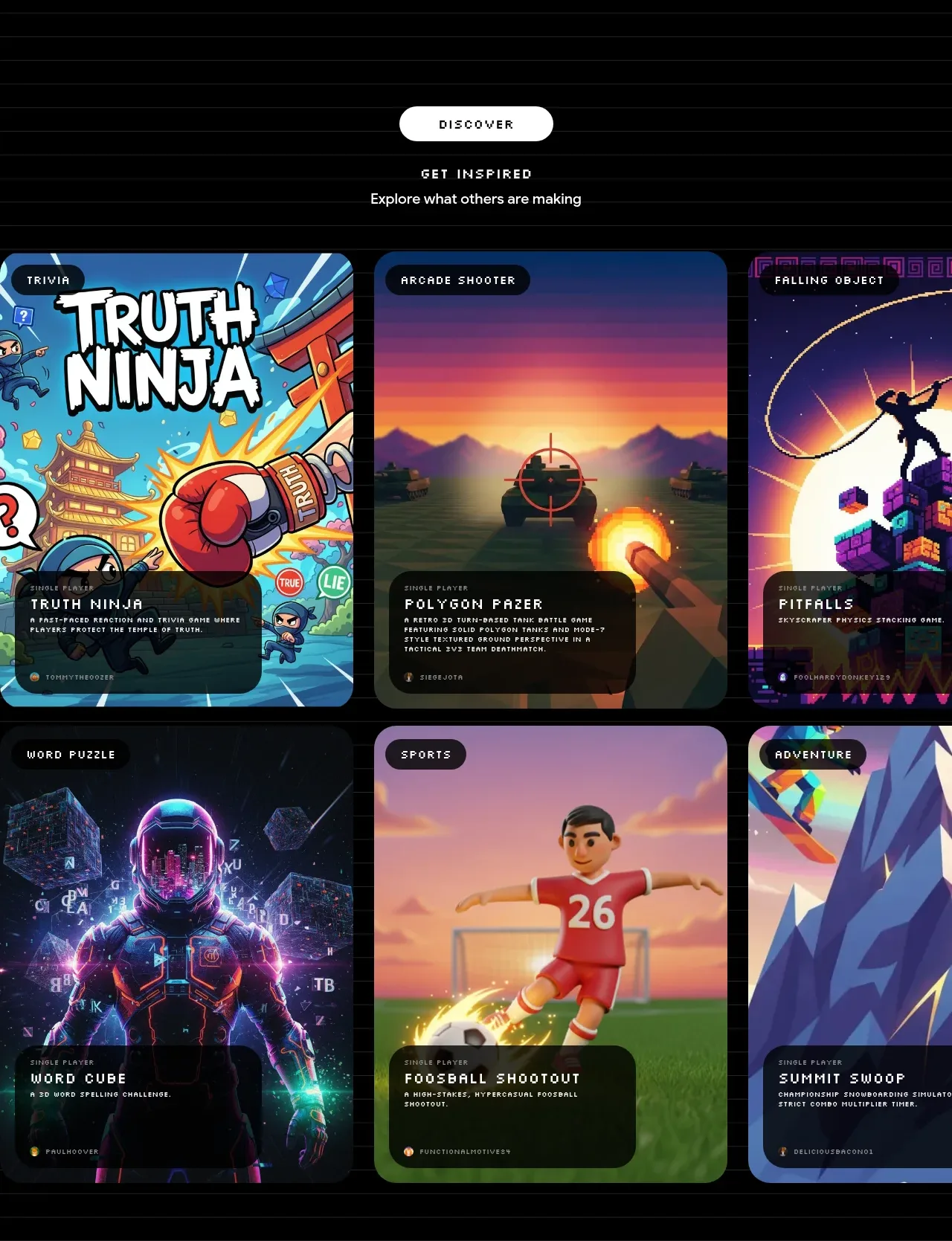
 Discover inspiration gallery
Playground by Google Labs · Gallery
Discover inspiration gallery
Playground by Google Labs · Gallery
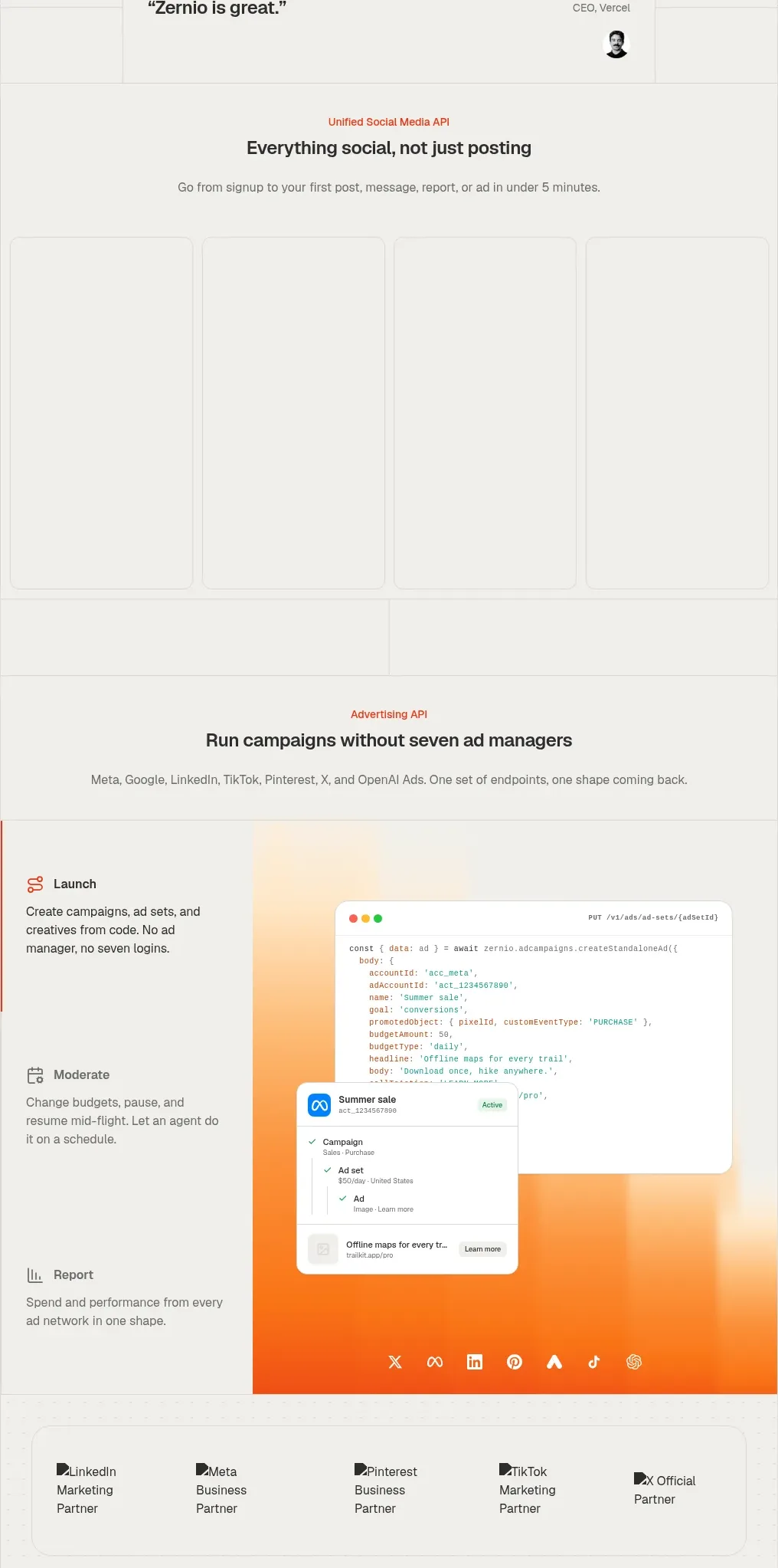
 Social media campaign API showcase
Zernio · Gallery
Social media campaign API showcase
Zernio · Gallery
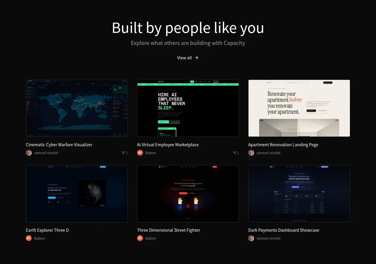
 Community project gallery
capacity.so · Gallery
Community project gallery
capacity.so · Gallery