 kage
kage
milliseconds.ai
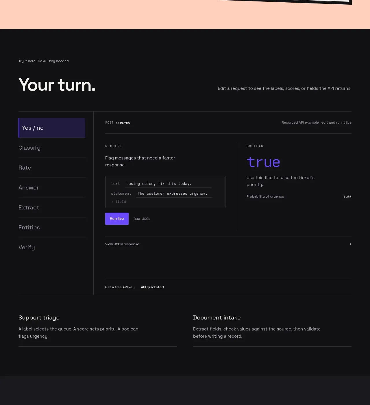
Design analysis
The dark playground turns the promise into something testable: a heading, a vertical mode selector, request/response panes, and supporting use-case links. Its strong borders and monospace labels make the interface feel like a real developer tool embedded in the marketing page.
Prompt preview
## Reference images

Study these alongside the description below: hierarchy, rhythm, spacing, colour. Build for the product you are asked about, using this design language.

- Component: https://kage-design-assets.t3.tigrisfiles.io/components/milliseconds-ai/6fac96f3-e489-4913-80bc-8c862b5f9e82-1790056992-3.webp
- Full page it was cut from: https://kage-design-assets.t3.tigrisfiles.io/screenshots/milliseconds-ai/6fac96f3-e489-4913-80bc-8c862b5f9e82-1790056904819-full.webp
- Component on Kage: https://kage.design/component/milliseconds-tabs

## Before you start
Ask what the user's API or technical product lets people test, which modes are meaningful, and what result users should see. Build the component around those answers.

Create a dark interactive playground section using `#101012` with 44px horizontal padding and 80–100px top/bottom spacing. Start with a small monospace hint, a large 40px heading, and a muted sentence aligned to the right on wide screens. Below, create a bordered application frame (`#29292d`) using a two-column layout: a 180px vertical tab rail on the left and a larger content area on the right. Tabs should have short labels, a selected state with a violet left rule and subtly lighter violet background (`#241b4d`), and hover/focus states. In the content pane, show a thin endpoint bar, a request panel, a response panel with one very large accent-colored result, and compact action buttons. Use 10–11px uppercase monospace metadata, 13–15px body text, and 20–28px result typography. Finish with a slim row of secondary links and two concise explanatory columns beneath the playground.

Use CSS grid, realistic but placeholder data, semantic tabs with keyboard navigation, and a responsive mobile layout where the tab rail becomes horizontal. Keep dividers thin, corners almost square, and contrast high.

Never: copy the reference labels, endpoint, request text, product name, logo, exact UI data, illustrations, or imagery.
More components
 Language selection cloud
Speechka · Tabs & steps
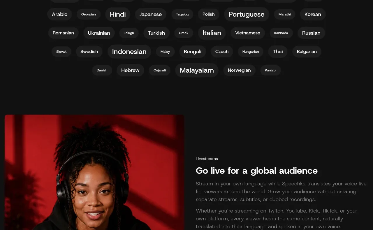
Language selection cloud
Speechka · Tabs & steps
 Five-dimension score breakdown
AgentScore · Tabs & steps
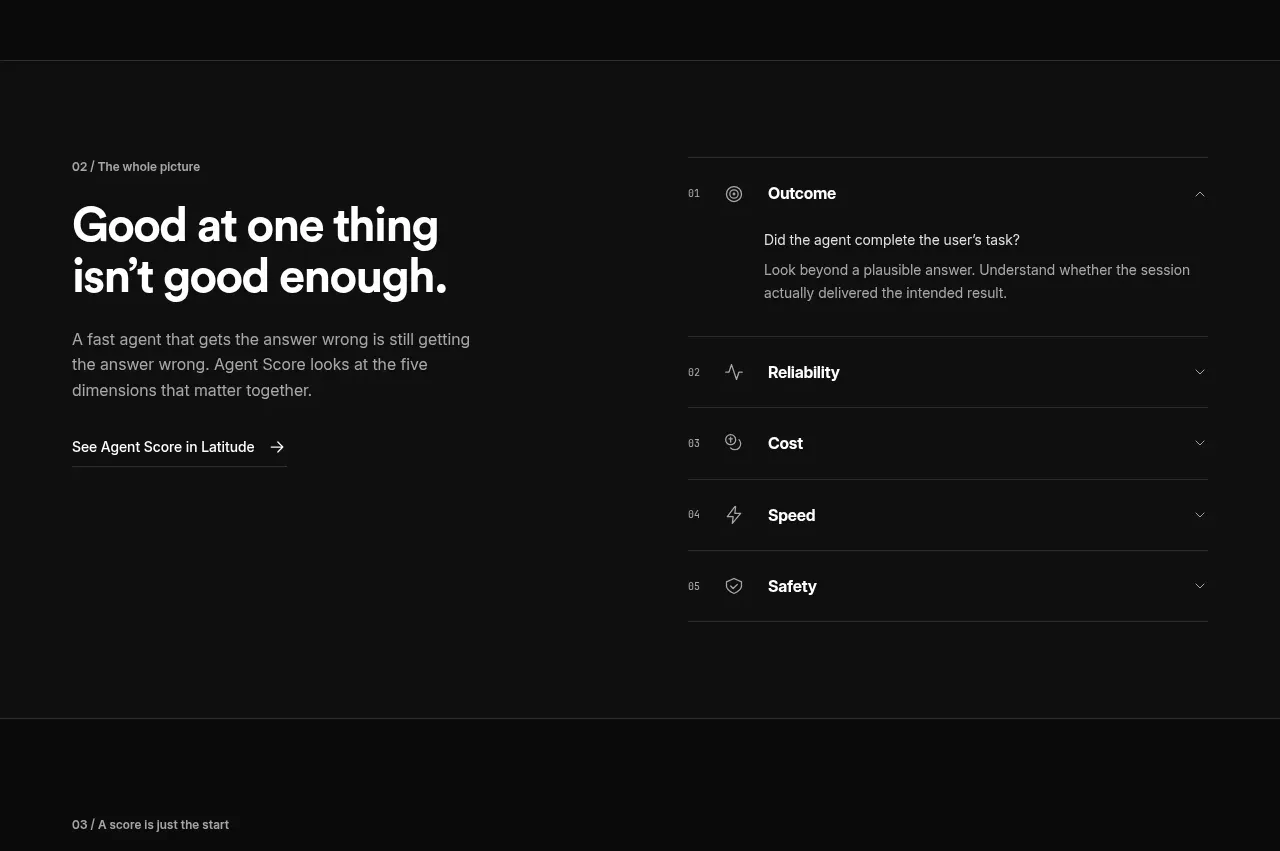
Five-dimension score breakdown
AgentScore · Tabs & steps
 Build and integration options
Alexandria by Firecrawl · Tabs & steps
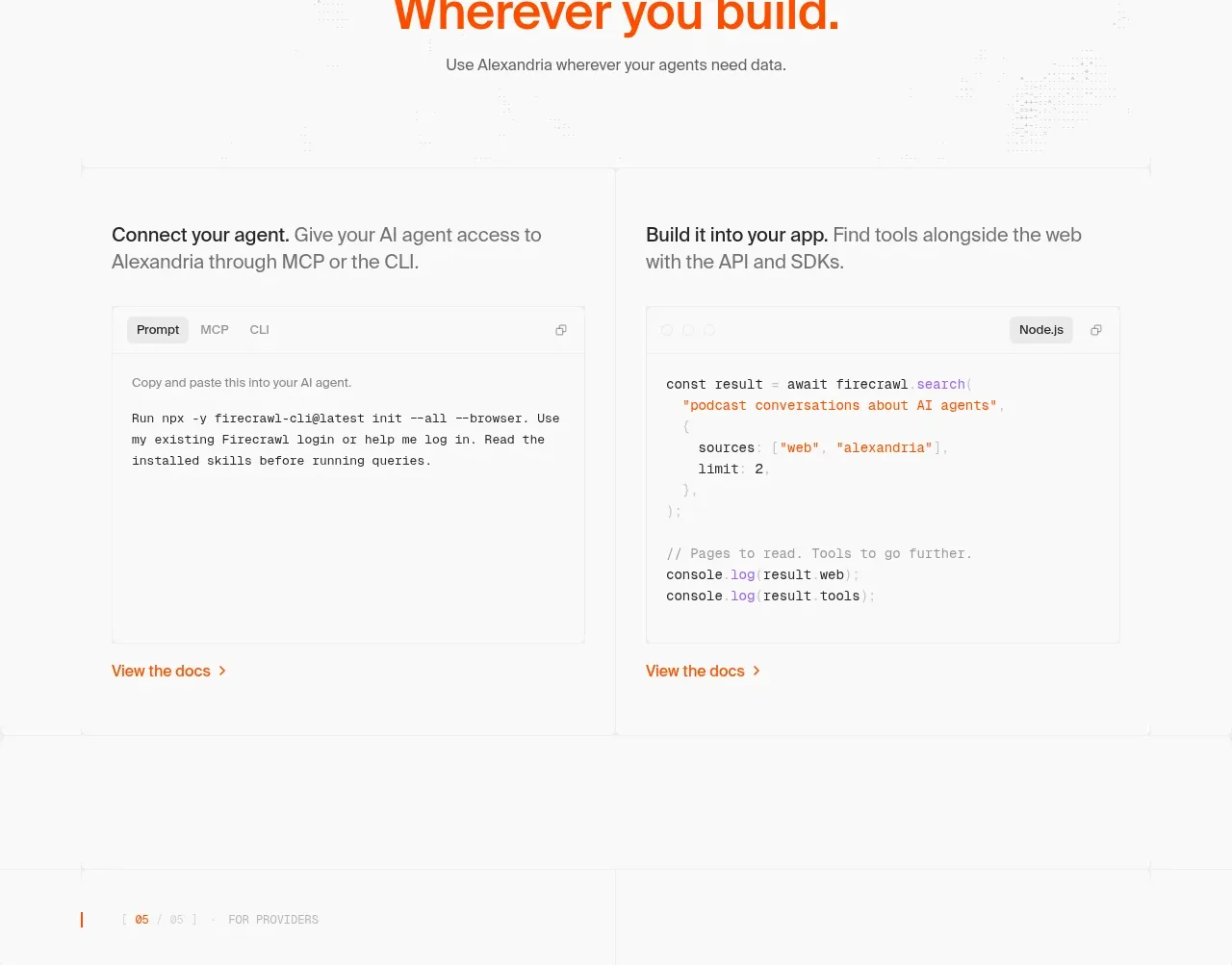
Build and integration options
Alexandria by Firecrawl · Tabs & steps
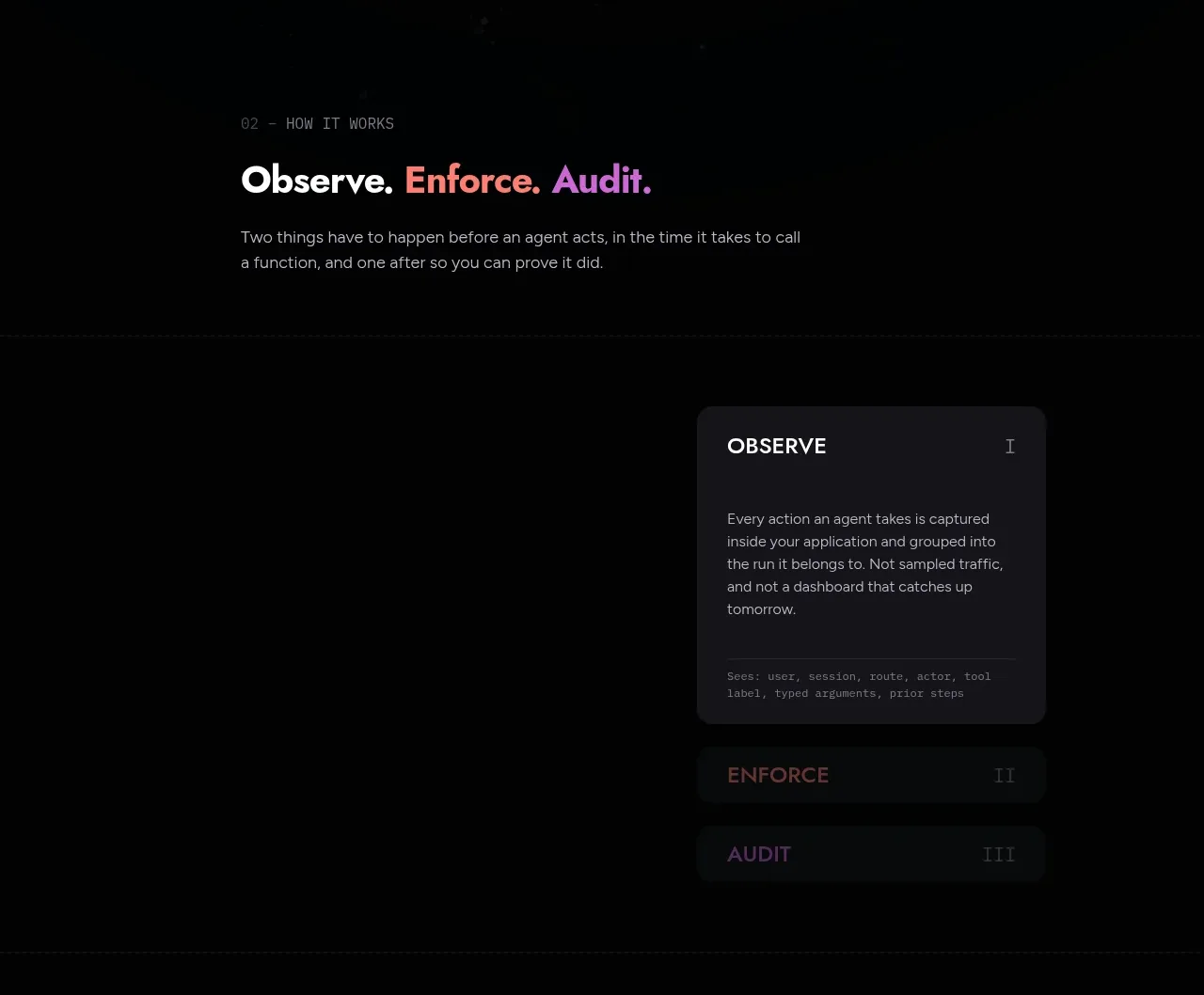
 Observe, enforce, audit workflow
Arcjet · Tabs & steps
Observe, enforce, audit workflow
Arcjet · Tabs & steps
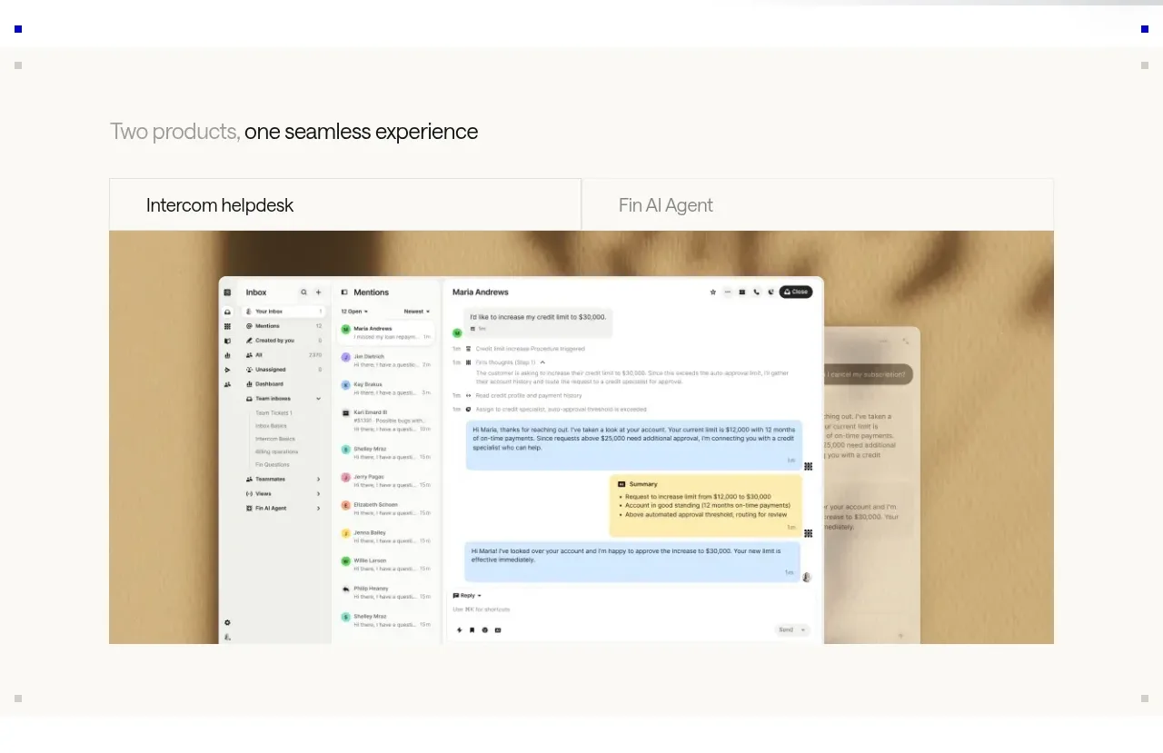
 Product overview showcase
intercom.com · Tabs & steps
Product overview showcase
intercom.com · Tabs & steps
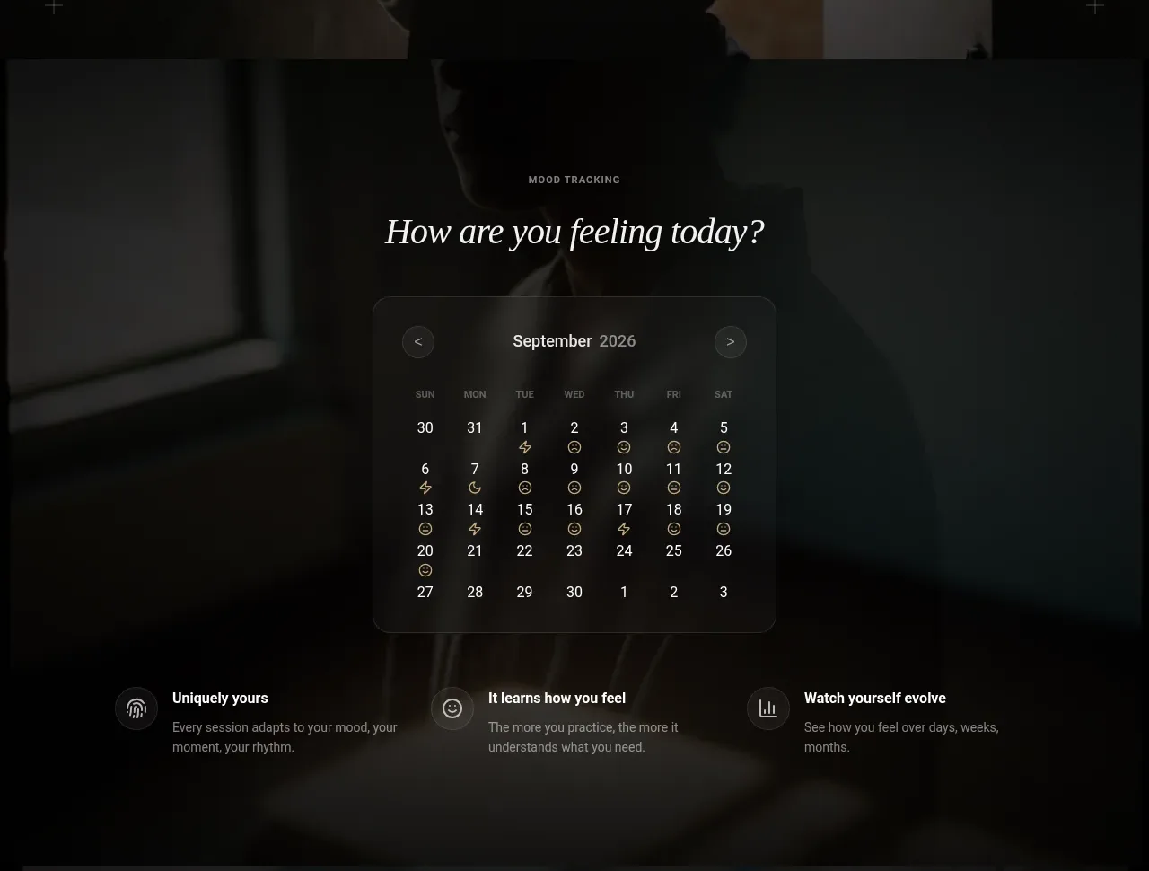
 Mood tracking calendar
Lull · Tabs & steps
Mood tracking calendar
Lull · Tabs & steps