kage
monish.cc
Design analysis
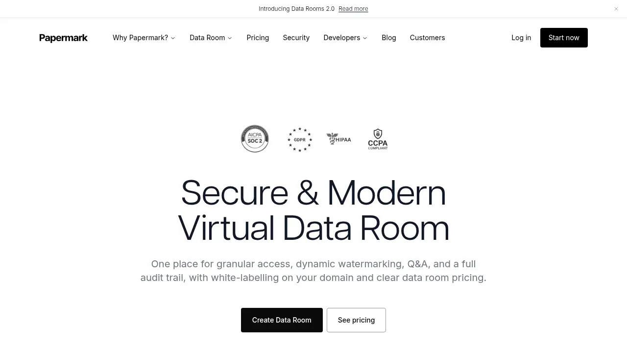
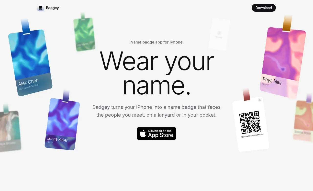
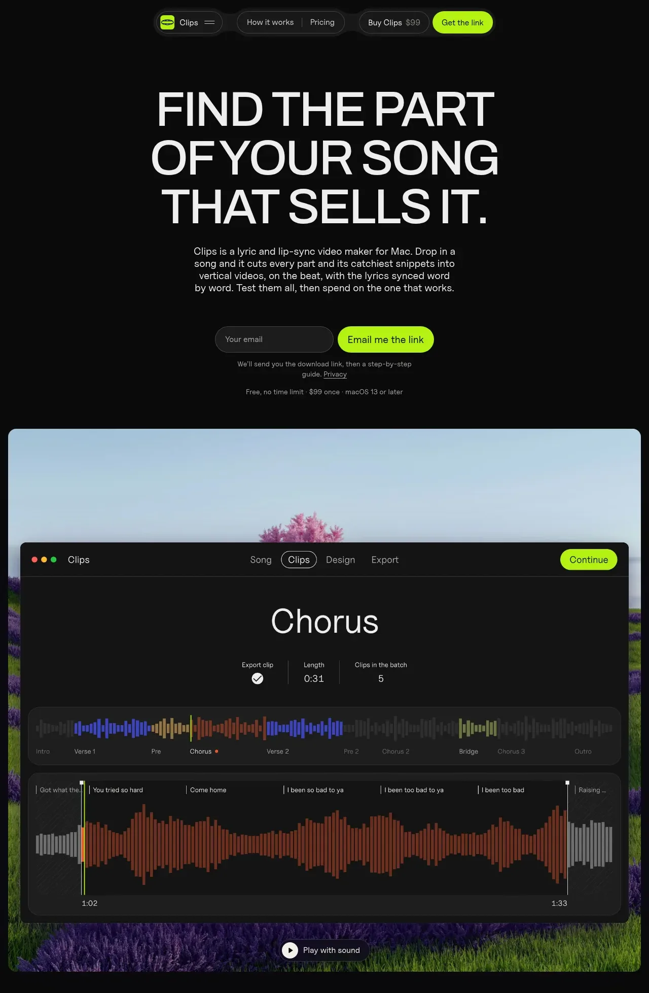
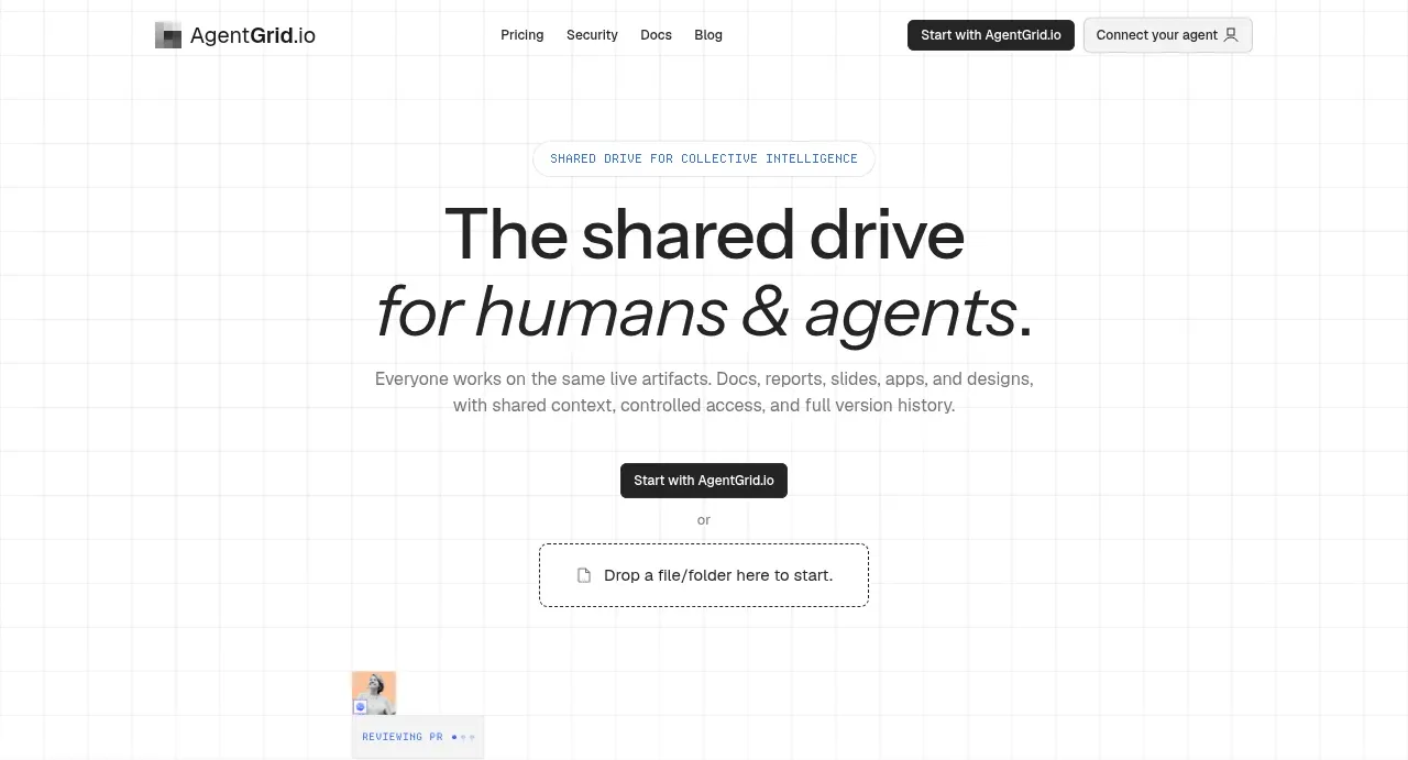
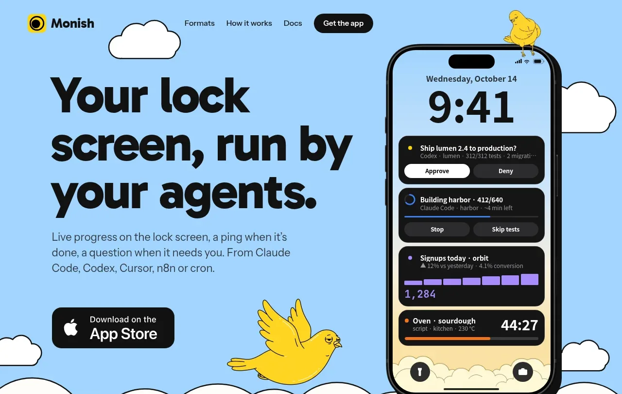
The hero combines an oversized black statement, supporting explanation, App Store CTA, and a large phone/product visual against a playful sky-blue scene with clouds and a bird.
Prompt preview
## Reference images

Study these alongside the description below: hierarchy, rhythm, spacing, colour. Build for the product you are asked about, using this design language.

- Component: https://kage-design-assets.t3.tigrisfiles.io/components/monish/5f3b5863-2239-4773-833d-591642a3d58f-1792821774-1.webp
- Full page it was cut from: https://kage-design-assets.t3.tigrisfiles.io/screenshots/monish/5f3b5863-2239-4773-833d-591642a3d58f-1792821722168-full.webp
- Component on Kage: https://kage.design/component/monish-hero

## Before you start
Ask what the user's product does, what its strongest promise is, and which brand colours and visual metaphor fit it. Apply these principles to that product.

Create a high-impact hero below the navigation. Use a two-column composition: the left side has a very large, tightly set, bold rounded headline, a short readable paragraph, and a single dark download/action button; the right side contains the main product visual or UI mockup. Let the visual partially overlap the lower edge of the blue field, and use a few simple decorative shapes only if they reinforce the brand. Use pale sky blue #9DD5F7, black #080808, warm off-white #FFFDF8, and a vivid yellow accent #FFD91A. Headline should be 64–78px desktop with tight line-height, body 16–18px, and CTA 16–18px bold. Keep the content max-width around 750px, use asymmetric whitespace, 24px radii for the main visual, and dark 2–3px outlines where a playful illustrated feel is desired. On mobile, stack text and visual, reducing headline size without losing impact.

Never use logos, product names, copy, illustrations, or imagery from the reference.