 kage
movoai.pro
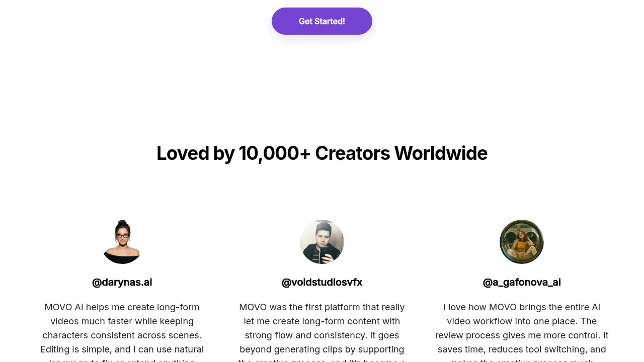
Design analysis
A calm centered community band combines a social-proof headline, community destinations, and one prominent button with substantial whitespace.
Prompt preview
## Reference images

Study these alongside the description below: hierarchy, rhythm, spacing, colour. Build for the product you are asked about, using this design language.

- Component: https://kage-design-assets.t3.tigrisfiles.io/components/movo-ai/8c1aa91f-026c-4018-9b05-6044a1e6f3fb-1792821692-8.webp
- Full page it was cut from: https://kage-design-assets.t3.tigrisfiles.io/screenshots/movo-ai/8c1aa91f-026c-4018-9b05-6044a1e6f3fb-1792821641495-full.webp
- Component on Kage: https://kage.design/component/movo-cta-2

## Before you start
Ask what community or social channels the user's product actually supports and what invitation best matches its audience. Then use this structure with original wording.

Build a centered community CTA with a strong headline, one explanatory sentence, a row of small outlined channel pills, and a single filled action button. Keep the layout intentionally sparse and friendly, with the action visually dominant after the channel row.

Use a 30–36px bold heading, 16px body copy, and 13px pill labels. Pills should use a pale lavender background #F6F2FF, a subtle #D8CDEF border, dark text #232323, 9999px radius, and small accessible icons. Use a purple primary button #7B3FE4 with white text and a soft shadow. Center everything in a max-width of 760px and give the section 96–140px vertical padding.

Make channel pills links with hover and focus states, and let them wrap cleanly on mobile.

Never: use the reference's community names, product name, exact copy, logos, or social icons.
More components

 Conversion banner
Papermark Data Rooms · Call to action
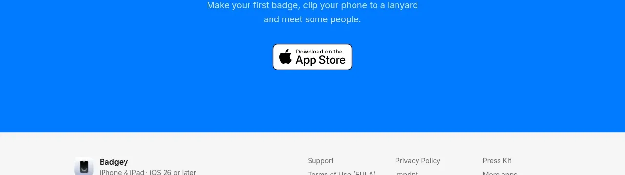
 Final download call to action
Badgey · Call to action

 Final signup call to action
AgentGrid.io · Call to action

 Final conversion call to action
Context Engine · Call to action
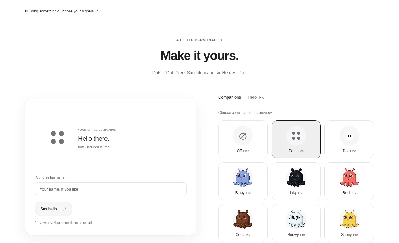
 Developer workflow callout
Dots · Call to action
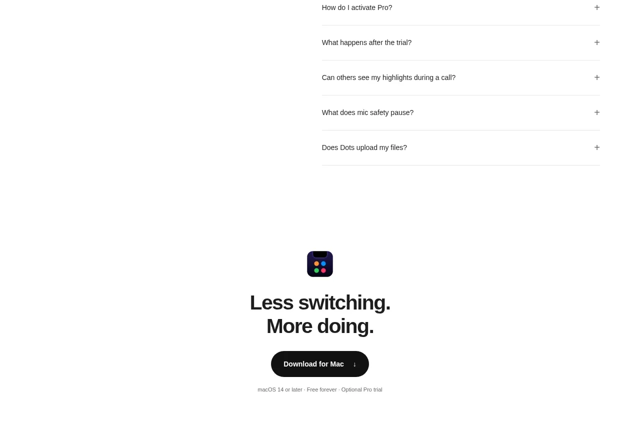 Final download CTA
Dots · Call to action