 kage
movoai.pro

Design analysis
A compact final conversion band repeats the core promise and presents one last high-contrast action immediately before the footer.
Prompt preview
## Reference images

Study these alongside the description below: hierarchy, rhythm, spacing, colour. Build for the product you are asked about, using this design language.

- Component: https://kage-design-assets.t3.tigrisfiles.io/components/movo-ai/8c1aa91f-026c-4018-9b05-6044a1e6f3fb-1792821694-11.webp
- Full page it was cut from: https://kage-design-assets.t3.tigrisfiles.io/screenshots/movo-ai/8c1aa91f-026c-4018-9b05-6044a1e6f3fb-1792821641495-full.webp
- Component on Kage: https://kage.design/component/movo-cta-3

## Before you start
Ask what final action the user's product wants visitors to take and what concise promise best supports it. Then create a distinct, original closing CTA.

Build a compact centered conversion banner with a two-line bold headline and one pill-shaped primary button beneath it. Keep the visual treatment clean and high contrast, with generous horizontal padding and enough vertical spacing that the heading never collides with the footer.

Use 28–34px bold heading text, 14–16px button text, charcoal #101010, white background, and purple #7B3FE4 for the button. Use a 9999px radius, subtle shadow, and a clear hover/focus state. Stack neatly on mobile.

Never: use the reference's slogan, product name, exact button text, logo, or copy.
More components

 Conversion banner
Papermark Data Rooms · Call to action
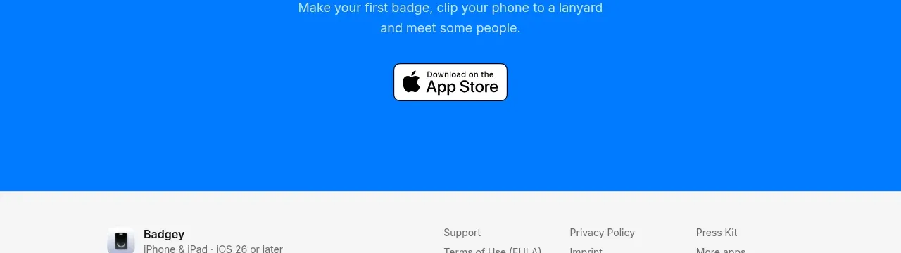
 Final download call to action
Badgey · Call to action

 Final signup call to action
AgentGrid.io · Call to action

 Final conversion call to action
Context Engine · Call to action
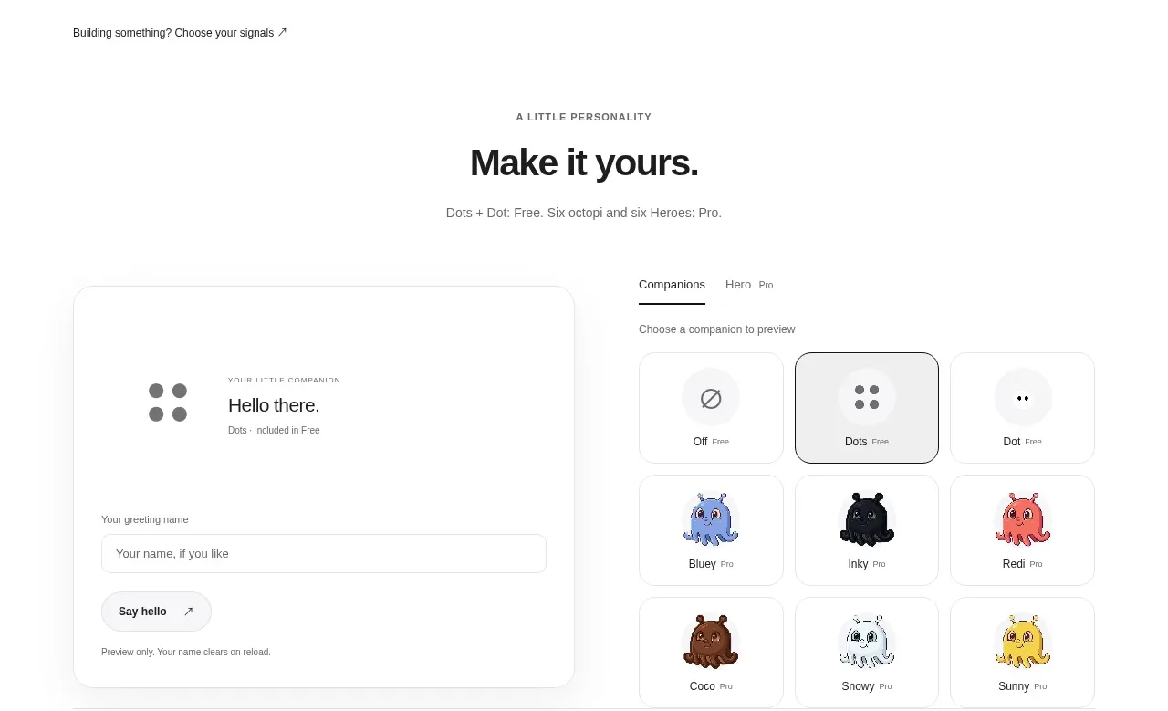
 Developer workflow callout
Dots · Call to action
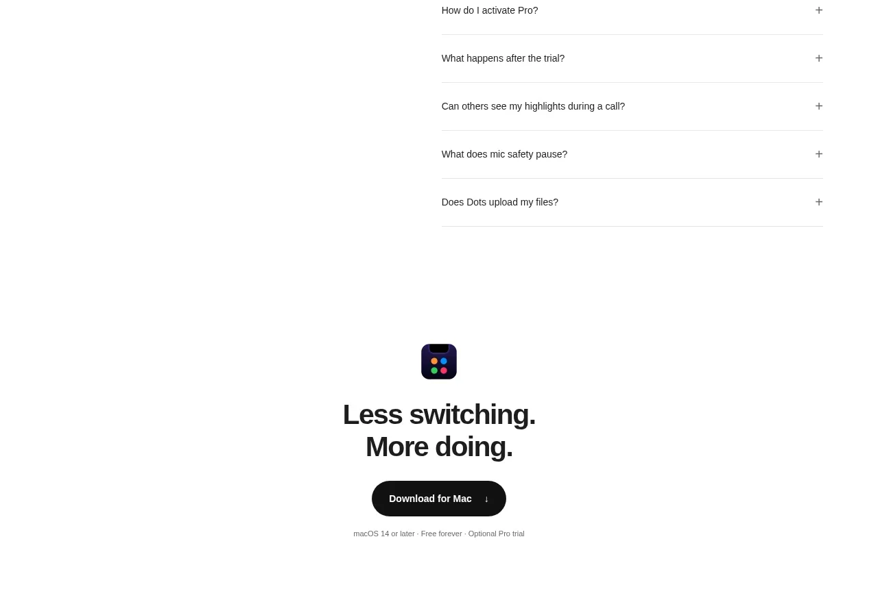 Final download CTA
Dots · Call to action