kage
kage
neopress.ai
Design analysis
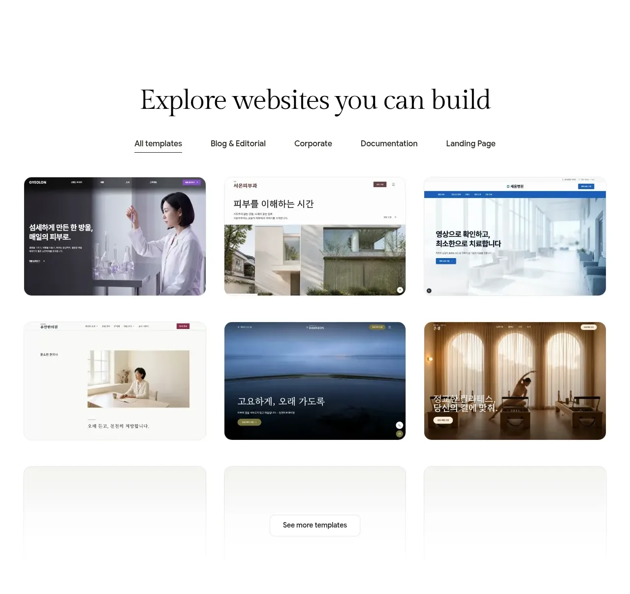
An editorial gallery combines a centered heading, category filters, a six-item visual grid, and a small continuation link to encourage exploration.
Prompt preview
## Reference images

Study these alongside the description below: hierarchy, rhythm, spacing, colour. Build for the product you are asked about, using this design language.

- Component: https://kage-design-assets.t3.tigrisfiles.io/components/neopress/126c1916-850c-4473-b9b4-49923d5d31e2-1789365754-4.webp
- Full page it was cut from: https://kage-design-assets.t3.tigrisfiles.io/screenshots/neopress/126c1916-850c-4473-b9b4-49923d5d31e2-1789365678746-full.webp
- Component on Kage: https://kage.design/component/neopress-gallery

## Before you start
Ask what kinds of templates, examples, or resources the user's product should showcase and which categories matter to its audience. Then design an original browsable gallery.

### Design language
- Use a centered serif section heading with a compact filter row beneath it; keep the gallery itself in a balanced three-column grid on desktop and one or two columns on mobile.
- Give each item a consistent aspect ratio, modest radius, clipped media, and a small caption or metadata treatment that does not cover the preview.
- Use off-white page background (`#fbfaf7`), white or pale cards (`#ffffff`), near-black headings (`#1b1b1a`), muted labels (`#74736d`), and subtle borders (`#e3e0d9`).
- Make the active filter distinct with a dark underline or text color, and provide hover/focus treatment such as a slight lift or border change; filters must work as buttons and announce state.
- Include a centered “view more” style action below the grid with enough spacing to preserve the gallery's editorial rhythm.

### Never
- Never reuse logos, product names, copy, illustrations, or imagery from the reference.
- Never create inconsistent thumbnail ratios, inaccessible filter controls, or a gallery that feels like an ad carousel.