kage
kage
notchpop.com
Design analysis
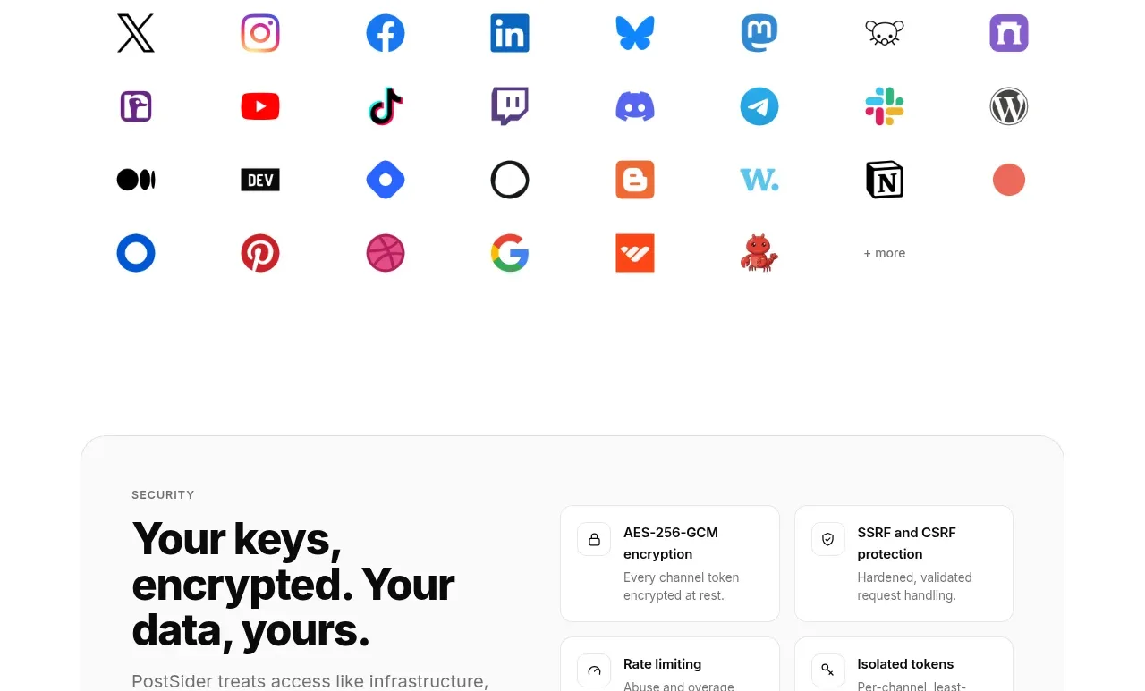
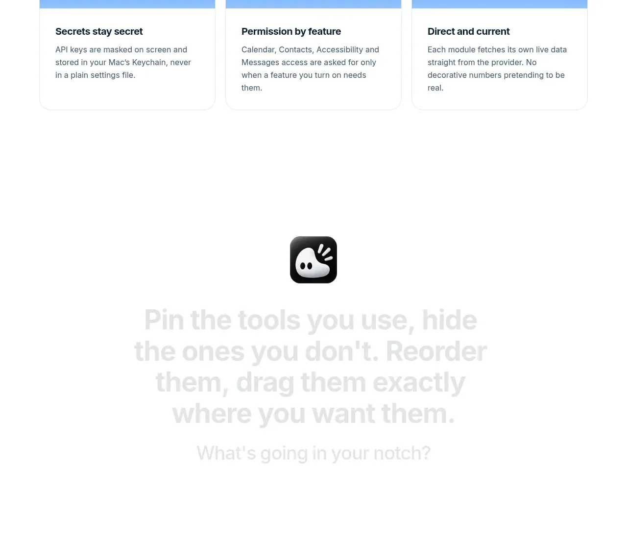
An extensions section explains extensibility with a centered heading and toggle-like accent, followed by a dense grid of integration rows and small icons.
Prompt preview
## Reference images

Study these alongside the description below: hierarchy, rhythm, spacing, colour. Build for the product you are asked about, using this design language.

- Component: https://kage-design-assets.t3.tigrisfiles.io/components/notchpop/1c698f48-5c0e-4cfb-974b-c3c3cf38c197-1790316297-6.webp
- Full page it was cut from: https://kage-design-assets.t3.tigrisfiles.io/screenshots/notchpop/1c698f48-5c0e-4cfb-974b-c3c3cf38c197-1790316211358-full.webp
- Component on Kage: https://kage.design/component/notchpop-logo-cloud

## Before you start
Ask what the user's product and brand are, then apply the principles below to that product rather than copying the reference.

Create an integrations section with a centered heading, a short explanatory paragraph, a small blue on/off toggle accent, and a link-style secondary action. Below it, show a four-column responsive grid of compact integration rows. Each row is a white rounded tile with a 1px #edf0f3 border, a 28–32px colored icon container, a bold 12–13px name, and one line of muted description. Keep the grid airy but information-dense, with 10–12px gaps. Make rows keyboard accessible and allow filtering or hover emphasis. Use blue (#1777df) only for the toggle and links so the section remains quiet.

Never: use logos, product names, copy, illustrations, or imagery from the reference.