kage
kage
useomnia.com
Design analysis
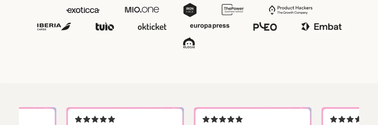
A compact social-proof band uses a small “trusted by” label and several monochrome customer marks arranged in two loose rows.
Prompt preview
## Reference images

Study these alongside the description below: hierarchy, rhythm, spacing, colour. Build for the product you are asked about, using this design language.

- Component: https://kage-design-assets.t3.tigrisfiles.io/components/omnia-agent/49497126-f7d8-48a0-b56b-a26990811c92-1790920878-5.webp
- Full page it was cut from: https://kage-design-assets.t3.tigrisfiles.io/screenshots/omnia-agent/49497126-f7d8-48a0-b56b-a26990811c92-1790920840559-full.webp
- Component on Kage: https://kage.design/component/omnia-agent-logo-cloud

## Before you start
Ask what the user's product and brand are, then apply these principles to that product rather than reproducing the reference.

Create a restrained customer-proof logo cloud beneath the demo section. Center a small uppercase label above two flexible rows of monochrome customer wordmarks. Keep the marks visually equal in weight through grayscale, consistent height, and generous spacing rather than boxed tiles. Use a quiet off-white background and enough vertical padding to separate this band from adjacent content. On mobile, wrap the marks naturally or use a slow, accessible marquee only if the number of logos requires it.

Never: use the reference logo, product name, exact copy, illustrations, imagery, or branded assets.