kage
kage
ovoplayer.com
Design analysis
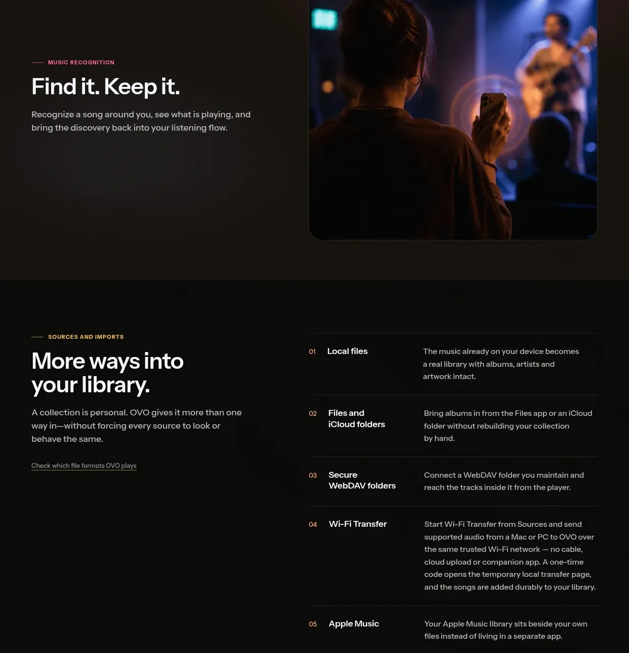
A strong left-side introduction is paired with a numbered, ruled list of supported source types and concise explanations.
Prompt preview
## Reference images

Study these alongside the description below: hierarchy, rhythm, spacing, colour. Build for the product you are asked about, using this design language.

- Component: https://kage-design-assets.t3.tigrisfiles.io/components/ovo/3c9ed73d-a170-49d0-8a12-5cf9a4f3d08f-1789452269-6.webp
- Full page it was cut from: https://kage-design-assets.t3.tigrisfiles.io/screenshots/ovo/3c9ed73d-a170-49d0-8a12-5cf9a4f3d08f-1789452172899-full.webp
- Component on Kage: https://kage.design/component/ovo-table

## Before you start
Ask what sources, integrations, or import methods the user's product supports and which need the clearest explanation. Then use this information to populate the pattern.

Build a dark two-column information section. The left column has an uppercase eyebrow, a large heading, a short paragraph, and a small text link. The right column is a numbered comparison/list table with 6–8 rows; each row contains a number, a bold source name, and a compact description. Separate rows with fine horizontal rules (#292722), align columns precisely, and use warm cream headings (#eeeae2), muted gray text (#aaa39a), and a tiny amber accent for numbers. Let the list become a stacked disclosure list on narrow screens while retaining row hierarchy.

Never use the reference's logos, product names, copy, illustrations, or imagery.