kage
kage
plane.so

Design analysis
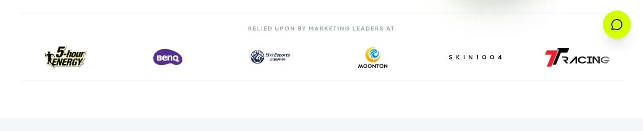
A low-height trust band introduces the product with a short customer statement and a sparse row of monochrome partner marks.
Prompt preview
## Reference images

Study these alongside the description below: hierarchy, rhythm, spacing, colour. Build for the product you are asked about, using this design language.

- Component: https://kage-design-assets.t3.tigrisfiles.io/components/plane-agents/6cd7606f-e6b6-4968-a1a7-76c61b9969ac-1790143341-2.webp
- Full page it was cut from: https://kage-design-assets.t3.tigrisfiles.io/screenshots/plane-agents/6cd7606f-e6b6-4968-a1a7-76c61b9969ac-1790143303447-full.webp
- Component on Kage: https://kage.design/component/plane-agents-logo-cloud

## Before you start
Ask what the user's product, audience, and brand are, then apply the principles below to that product rather than copying the reference.

Build a restrained customer proof strip after the hero preview. Put a short sentence on the left or above, followed by a horizontally distributed row of four to six subdued customer marks. Keep the band mostly white with generous whitespace, use small gray typography #777777, and render partner marks in low-contrast grayscale so they support rather than compete with the hero. Align everything to the same centered page container and allow horizontal scrolling on mobile instead of wrapping into an awkward grid.

Never: use logos, product names, copy, illustrations, or imagery from the reference.