kage
kage
polylane.com
Design analysis
A related-content section presents two cards on the first row and a full-width third card, making deeper resources easy to scan.
Prompt preview
## Reference images

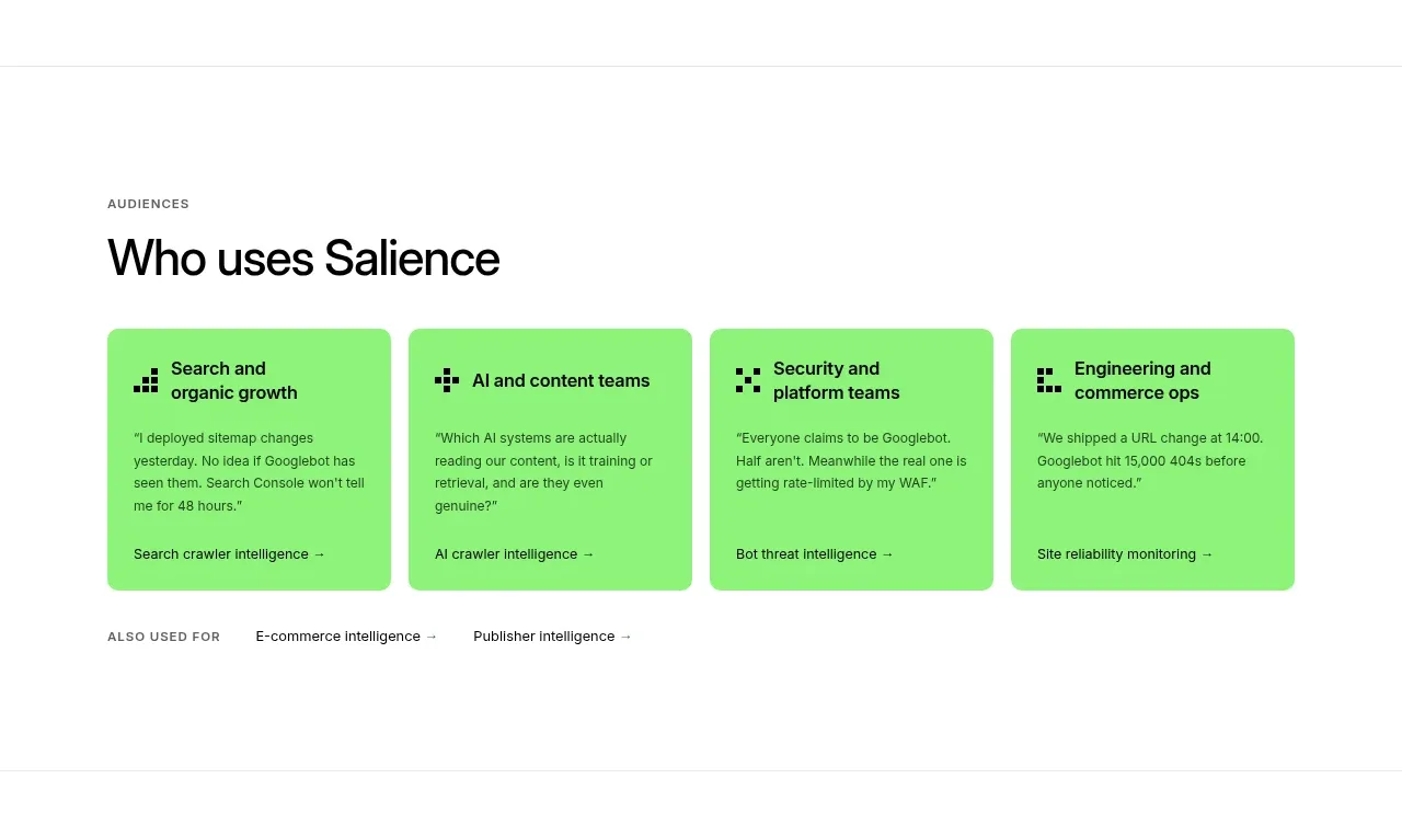
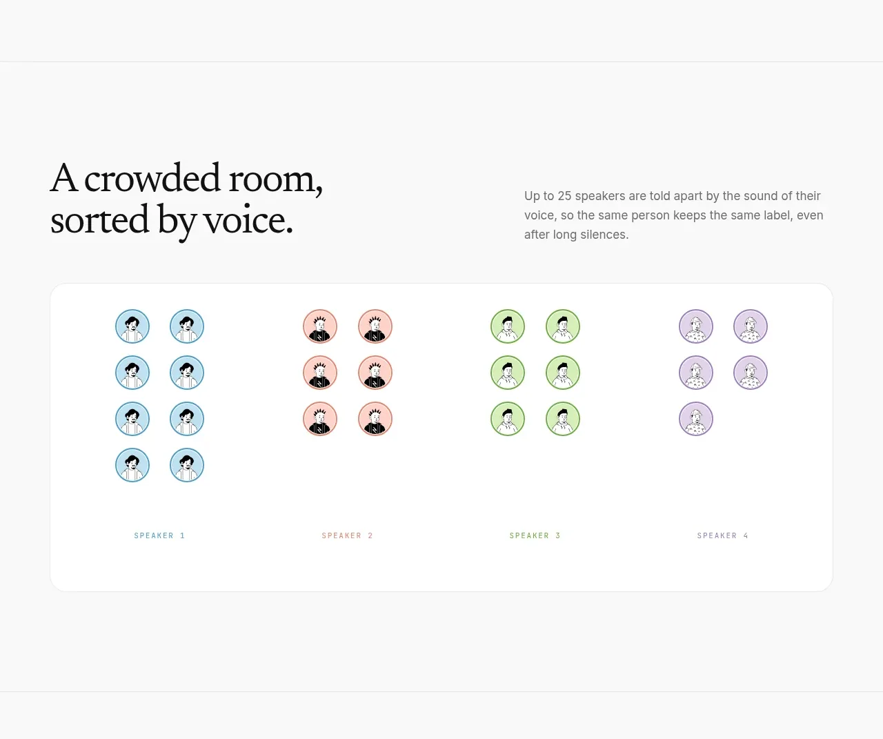
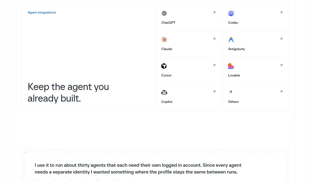
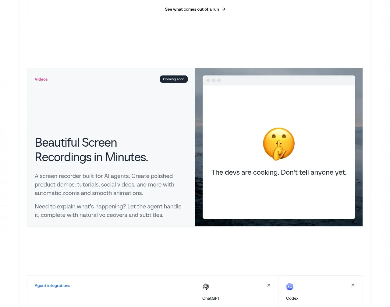
Study these alongside the description below: hierarchy, rhythm, spacing, colour. Build for the product you are asked about, using this design language.

- Component: https://kage-design-assets.t3.tigrisfiles.io/components/polylane-impact-analysis/878f0a8a-6be5-46ae-8786-d3cb31a469c0-1792130549-10.webp
- Full page it was cut from: https://kage-design-assets.t3.tigrisfiles.io/screenshots/polylane-impact-analysis/878f0a8a-6be5-46ae-8786-d3cb31a469c0-1792130477581-full.webp
- Component on Kage: https://kage.design/component/polylane-impact-analysis-card-2

## Before you start
Ask what educational resources are relevant to the user's product and audience, then create original guide cards from those inputs.

Create a resource section with a left-aligned heading and a bordered card grid: two cards across on the first row and one full-width card below. Each card needs a small content-type label, a strong 16–18px title, and a 14–15px summary. Use consistent 24px padding, 1px #e3e5e1 borders, white background, and subtle hover elevation or border-colour change. Keep the heading around 28–32px and leave 24–32px before the grid. Stack everything on mobile and make the whole card or a clearly labeled link clickable.

Never: use logos, product names, copy, illustrations, or imagery from the reference.