 kage
kage
polylane.com

Design analysis
A small centered trust statement sits above two orderly rows of monochrome customer marks, providing social proof without overwhelming the hero.
Prompt preview
## Reference images

Study these alongside the description below: hierarchy, rhythm, spacing, colour. Build for the product you are asked about, using this design language.

- Component: https://kage-design-assets.t3.tigrisfiles.io/components/polylane-impact-analysis/878f0a8a-6be5-46ae-8786-d3cb31a469c0-1792130546-3.webp
- Full page it was cut from: https://kage-design-assets.t3.tigrisfiles.io/screenshots/polylane-impact-analysis/878f0a8a-6be5-46ae-8786-d3cb31a469c0-1792130477581-full.webp
- Component on Kage: https://kage.design/component/polylane-impact-analysis-logo-cloud

## Before you start
Ask what kinds of customers or communities the user's product serves, then apply this trust-pattern with the user's own approved assets.

Build a restrained trust strip with a centered sentence in 15–16px dark text, followed by a responsive grid of customer names or approved logos. Use two rows on desktop, equal visual weight, generous 28–36px column gaps, and muted monochrome treatment (#303535 at 75% opacity). Keep the section white with 48–64px vertical padding and no heavy container. On small screens, wrap into fewer columns or horizontal-scroll accessibly. Add optional small “read story” micro-links only where the user has real case studies.

Never: use logos, product names, copy, illustrations, or imagery from the reference.
More components
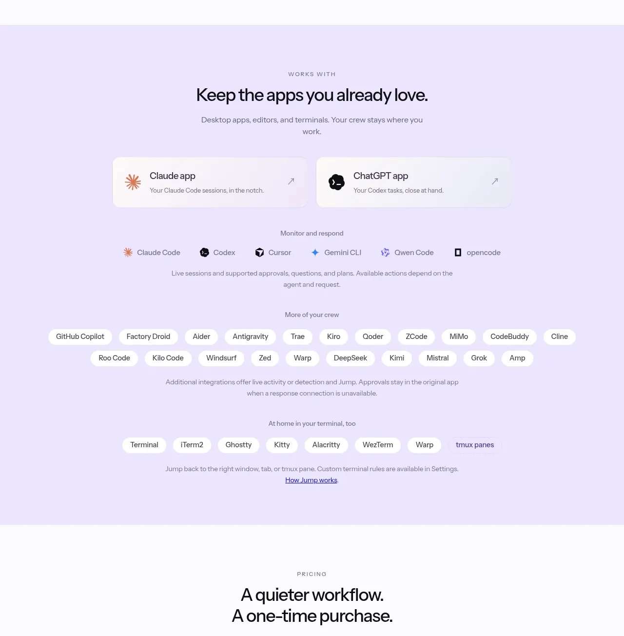
 Supported apps and integrations
CrewTower Mod for Claude Code · Logo cloud
Supported apps and integrations
CrewTower Mod for Claude Code · Logo cloud
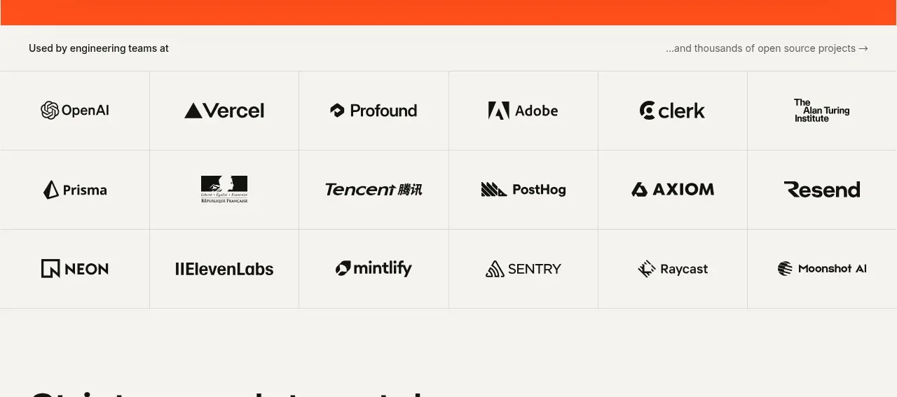
 Teams and open-source adoption grid
Ultracite v8 · Logo cloud
Teams and open-source adoption grid
Ultracite v8 · Logo cloud

 Platform compatibility grid
Scalebrowser · Logo cloud
Platform compatibility grid
Scalebrowser · Logo cloud
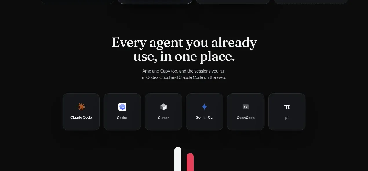
 Compatible tools grid
Parallax · Logo cloud
Compatible tools grid
Parallax · Logo cloud

 Trusted by teams strip
AI Sandboxes by Buddy · Logo cloud
Trusted by teams strip
AI Sandboxes by Buddy · Logo cloud

 Platform compatibility statement
Navige · Logo cloud
Platform compatibility statement
Navige · Logo cloud