 kage
kage
polylane.com
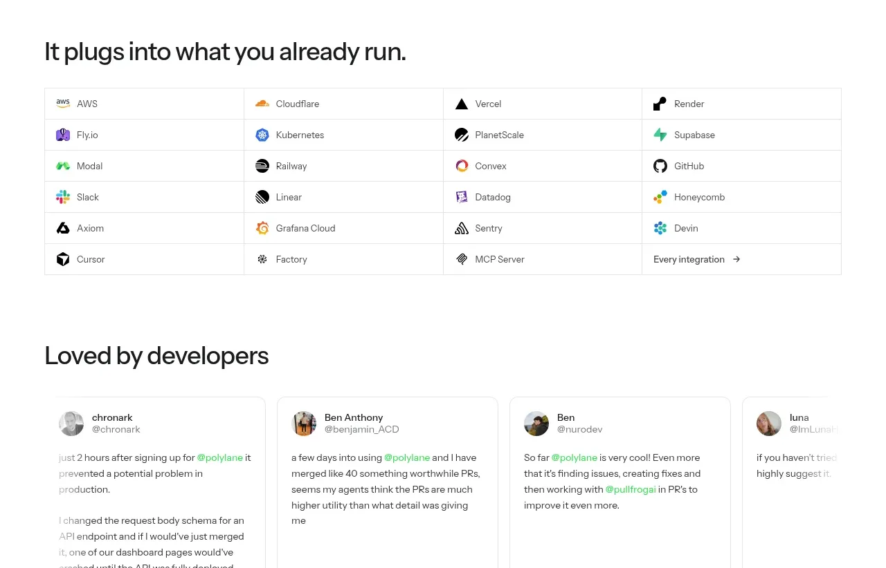
Design analysis
A compact four-column integration directory shows breadth through icon-and-name cells and ends with an all-integrations link.
Prompt preview
## Reference images

Study these alongside the description below: hierarchy, rhythm, spacing, colour. Build for the product you are asked about, using this design language.

- Component: https://kage-design-assets.t3.tigrisfiles.io/components/polylane-impact-analysis/878f0a8a-6be5-46ae-8786-d3cb31a469c0-1792130548-8.webp
- Full page it was cut from: https://kage-design-assets.t3.tigrisfiles.io/screenshots/polylane-impact-analysis/878f0a8a-6be5-46ae-8786-d3cb31a469c0-1792130477581-full.webp
- Component on Kage: https://kage.design/component/polylane-impact-analysis-logo-cloud-2

## Before you start
Ask which integrations the user's product genuinely supports and what brand language to use, then build a directory with those real items.

Create a section headed by a concise left-aligned statement, followed by a bordered four-column directory grid. Each cell should contain a small integration icon and name, with 16–20px horizontal and 14–18px vertical padding. Use 1px neutral dividers (#e4e5e2), white background, 14px labels, and subtle hover highlighting. Make the last cell an “all integrations” action with an arrow. On mobile, change to two columns or a searchable list. Ensure the grid is keyboard navigable and icons have accessible labels.

Never: use logos, product names, copy, illustrations, or imagery from the reference.
More components
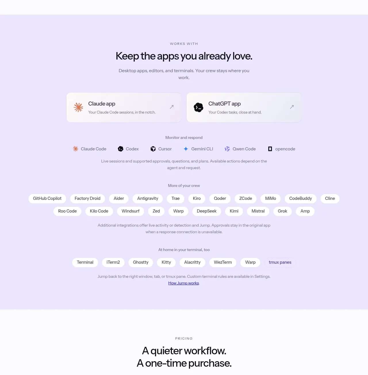
 Supported apps and integrations
CrewTower Mod for Claude Code · Logo cloud
Supported apps and integrations
CrewTower Mod for Claude Code · Logo cloud
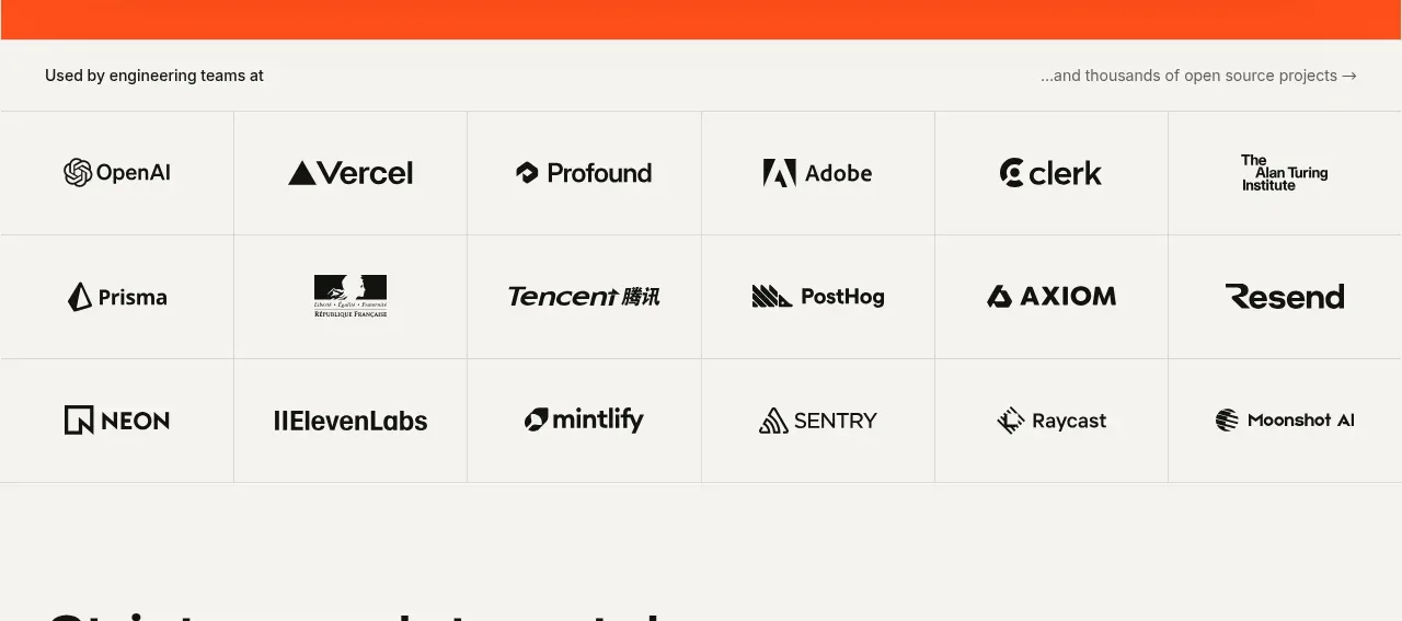
 Teams and open-source adoption grid
Ultracite v8 · Logo cloud
Teams and open-source adoption grid
Ultracite v8 · Logo cloud

 Platform compatibility grid
Scalebrowser · Logo cloud
Platform compatibility grid
Scalebrowser · Logo cloud
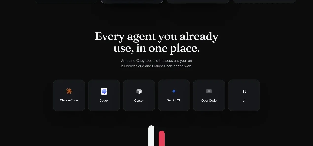
 Compatible tools grid
Parallax · Logo cloud
Compatible tools grid
Parallax · Logo cloud

 Trusted by teams strip
AI Sandboxes by Buddy · Logo cloud
Trusted by teams strip
AI Sandboxes by Buddy · Logo cloud

 Platform compatibility statement
Navige · Logo cloud
Platform compatibility statement
Navige · Logo cloud