kage
kage
postsider.com
Design analysis
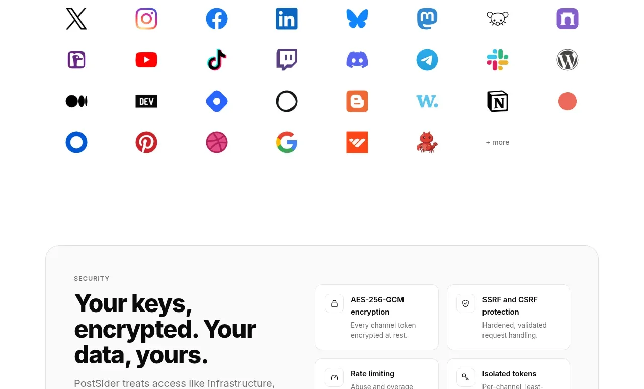
A centered ecosystem statement is followed by a spacious multi-row grid of colorful channel marks and a small overflow label.
Prompt preview
## Reference images

Study these alongside the description below: hierarchy, rhythm, spacing, colour. Build for the product you are asked about, using this design language.

- Component: https://kage-design-assets.t3.tigrisfiles.io/components/postsider/9db522ee-ab56-4492-bd61-aeca6aa2f318-1790057108-6.webp
- Full page it was cut from: https://kage-design-assets.t3.tigrisfiles.io/screenshots/postsider/9db522ee-ab56-4492-bd61-aeca6aa2f318-1790056967277-full.webp
- Component on Kage: https://kage.design/component/postsider-logo-cloud

## Before you start
Ask which integrations or ecosystems the user's product genuinely supports and which should be prioritized. Use the user's actual integration assets or neutral placeholders during prototyping.

Create a platform-support section with a centered uppercase eyebrow, bold heading, and two-line explanatory subtitle. Below it, show a balanced multi-row icon grid across the content width. Each item is centered in a generous cell with a small recognizable mark and optional short label; vary brand colors while keeping cell sizing consistent. Use ample white space, no distracting card chrome, and a final “more” treatment for overflow. Ensure marks have accessible labels, adequate contrast, and responsive wrapping.

Never: use logos, product names, copy, illustrations, or imagery from the reference.