 kage
kage
relic.space
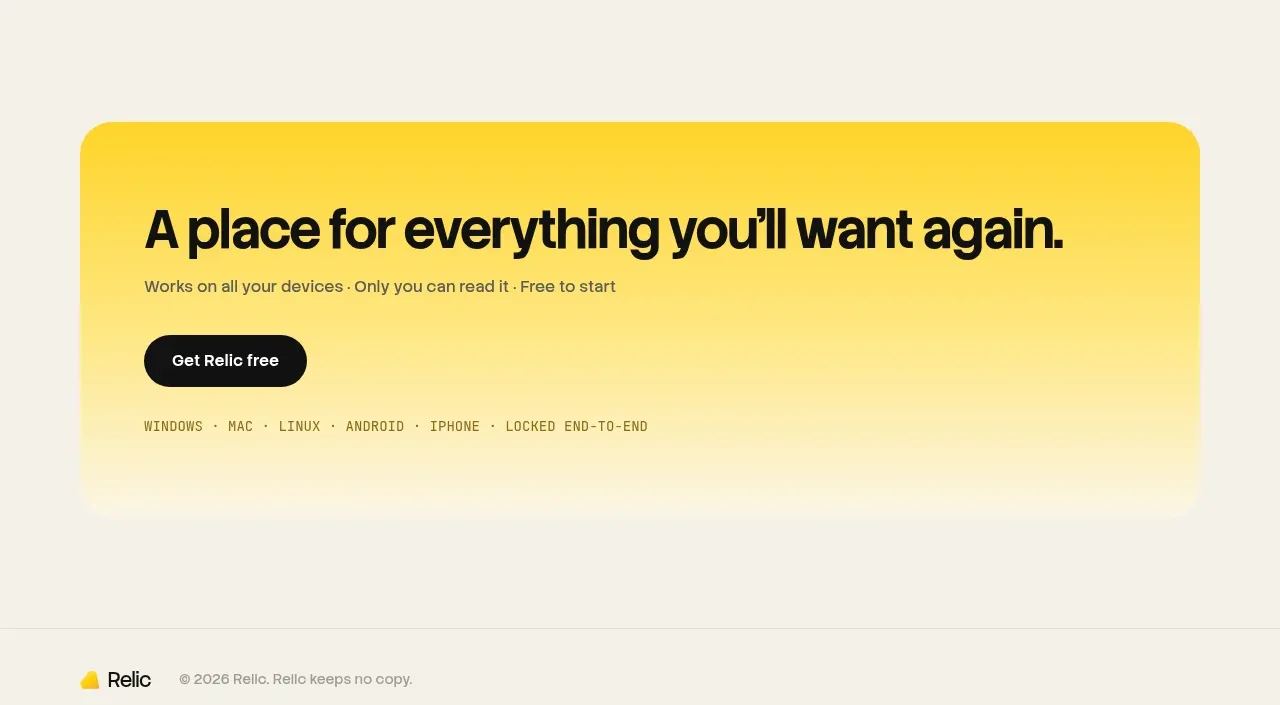
Design analysis
A bright rounded banner closes the content with one memorable promise, a short qualifier, and a single high-contrast action.
Prompt preview
## Reference images

Study these alongside the description below: hierarchy, rhythm, spacing, colour. Build for the product you are asked about, using this design language.

- Component: https://kage-design-assets.t3.tigrisfiles.io/components/relic/11197dbe-e39c-44cc-b0a1-5cdca0c05213-1789279384-11.webp
- Full page it was cut from: https://kage-design-assets.t3.tigrisfiles.io/screenshots/relic/11197dbe-e39c-44cc-b0a1-5cdca0c05213-1789279305759-full.webp
- Component on Kage: https://kage.design/component/relic-cta

## Before you start
Ask what final action the user's product wants visitors to take and what one-sentence promise can motivate that action. Build a focused closing CTA from that answer.

Create a wide rounded conversion banner with a vivid yellow top that softly fades toward cream. Use a large bold headline, a short supporting line, and one dark pill CTA aligned to the left. Add a tiny uppercase line of supported platforms or reassurance beneath the main content only if it is relevant. Use yellow `#ffd21a`, cream `#f5efe3`, black `#171714`, and muted brown `#6b624e`; use a 28px radius, 32px padding, 24–32px headline size, and ample breathing room. Keep this banner visually distinct but not noisy, and make the CTA the only dominant interactive element.

Never use logos, product names, copy, illustrations, or imagery from the reference.
More components

 Dark conversion call to action
DockFix 5.0 · Call to action
Dark conversion call to action
DockFix 5.0 · Call to action
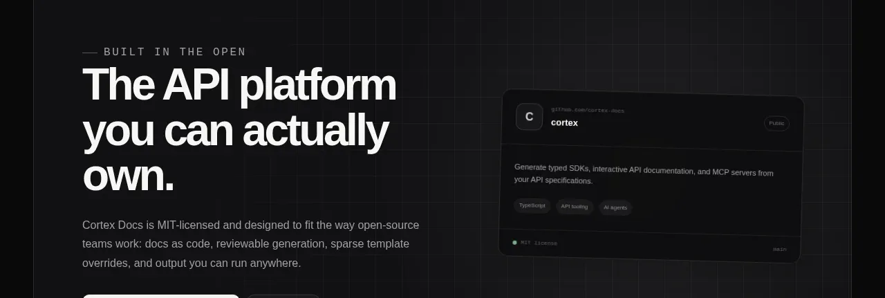
 Final conversion banner
Cortex · Call to action
Final conversion banner
Cortex · Call to action
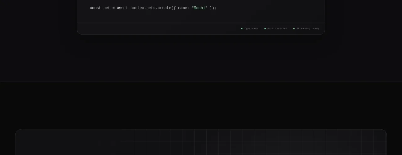 Open-source platform callout
Cortex · Call to action
Open-source platform callout
Cortex · Call to action
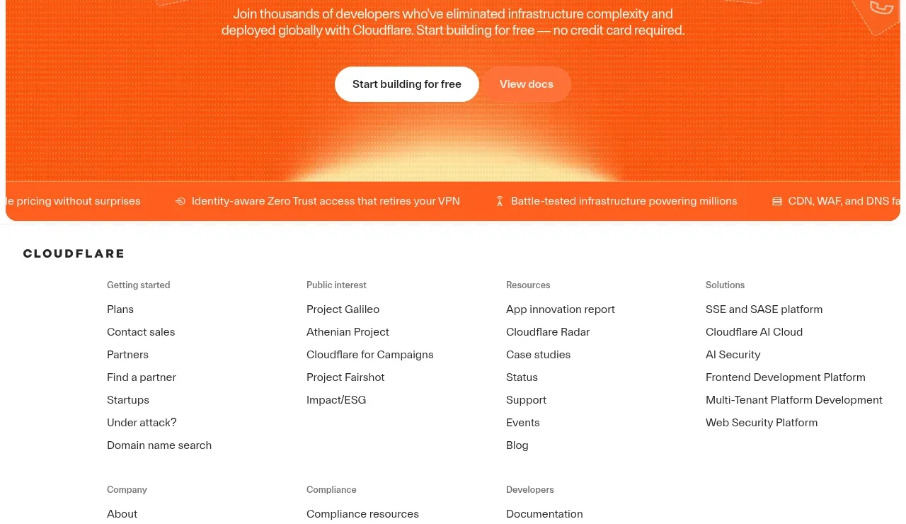
 Conversion banner
cloudflare.com · Call to action
Conversion banner
cloudflare.com · Call to action

 Open source repository CTA
Moji · Call to action
Open source repository CTA
Moji · Call to action

 Early-access signup
Jackalope · Call to action
Early-access signup
Jackalope · Call to action