kage
kage
relic.space
Design analysis
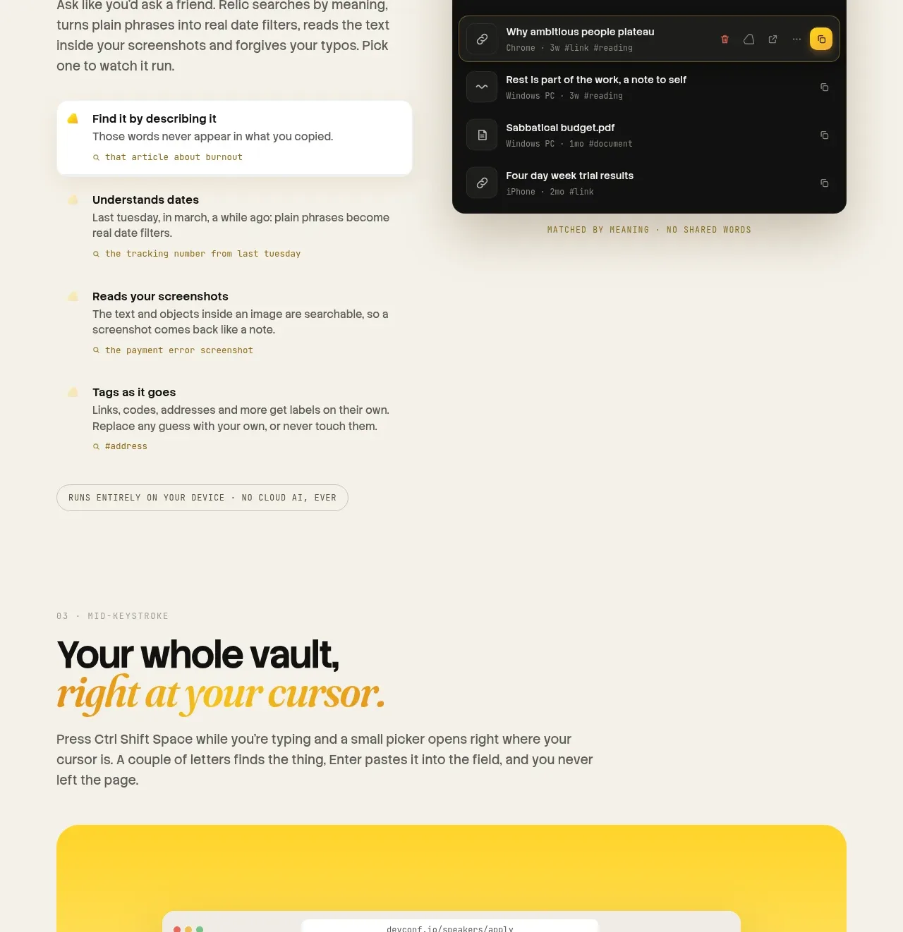
The section shifts to a broad statement about instant access and uses a large bright-framed browser mockup as the visual anchor.
Prompt preview
## Reference images

Study these alongside the description below: hierarchy, rhythm, spacing, colour. Build for the product you are asked about, using this design language.

- Component: https://kage-design-assets.t3.tigrisfiles.io/components/relic/11197dbe-e39c-44cc-b0a1-5cdca0c05213-1789279380-4.webp
- Full page it was cut from: https://kage-design-assets.t3.tigrisfiles.io/screenshots/relic/11197dbe-e39c-44cc-b0a1-5cdca0c05213-1789279305759-full.webp
- Component on Kage: https://kage.design/component/relic-gallery

## Before you start
Ask which devices or contexts your product supports and what the user should be able to retrieve anywhere. Design an original visual demonstration around that answer.

Create a visual-first feature band with a left-aligned eyebrow, a large two-line headline, a short paragraph, and a large rounded showcase panel below. Give the showcase a saturated yellow-to-cream treatment around an original browser, app, or device mockup; avoid decorative imagery that does not explain the product. Use `#f5efe3` for the page, yellow `#ffd21a` for the showcase, white `#fffdf8` for the inner mockup, and near-black `#171714` for text. Use a 28px outer radius, 32px internal padding, a strong visual scale, and enough cropping to make the mockup feel immersive. Keep explanatory text readable above the image and make the mockup accessible with a descriptive label.

Never use logos, product names, copy, illustrations, or imagery from the reference.