kage
kage
relic.space
Design analysis
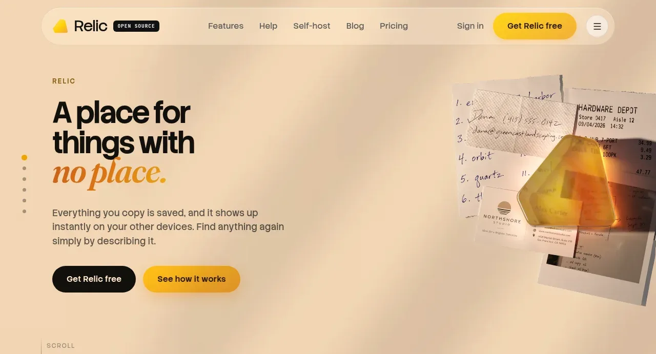
The hero uses a large two-line statement, an italic accent line, concise supporting copy, two CTAs, and a tactile floating visual on the right against a pale warm background.
Prompt preview
## Reference images

Study these alongside the description below: hierarchy, rhythm, spacing, colour. Build for the product you are asked about, using this design language.

- Component: https://kage-design-assets.t3.tigrisfiles.io/components/relic/11197dbe-e39c-44cc-b0a1-5cdca0c05213-1789279379-1.webp
- Full page it was cut from: https://kage-design-assets.t3.tigrisfiles.io/screenshots/relic/11197dbe-e39c-44cc-b0a1-5cdca0c05213-1789279305759-full.webp
- Component on Kage: https://kage.design/component/relic-hero

## Before you start
Ask what the user's product is, what transformation it provides, and which action matters most. Then apply these principles to create an original hero for that product and brand.

Create a spacious split hero directly below the navigation. Align the text to a generous left column and reserve the right side for an original product-related visual or abstract composition that feels tactile and slightly offset. Use a short eyebrow, a bold oversized sans-serif headline, and one italic serif or display accent line to create an editorial contrast. Add one dark primary pill button and one amber secondary pill button, followed by a small scroll cue near the lower edge. Use a warm paper palette: background `#f5eddf`, text `#171714`, muted copy `#625d53`, amber accent `#c98218`, and yellow CTA `#f5bb16`; use 24–40px outer padding, 48–72px headline line height, and generous empty space. Keep the visual subordinate to the message and ensure the mobile layout stacks text before visual.

Never use logos, product names, copy, illustrations, or imagery from the reference.