 kage
resend.com
Design analysis
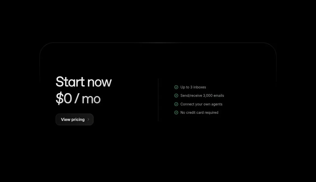
A compact bordered CTA offers a free starting tier, summarizes included benefits, and leads to a pricing action.
Prompt preview
## Reference images

Study these alongside the description below: hierarchy, rhythm, spacing, colour. Build for the product you are asked about, using this design language.

- Component: https://kage-design-assets.t3.tigrisfiles.io/components/resend-inboxes/352e3462-9455-4ac7-822b-63aef1588265-1792735567-7.webp
- Full page it was cut from: https://kage-design-assets.t3.tigrisfiles.io/screenshots/resend-inboxes/352e3462-9455-4ac7-822b-63aef1588265-1792735452629-full.webp
- Component on Kage: https://kage.design/component/resend-inboxes-cta

## Before you start
Ask what free or entry offer the user's product has, what benefits are accurate, and what brand styling should be used. Do not assume the reference pricing.

Create a wide, centered pricing CTA card with a large rounded outline and a two-column interior. On the left, show a compact offer label, prominent price/value statement, and a pill-shaped action button. On the right, list three to five benefits with small positive-status icons. Use a black background, very subtle panel fill (#050505), thin border (#242424), white type (#ededed), muted benefit text (#a0a0a0), and a restrained green confirmation accent around #4fd39a. Use 24–32px outer radius, 32–56px padding, clear mobile stacking, and a single obvious conversion action. Keep the card visually quieter than the hero while making the offer scannable.

Never: use the reference logo, product name, exact price, exact benefit copy, illustrations, imagery, or copied pricing language.
More components

 Conversion banner
Papermark Data Rooms · Call to action
 Final download call to action
Badgey · Call to action

 Final signup call to action
AgentGrid.io · Call to action
 Final conversion call to action
Context Engine · Call to action
 Final download CTA
Dots · Call to action
 Developer workflow callout
Dots · Call to action