 kage
resend.com
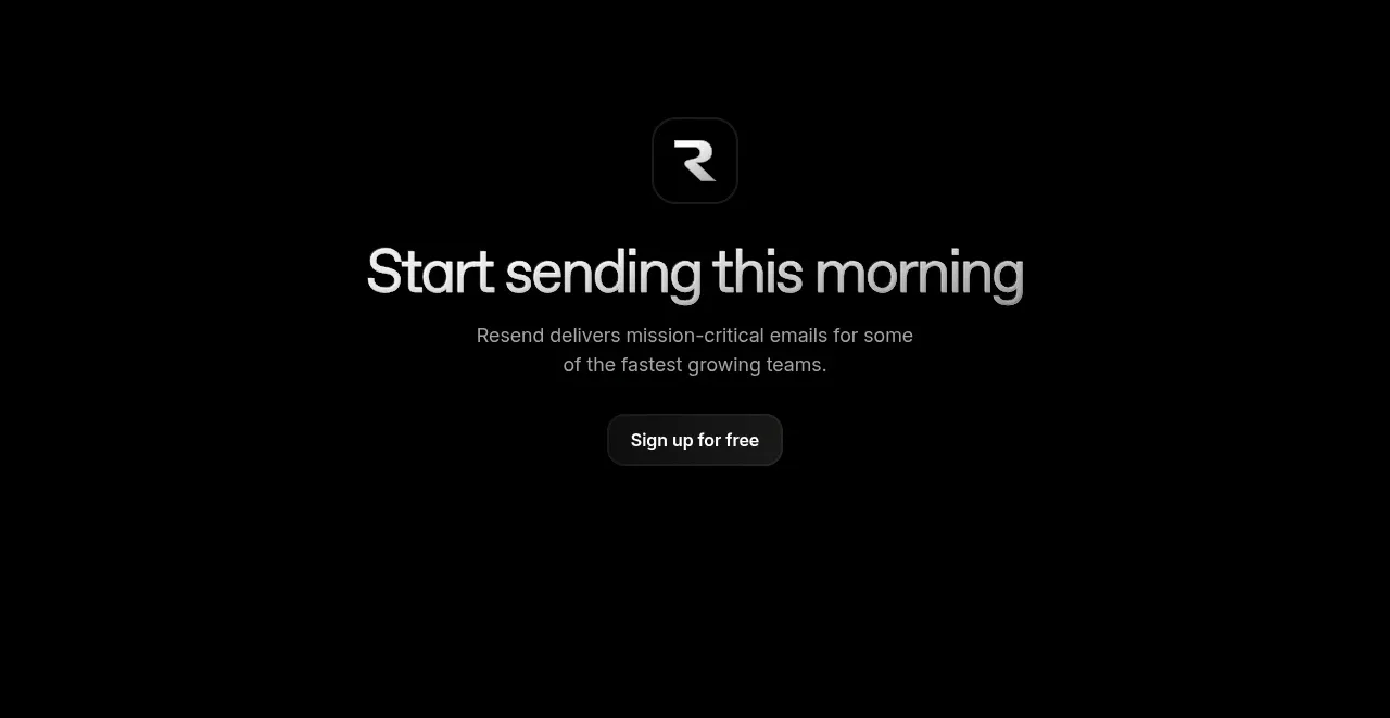
Design analysis
A centered closing call to action uses a small brand mark treatment, a concise headline, supporting text, and a single signup button.
Prompt preview
## Reference images

Study these alongside the description below: hierarchy, rhythm, spacing, colour. Build for the product you are asked about, using this design language.

- Component: https://kage-design-assets.t3.tigrisfiles.io/components/resend-inboxes/352e3462-9455-4ac7-822b-63aef1588265-1792735567-8.webp
- Full page it was cut from: https://kage-design-assets.t3.tigrisfiles.io/screenshots/resend-inboxes/352e3462-9455-4ac7-822b-63aef1588265-1792735452629-full.webp
- Component on Kage: https://kage.design/component/resend-inboxes-cta-2

## Before you start
Ask what final action the user's product wants visitors to take and what brand elements are available. Apply the user's identity rather than reproducing the reference.

Build a centered final CTA with generous vertical padding and no competing columns. Include a small abstract product mark or icon above the headline, a short high-contrast headline, one or two lines of muted supporting copy, and one filled pill button. Use near-black #030303, white #f0f0f0, muted gray #929292, and a soft dark button fill #1d1d1d with a subtle border #303030. Keep the content max-width around 560px, use a clear type scale such as 40–56px headline and 15–16px body, and provide hover, focus, and loading states for the button. Avoid excessive decoration so the action feels like a calm conclusion.

Never: use the reference logo, product name, exact copy, exact button label, illustrations, imagery, or copied brand mark.
More components

 Conversion banner
Papermark Data Rooms · Call to action
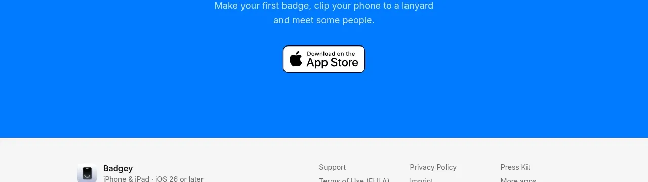
 Final download call to action
Badgey · Call to action

 Final signup call to action
AgentGrid.io · Call to action

 Final conversion call to action
Context Engine · Call to action
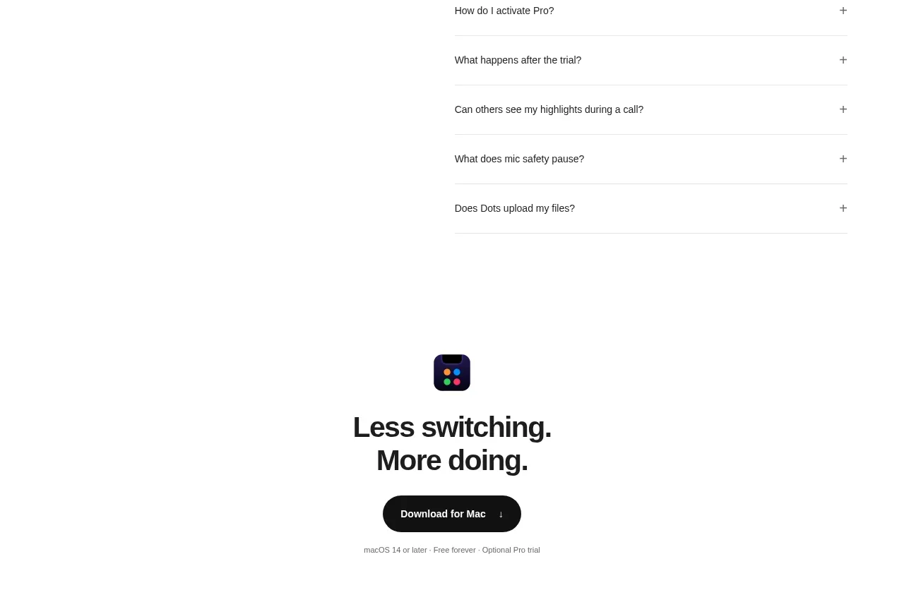
 Final download CTA
Dots · Call to action
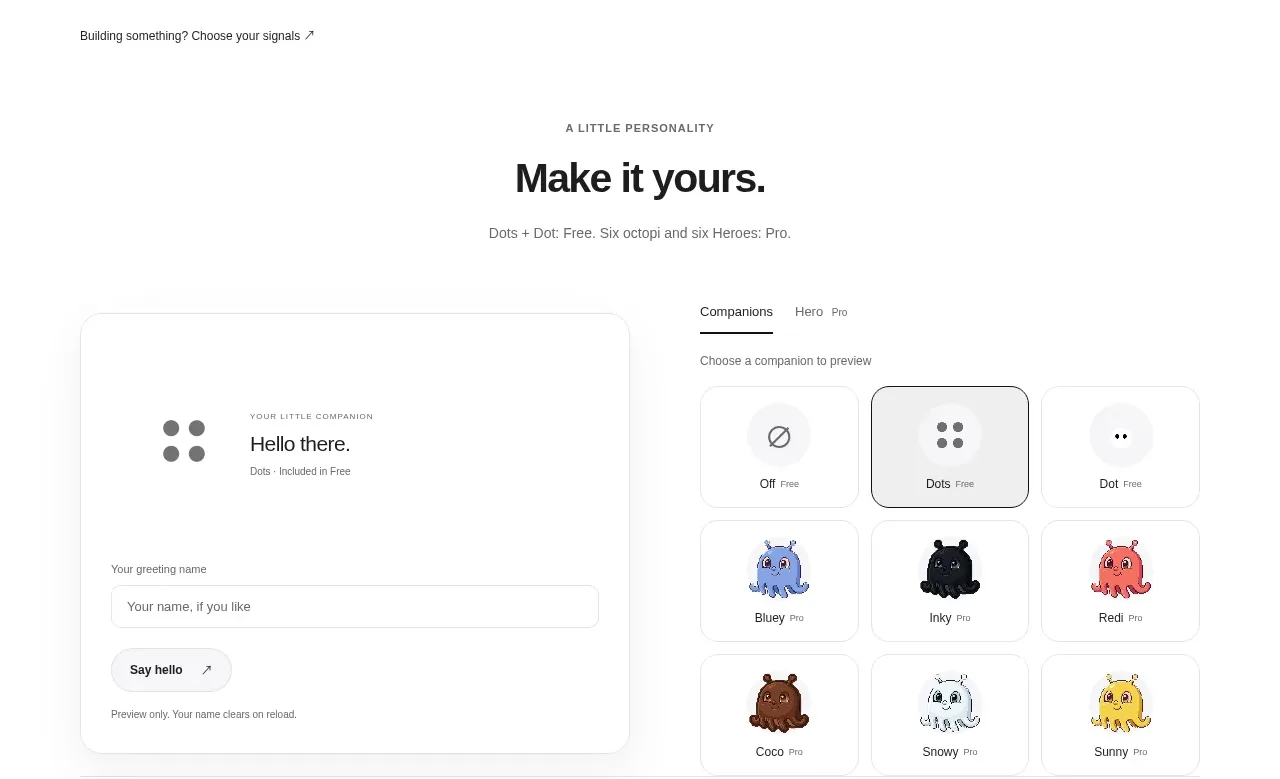 Developer workflow callout
Dots · Call to action