kage
kage
context.dev
Design analysis
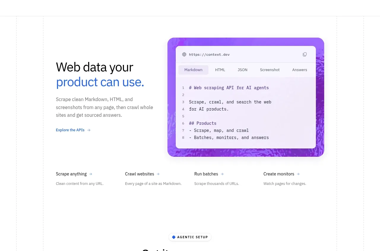
A split introductory feature section pairs explanatory copy with a vivid code/result visual, followed by four concise capability summaries.
Prompt preview
## Reference images

Study these alongside the description below: hierarchy, rhythm, spacing, colour. Build for the product you are asked about, using this design language.

- Component: https://kage-design-assets.t3.tigrisfiles.io/components/scrape-anything-by-context-dev/b0e64468-3924-45db-a4d8-d7cbe8044a77-1791871393-3.webp
- Full page it was cut from: https://kage-design-assets.t3.tigrisfiles.io/screenshots/scrape-anything-by-context-dev/b0e64468-3924-45db-a4d8-d7cbe8044a77-1791871314047-full.webp
- Component on Kage: https://kage.design/component/scrape-anything-by-context-feature-grid

## Before you start
Ask what the user's product, audience, and brand are, then use this component to explain their most important capabilities.

Create a broad feature section with a two-column lead row: concise heading and paragraph on the left, and a rounded product-output visual on the right. Follow it with four evenly spaced mini-feature summaries in one row on desktop and a grid on mobile. Use a faint vertical grid or rule system in the background, a white canvas, black headings, blue emphasis, and a saturated purple-blue visual surface around #5428E8 with a light code card on top. Keep the lead row aligned to a shared container and use 72–112px section padding. Mini-features should use 12–14px semibold titles and 11–13px muted descriptions. Add subtle elevation only to the visual card.

Never: use logos, product names, copy, illustrations, or imagery from the reference.