kage
kage
context.dev
Design analysis
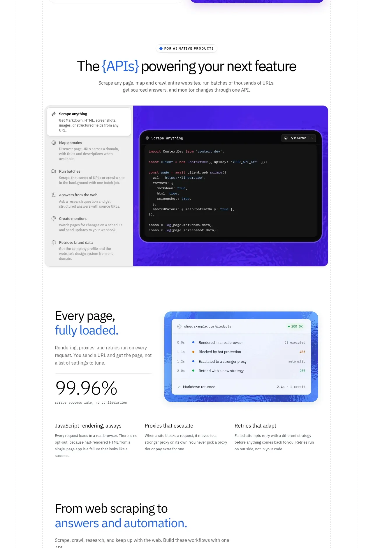
A centered section heading introduces a large interactive-looking API/code panel, followed by a reliability highlight and three supporting feature columns.
Prompt preview
## Reference images

Study these alongside the description below: hierarchy, rhythm, spacing, colour. Build for the product you are asked about, using this design language.

- Component: https://kage-design-assets.t3.tigrisfiles.io/components/scrape-anything-by-context-dev/b0e64468-3924-45db-a4d8-d7cbe8044a77-1791871394-5.webp
- Full page it was cut from: https://kage-design-assets.t3.tigrisfiles.io/screenshots/scrape-anything-by-context-dev/b0e64468-3924-45db-a4d8-d7cbe8044a77-1791871314047-full.webp
- Component on Kage: https://kage.design/component/scrape-anything-by-context-feature-grid-2

## Before you start
Ask what the user's product, audience, and brand are, then show how its API or core system powers real product experiences.

Create a feature section with a small eyebrow, centered headline, and supporting paragraph. Place a large split product panel beneath: a narrow navigation/list rail on the left and a wide dark code or data surface on the right, wrapped in a bright blue-purple container. Below it, use another two-column highlight with a concise heading, supporting copy, a large numeric reliability metric, and a lightweight status/result panel. Finish with three evenly spaced explanatory columns. Use a white background, faint grid rules, #111318 code surfaces, #2F6DCE accents, and #5428E8 visual framing. Use 16–24px radii, subtle borders, and readable syntax-like line spacing. Make the panel responsive by converting the rail to tabs or a dropdown on mobile.

Never: use logos, product names, copy, illustrations, or imagery from the reference.