kage
kage
context.dev
Design analysis
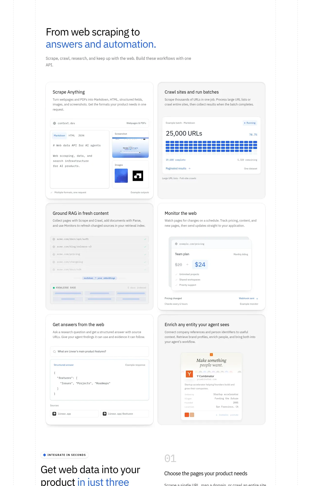
A heading introduces a two-column matrix of six use-case cards, each pairing a short explanation with a tailored interface preview.
Prompt preview
## Reference images

Study these alongside the description below: hierarchy, rhythm, spacing, colour. Build for the product you are asked about, using this design language.

- Component: https://kage-design-assets.t3.tigrisfiles.io/components/scrape-anything-by-context-dev/b0e64468-3924-45db-a4d8-d7cbe8044a77-1791871395-6.webp
- Full page it was cut from: https://kage-design-assets.t3.tigrisfiles.io/screenshots/scrape-anything-by-context-dev/b0e64468-3924-45db-a4d8-d7cbe8044a77-1791871314047-full.webp
- Component on Kage: https://kage.design/component/scrape-anything-by-context-feature-grid-3

## Before you start
Ask what the user's product, audience, and brand are, then turn their strongest use cases into a scannable visual gallery.

Build a use-case section with a left-aligned heading, blue-highlighted phrase, and concise intro. Below, create a two-column card grid of six equal or near-equal cards. Each card has a short title, one-sentence explanation, and a contained UI preview such as a document, metric grid, list, pricing fragment, answer panel, or brand-data snippet. Use warm white or #F8F9FB card fills, #E3E6EA borders, 16px radii, and gentle shadows. Keep previews abstract and product-relevant, with small typographic details that communicate function without overwhelming the card. Use responsive one-column stacking and consistent card heights where possible.

Never: use logos, product names, copy, illustrations, or imagery from the reference.