kage
kage
context.dev
Design analysis
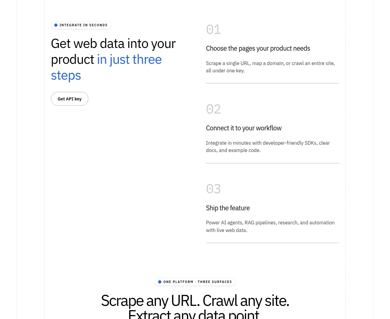
A left-side CTA introduces a three-step process while the numbered steps form a vertically ordered list with dividers.
Prompt preview
## Reference images

Study these alongside the description below: hierarchy, rhythm, spacing, colour. Build for the product you are asked about, using this design language.

- Component: https://kage-design-assets.t3.tigrisfiles.io/components/scrape-anything-by-context-dev/b0e64468-3924-45db-a4d8-d7cbe8044a77-1791871395-7.webp
- Full page it was cut from: https://kage-design-assets.t3.tigrisfiles.io/screenshots/scrape-anything-by-context-dev/b0e64468-3924-45db-a4d8-d7cbe8044a77-1791871314047-full.webp
- Component on Kage: https://kage.design/component/scrape-anything-by-context-feature-grid-4

## Before you start
Ask what the user's product, audience, and brand are, then express its activation journey in three crisp stages.

Create a two-column process section. On the left, place a small eyebrow, a large benefit-oriented heading, and one primary button. On the right, stack three numbered steps vertically, each with an oversized pale number, a concise title, supporting text, and a bottom divider. Keep the list easy to scan and make the progression obvious through alignment and consistent spacing. Use white space generously, #D1D5DB dividers, black headings, muted gray body text, and blue emphasis. On mobile, place the CTA above the step list and reduce number scale without losing hierarchy.

Never: use logos, product names, copy, illustrations, or imagery from the reference.