kage
kage
context.dev
Design analysis
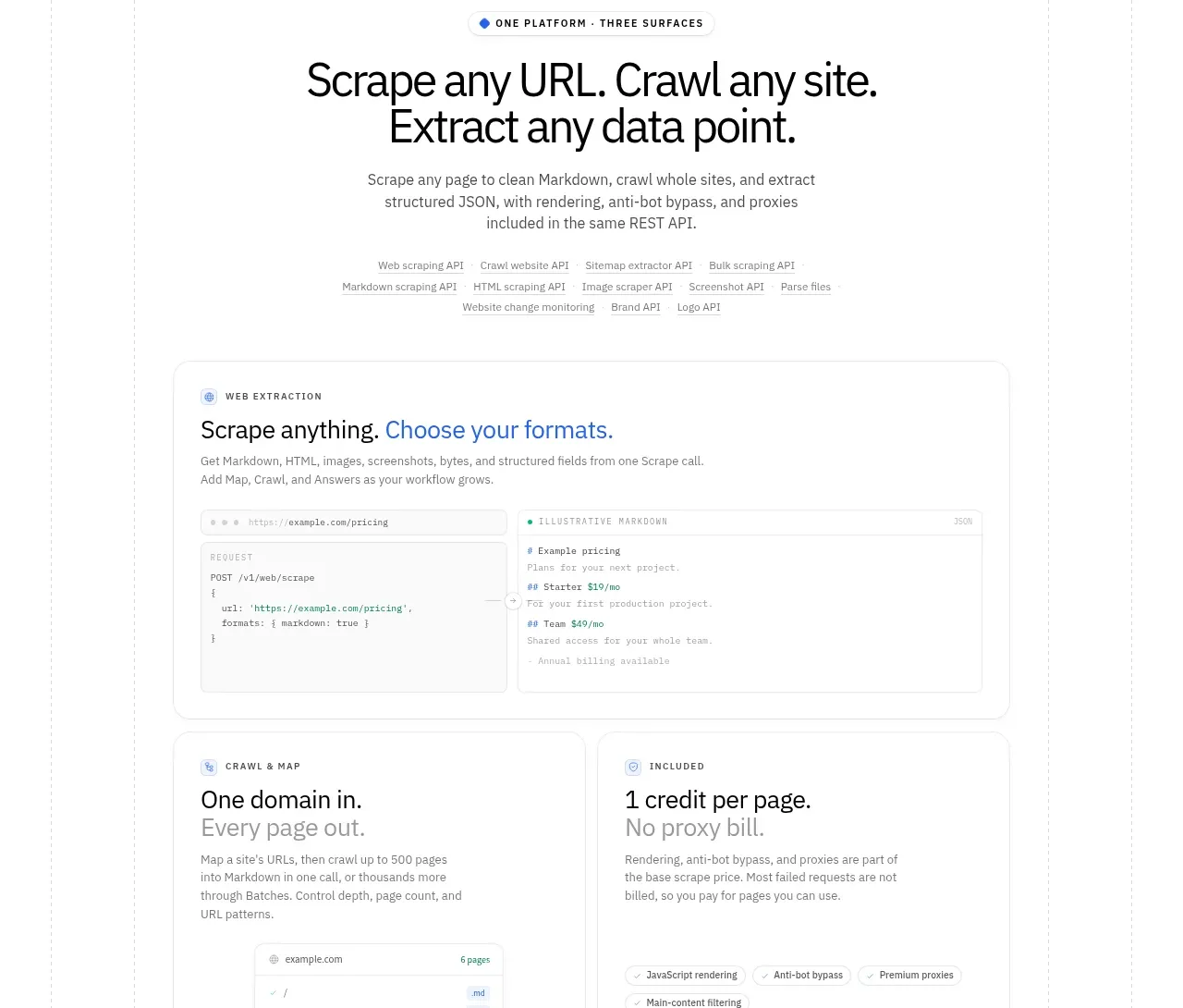
A centered positioning headline explains three related platform surfaces, followed by a broad extraction-format panel and two supporting cards.
Prompt preview
## Reference images

Study these alongside the description below: hierarchy, rhythm, spacing, colour. Build for the product you are asked about, using this design language.

- Component: https://kage-design-assets.t3.tigrisfiles.io/components/scrape-anything-by-context-dev/b0e64468-3924-45db-a4d8-d7cbe8044a77-1791871396-8.webp
- Full page it was cut from: https://kage-design-assets.t3.tigrisfiles.io/screenshots/scrape-anything-by-context-dev/b0e64468-3924-45db-a4d8-d7cbe8044a77-1791871314047-full.webp
- Component on Kage: https://kage.design/component/scrape-anything-by-context-feature-grid-5

## Before you start
Ask what the user's product, audience, and brand are, then explain the product as a coherent platform rather than a list of disconnected features.

Build a centered section with a compact eyebrow, a strong two-line headline, and a short paragraph. Under it, create one wide feature card that combines a title, explanatory copy, and a split request/response or configuration preview. Beneath that, place two side-by-side cards: one focused on breadth or navigation and one on transparent usage or pricing. Use a white background, thin gray borders, 16–20px radii, restrained shadows, and small pill labels for metadata. The previews should look like simplified interface fragments using neutral panels and one blue accent. Keep all cards aligned to the same container and stack them on mobile.

Never: use logos, product names, copy, illustrations, or imagery from the reference.