kage
kage
simhadigital.com

Design analysis
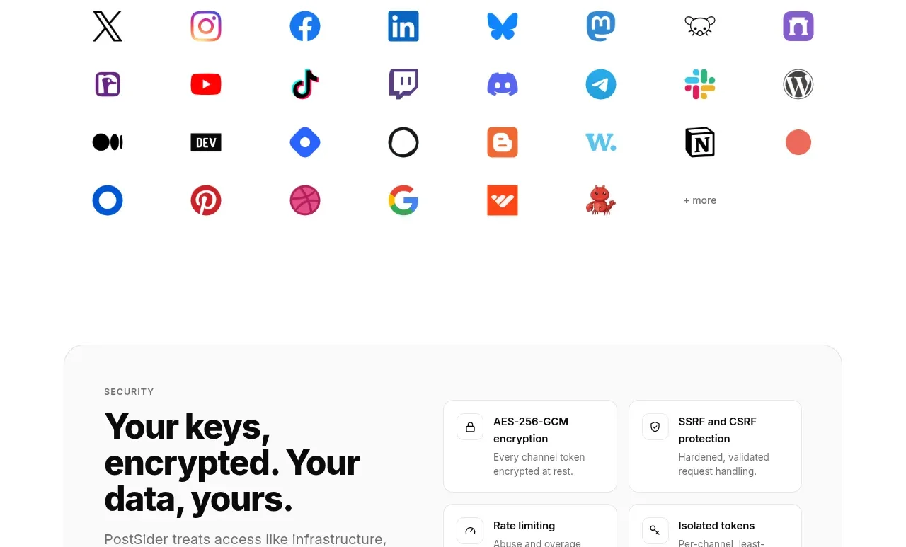
A small centered source label and one restrained row of familiar data-source names communicates breadth without overpowering the hero.
Prompt preview
## Reference images

Study these alongside the description below: hierarchy, rhythm, spacing, colour. Build for the product you are asked about, using this design language.

- Component: https://kage-design-assets.t3.tigrisfiles.io/components/simha-digital/94ffd0b7-28d3-4d9a-b697-c16514e9c8c4-1790057072-2.webp
- Full page it was cut from: https://kage-design-assets.t3.tigrisfiles.io/screenshots/simha-digital/94ffd0b7-28d3-4d9a-b697-c16514e9c8c4-1790056948469-full.webp
- Component on Kage: https://kage.design/component/simha-digital-logo-cloud

## Before you start
Ask which integrations or trusted platforms matter to the user's product and what visual density fits its brand. Apply the same structural idea to those inputs.

Build a narrow trust/integrations strip with a centered uppercase eyebrow, then a single evenly spaced row of text-based integration names or neutral marks. Keep the background warm white, use a top and bottom hairline divider, and make the label and names quiet rather than promotional. Use #F8F9F6, #7B817A, and #DDE1D9. Set the label around 9px with letter spacing, names around 12px and medium weight, and generous horizontal gaps. Allow horizontal wrapping or scrolling on small screens.

Never use the reference's logo, product name, copy, illustrations, or imagery.