kage
kage
speechka.io

Design analysis
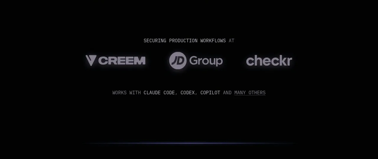
A bordered dark panel explains compatibility in one centered message and presents a single horizontal row of recognizable integration marks.
Prompt preview
## Reference images

Study these alongside the description below: hierarchy, rhythm, spacing, colour. Build for the product you are asked about, using this design language.

- Component: https://kage-design-assets.t3.tigrisfiles.io/components/speechka/662d10a3-b9d2-40f0-bccc-e5bde29d7609-1790229790-5.webp
- Full page it was cut from: https://kage-design-assets.t3.tigrisfiles.io/screenshots/speechka/662d10a3-b9d2-40f0-bccc-e5bde29d7609-1790229722330-full.webp
- Component on Kage: https://kage.design/component/speechka-logo-cloud

## Before you start
Ask what the user's product is, who it serves, and what brand personality and visual identity it should use. Apply the principles below to that product rather than reproducing the reference.

Create a centered integration panel with a short heading, one explanatory sentence, and a row or responsive grid of partner marks. Keep the panel visually quiet so the compatibility message is the focus. Use #0d0d0d or #111111, a thin #242424 border, 8px radius, white heading text, gray copy, and monochrome white/gray marks with consistent optical sizing. Use 32–48px vertical padding and generous gaps; allow horizontal scrolling or wrapping on small screens. Logos should be accessible, labeled, and never overpower the product CTA.

Never use logos, product names, copy, illustrations, or imagery from the reference.