 kage
kage
speechka.io

Design analysis
A centered statement introduces a dense but approachable collection of rounded language pills, communicating breadth without a conventional table.
Prompt preview
## Reference images

Study these alongside the description below: hierarchy, rhythm, spacing, colour. Build for the product you are asked about, using this design language.

- Component: https://kage-design-assets.t3.tigrisfiles.io/components/speechka/662d10a3-b9d2-40f0-bccc-e5bde29d7609-1790229791-8.webp
- Full page it was cut from: https://kage-design-assets.t3.tigrisfiles.io/screenshots/speechka/662d10a3-b9d2-40f0-bccc-e5bde29d7609-1790229722330-full.webp
- Component on Kage: https://kage.design/component/speechka-tabs

## Before you start
Ask what the user's product is, who it serves, and what brand personality and visual identity it should use. Apply the principles below to that product rather than reproducing the reference.

Build a language or capability selector around a centered large statement, with one emphasized phrase and a muted continuation. Below it, render selectable rounded pills that wrap naturally across several rows and vary subtly in size or emphasis to create hierarchy. Use #111111 page background, #f5f5f5 and #8a8a8a text, pill surfaces around #191919, hover borders #3a3a3a, and an active accent state using #ed171b or a bright outline. Use 12–20px pill padding, 999px radius, 8–12px gaps, and enough surrounding whitespace. Make each pill keyboard accessible and provide an optional search or filter if the list is long.

Never use logos, product names, copy, illustrations, or imagery from the reference.
More components
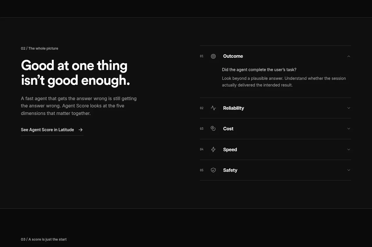
 Five-dimension score breakdown
AgentScore · Tabs & steps
Five-dimension score breakdown
AgentScore · Tabs & steps
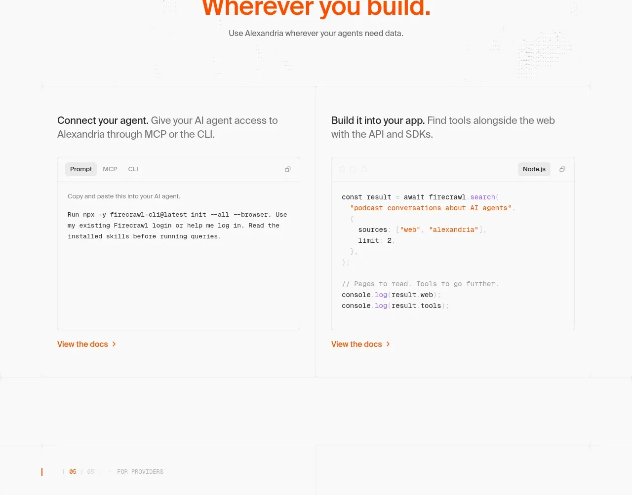
 Build and integration options
Alexandria by Firecrawl · Tabs & steps
Build and integration options
Alexandria by Firecrawl · Tabs & steps
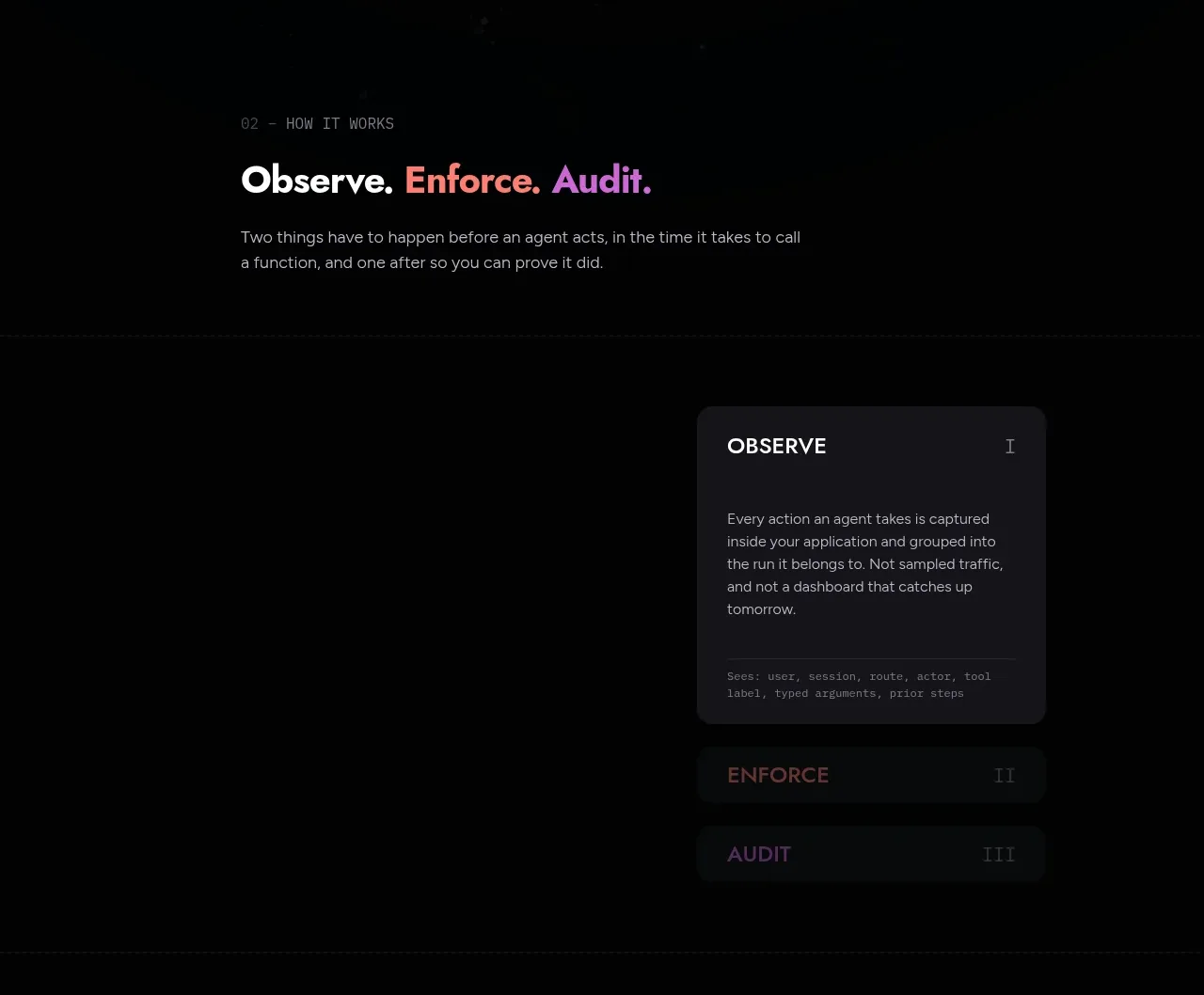
 Observe, enforce, audit workflow
Arcjet · Tabs & steps
Observe, enforce, audit workflow
Arcjet · Tabs & steps
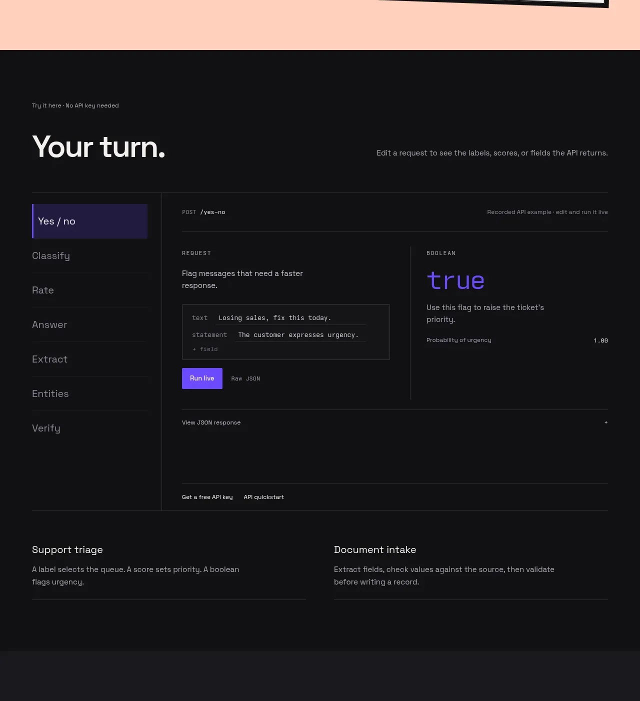
 Interactive API playground
Milliseconds.ai · Tabs & steps
Interactive API playground
Milliseconds.ai · Tabs & steps
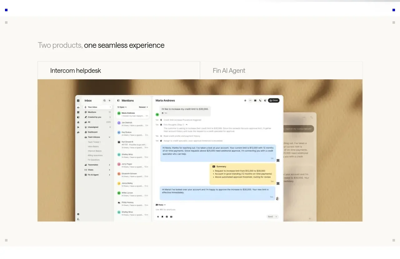
 Product overview showcase
intercom.com · Tabs & steps
Product overview showcase
intercom.com · Tabs & steps
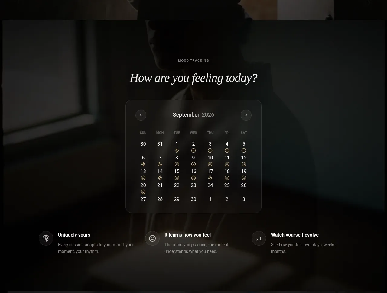
 Mood tracking calendar
Lull · Tabs & steps
Mood tracking calendar
Lull · Tabs & steps