kage
sponkly.com
Design analysis
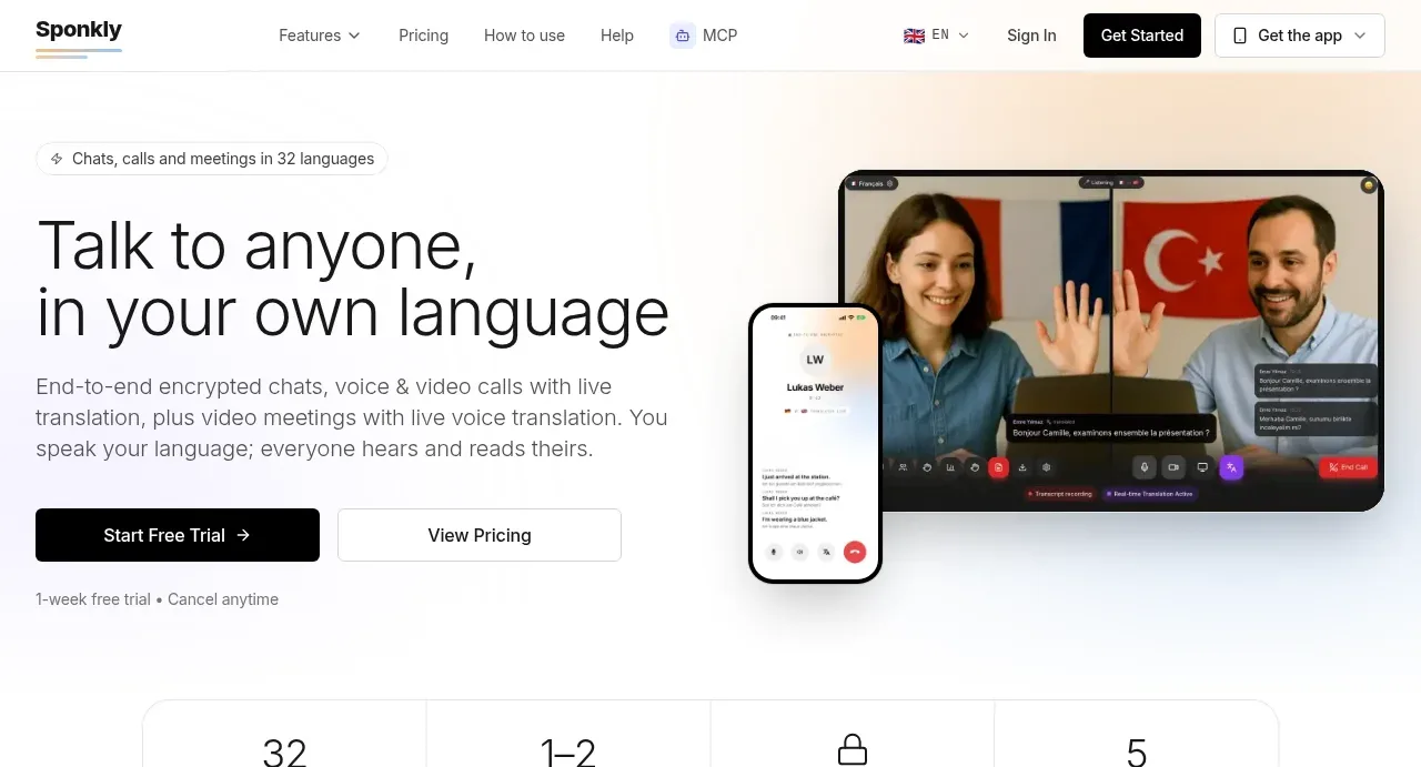
The hero pairs a large language-focused promise with concise supporting copy, two CTAs, trust microcopy, and a prominent conversation/video visual.
Prompt preview
## Reference images

Study these alongside the description below: hierarchy, rhythm, spacing, colour. Build for the product you are asked about, using this design language.

- Component: https://kage-design-assets.t3.tigrisfiles.io/components/sponkly/bd3f409f-e542-449e-8bba-263211d90a1c-1792735453-1.webp
- Full page it was cut from: https://kage-design-assets.t3.tigrisfiles.io/screenshots/sponkly/bd3f409f-e542-449e-8bba-263211d90a1c-1792735346298-full.webp
- Component on Kage: https://kage.design/component/sponkly-hero

## Before you start
Ask me what my product does, who the target user is, and what brand and tone it should have. Use those answers to create an original hero following these principles.

Create a spacious two-column hero directly below the navigation. Put a short eyebrow above a large 42–52px desktop headline on the left, with a 16px supporting paragraph, a primary dark CTA, a secondary outlined CTA, and a small reassurance line beneath. Use a pale, almost white background with a subtle cool tint around #F8FAFB, near-black text #171717, muted copy #747474, and a restrained accent colour chosen for the user's brand. The right side should contain an original product-relevant visual or UI mockup in a rounded frame; keep it secondary to the headline and let it overlap slightly into the hero composition if useful.

Use a centered max-width container, a roughly 45/55 text-to-visual split, 24–32px internal gaps, 14–16px button height rhythm, and 16–20px radii for the visual. On mobile, stack the visual beneath the CTA and preserve a clear first-screen action.

### Never
- Never copy the reference headline, product name, logos, or exact CTA copy.
- Never reuse the reference video, screenshots, illustrations, imagery, or visual composition verbatim.