kage
kage
squadroom.app
Design analysis
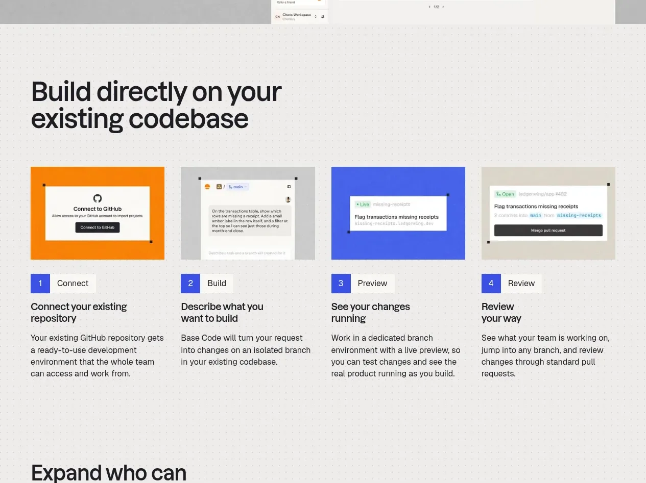
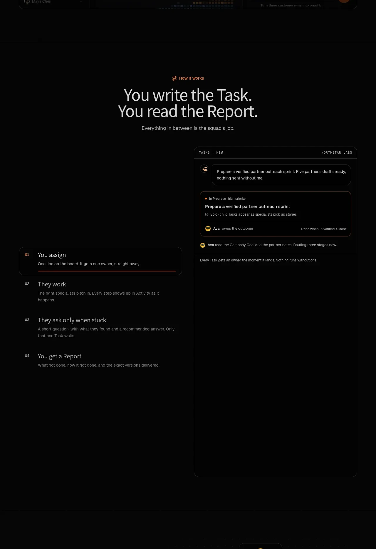
This section explains the core workflow through a strong statement, numbered steps on the left, and a tall task detail interface on the right.
Prompt preview
## Reference images

Study these alongside the description below: hierarchy, rhythm, spacing, colour. Build for the product you are asked about, using this design language.

- Component: https://kage-design-assets.t3.tigrisfiles.io/components/squadroom/d449f1a3-a1d7-46c0-a9d5-0020447fa3ed-1791871291-2.webp
- Full page it was cut from: https://kage-design-assets.t3.tigrisfiles.io/screenshots/squadroom/d449f1a3-a1d7-46c0-a9d5-0020447fa3ed-1791871247696-full.webp
- Component on Kage: https://kage.design/component/squadroom-feature-grid

## Before you start
Ask what the user's core workflow is and what sequence a new customer must understand. Apply the following system to that product, with original labels and content.

Build a dark workflow section with a centered eyebrow and a large two-line statement near the top. Use a near-black background (#070707), white-gray headings (#e4e4e1), muted copy (#858580), and orange micro-accent icons (#ff7624). After the intro, use a two-column layout: a vertical numbered step list on the left and a tall, narrow product task panel on the right. Each step should have a small monospace or tabular index, a concise heading, and one sentence of explanation. Highlight the active step with a thin orange rule or border while keeping inactive steps low contrast.

The right panel should be a realistic dark interface showing a task title, status, owner, priority, comments, and completion/report metadata. Use layered cards, 1px borders in #252525, 12px radius, small uppercase labels, and careful spacing. Keep the section spacious, with the panel extending vertically to create visual weight. On mobile, stack the task panel below the steps.

Never: use logos, product names, copy, illustrations, or imagery from the reference.