kage
kage
squadroom.app
Design analysis
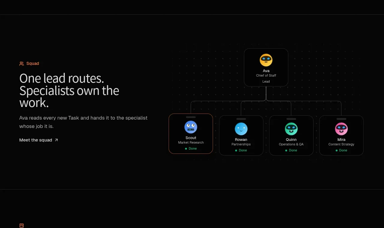
A compact feature band introduces the team concept with a left-aligned proposition and a right-side node diagram connecting a lead agent to specialists.
Prompt preview
## Reference images

Study these alongside the description below: hierarchy, rhythm, spacing, colour. Build for the product you are asked about, using this design language.

- Component: https://kage-design-assets.t3.tigrisfiles.io/components/squadroom/d449f1a3-a1d7-46c0-a9d5-0020447fa3ed-1791871291-3.webp
- Full page it was cut from: https://kage-design-assets.t3.tigrisfiles.io/screenshots/squadroom/d449f1a3-a1d7-46c0-a9d5-0020447fa3ed-1791871247696-full.webp
- Component on Kage: https://kage.design/component/squadroom-feature-grid-2

## Before you start
Ask what roles, people, services, or agents make up the user's product ecosystem. Adapt the diagram to those roles rather than reproducing the reference.

Create a dark two-column feature section. Put a small orange eyebrow, a large two-to-three-line heading, supporting text, and one text CTA in the left column. On the right, show a simple organizational routing diagram: one rounded lead node above several smaller specialist nodes, connected by thin subdued lines. Use near-black #080808, #e6e6e2 type, #898984 secondary text, orange #ff7624 accents, and distinct but restrained avatar/status colors for nodes.

Nodes should be compact cards with 1px #282828 borders, 10–12px radius, centered labels, and tiny green completion indicators. Use CSS/SVG lines rather than an image, and let the diagram remain legible at narrow widths by allowing horizontal scroll or stacking. Maintain a max-width around 750px and align the visual baseline with the text.

Never: use logos, product names, copy, illustrations, or imagery from the reference.