kage
kage
squadroom.app
Design analysis
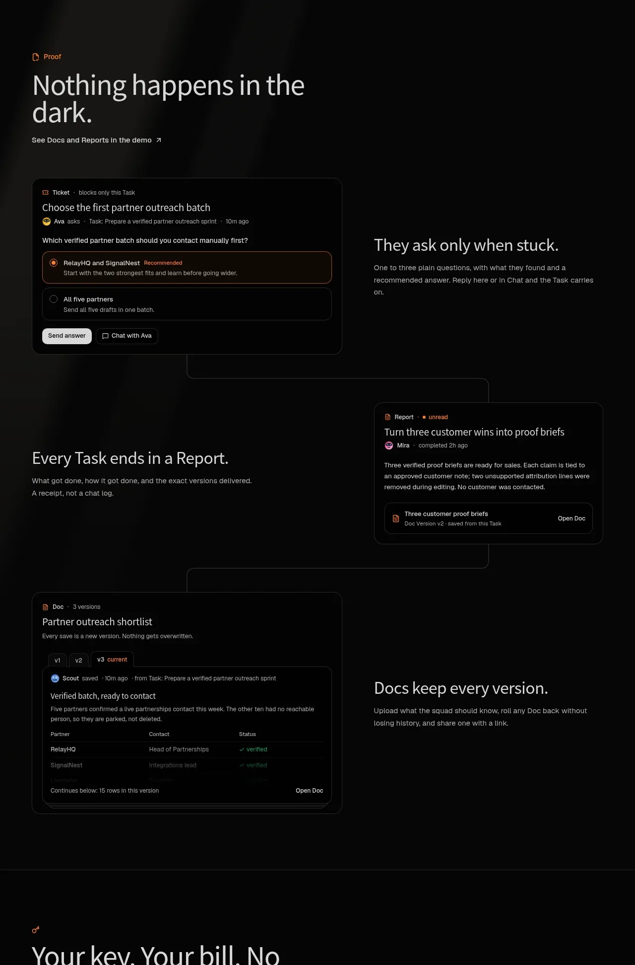
A long proof section uses alternating text and interface cards to show decisions, reports, and versioned documentation as connected outcomes.
Prompt preview
## Reference images

Study these alongside the description below: hierarchy, rhythm, spacing, colour. Build for the product you are asked about, using this design language.

- Component: https://kage-design-assets.t3.tigrisfiles.io/components/squadroom/d449f1a3-a1d7-46c0-a9d5-0020447fa3ed-1791871292-5.webp
- Full page it was cut from: https://kage-design-assets.t3.tigrisfiles.io/screenshots/squadroom/d449f1a3-a1d7-46c0-a9d5-0020447fa3ed-1791871247696-full.webp
- Component on Kage: https://kage.design/component/squadroom-feature-grid-3

## Before you start
Ask what evidence, decisions, reports, or saved artifacts your product produces. Apply this layout to those outcomes using original content.

Build a dark editorial feature section with three alternating rows. Start with a small eyebrow and a left-aligned intro heading. Each row should pair a realistic UI card with a concise explanatory text block, alternating image-left/text-right and text-left/image-right. Use #070707 as the background, #e5e5e1 headings, #92928c body copy, and orange #ff7624 for small labels and active states.

The UI cards should be crisp, shallow product interfaces: a question/ticket card with selectable choices, a report card with a status and summary, and a versioned document card with tabs and a small table. Use #101010 surfaces, #272727 borders, 10–14px radius, subtle shadows, and 12–14px UI text. Connect rows with understated vertical or horizontal alignment cues, but do not overdecorate. Give each row enough vertical breathing room and stack them on mobile.

Never: use logos, product names, copy, illustrations, or imagery from the reference.