kage
kage
squadroom.app
Design analysis
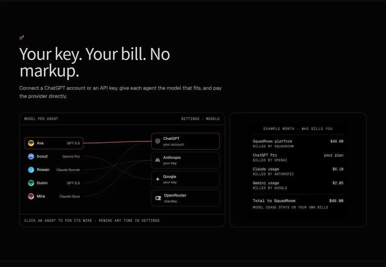
This section communicates cost control with a left-side promise and a detailed routing/settings panel beside a transparent bill summary.
Prompt preview
## Reference images

Study these alongside the description below: hierarchy, rhythm, spacing, colour. Build for the product you are asked about, using this design language.

- Component: https://kage-design-assets.t3.tigrisfiles.io/components/squadroom/d449f1a3-a1d7-46c0-a9d5-0020447fa3ed-1791871293-6.webp
- Full page it was cut from: https://kage-design-assets.t3.tigrisfiles.io/screenshots/squadroom/d449f1a3-a1d7-46c0-a9d5-0020447fa3ed-1791871247696-full.webp
- Component on Kage: https://kage.design/component/squadroom-feature-grid-4

## Before you start
Ask what pricing, model, infrastructure, or usage concern your product must make transparent. Design the feature around the user's actual trust question.

Create a dark two-column feature section. On the left, place a small orange eyebrow, a large two-line benefit heading, and a short explanation. On the right, show a split product UI: a routing/settings panel mapping several workers to providers or resources, and a compact invoice card with line items and a total. Use #080808 background, #e5e5e1 headings, #92928d copy, #252525 borders, and orange #ff7624 for selected connections and totals.

Use a technical but approachable visual language: 11px uppercase or monospace metadata, 13px row labels, thin connector lines, pill-like provider controls, and 12px card radii. Make the total easy to scan and use aligned numeric columns. On mobile, stack the routing panel above the bill. Include visible focus and hover states for selectable providers.

Never: use logos, product names, copy, illustrations, or imagery from the reference.