kage
kage
squadroom.app
Design analysis
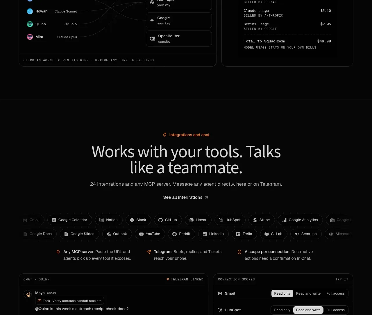
A split feature shows research results captured from multiple sources beside a concise explanation of how those findings become useful product knowledge.
Prompt preview
## Reference images

Study these alongside the description below: hierarchy, rhythm, spacing, colour. Build for the product you are asked about, using this design language.

- Component: https://kage-design-assets.t3.tigrisfiles.io/components/squadroom/d449f1a3-a1d7-46c0-a9d5-0020447fa3ed-1791871293-7.webp
- Full page it was cut from: https://kage-design-assets.t3.tigrisfiles.io/screenshots/squadroom/d449f1a3-a1d7-46c0-a9d5-0020447fa3ed-1791871247696-full.webp
- Component on Kage: https://kage.design/component/squadroom-feature-grid-5

## Before you start
Ask what research sources your product supports and how users consume the resulting insights. Apply the pattern to that workflow.

Create a dark split feature band with a realistic research-results panel on the left and explanatory copy on the right. The panel should resemble a compact feed or table containing source rows, quoted findings, timestamps, and a saved-summary footer. The copy side should have a small eyebrow, a large two-line headline, body text, a text CTA, and a small row of source labels.

Use a near-black #080808 canvas, #e5e5e1 headings, #8d8d88 body copy, #252525 card borders, and orange #ff7624 for the eyebrow and active research marker. Use 12px rounded corners, compact 12–13px UI text, thin dividers, and generous whitespace around the two columns. Make the feed scrollable or collapse into a vertical list on mobile.

Never: use logos, product names, copy, illustrations, or imagery from the reference.